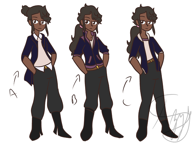
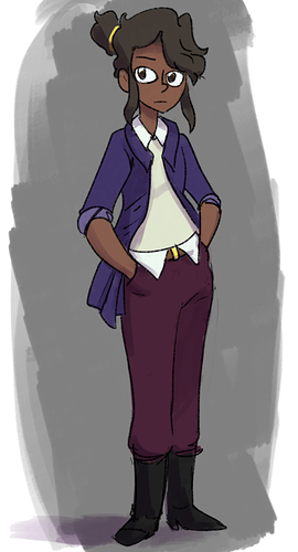
A little feedback on your palette. I think these colors are perfectly fine but the saturation and contrast is a little tough.
Her jacket in paticular is this very VERY dark but super high saturation purple. I think it would benefit quite a bit from a being a touch lighter in color but quite a bit less saturated.
The pants and the boots also kind of clash, the boots are black while the pants are grey, but such a dark grey my brain keeps trying to make them the same color.
Do you mind if I post a draw over for some suggestions I might make? I hope that's not too forward.