40 / 303
Apr 2017

It's hard enough as a creator to get any kind of attention with the current trending genres, but now that they are even further down, it forces the more obscure comics/not popular yet comics into obscurity even more.

Not really a big fan of the new layout either. I know Taptastic is all about the new premium content, but this seems a bit ham-fisted.

  • Font is beautiful typography but not ideal for say a Creator's page. If they feel compelled to use that font, best be used for titles and headers. See, thin fonts tend to be popular to artists. It's very appealing and I like them too. But you have to consider what it is being used for and its readability. In this case, it's not ideal.

  • For overall web design, I like it the font they chose looks good for the menu div and the colors work well together. They found their colors which have to be consistent (the yellow and navy blue seem to be their choice) so it's fine that they use that for the header and footer. The extra colors added such as the green "+Series" is unnecessary but it doesn't take away from the look of the site. By the way, there is nothing wrong with them adding more colors in the update. Of course people will be resistent to the change but it's not a bad fix. But I do agree with others that there may be too much going on on the front page. It's still meant to favor touch screens and mobile users. At least Tapas doesn't use that infinite scrolling, I really hate that.

  • For the publish button, I actually like that. It's much easier than clicking on the drop down menu and randomly clicking until I can get to my comic. I will say, maybe call it something different. Publish implies making a new comic but when you click on it, it sends you to your "dashboard" area with ad revenue info, episode updating for comic. Just a small preference.
  • I have to complain about the footer. To me and my experience, it seems waay too big. Takes up over 1/3 of screen I believe. I guarantee you can reduce so much of that space by reducing the margins, if that's why there is so much empty space.

  • The Discover page looks fine so far, not much different from the old one. The Home page, I can see why many of you say it is cluttered. I can see that, too much scrolling involved (more touch screen friendly). I hate that but most people enjoy it. There's too much emphasis on Premium and Top picks. I would think a mix of the "fresh" and "trending" should be near the top if you want the lesser known comics to gain more attention. I believe I got a lot of attention because of that in the old layouts.

  • For placement of Trending, New, etc. I think it would make sense to have New&Noteworthy at the top, Recently updated (because that gives exposure to all comics, not just trending) and then Trending.

  • As Uzuki said above, there are some parts that are not working. I will include a link to one example below. Certain emphasizes the mobile preference. Sad to me but that's where the future of technology is heading to, that easy interface format.
    https://sta.sh/0y4qf3md4rp4

Overall, the chagnes are here to stay and though they have some bugs and are in need of fixing, that doesn't mean they are worse. Even though I don't like all of the changes, I do think these changes are for the better. I would prefer Tapas work on the mobile vs desktop friendliness more as it still seems more mobile friendly than desktop. Don't be upset things are changing, you'll adapt.
I look forward to seeing the changes, I like web design am interested in how they format everything.

OH, also, yes change the font. Beautiful, artsy font, but not for regular text. Maybe for titles and headers but not regular text. Makes it difficult to read. That's the one thing I'll actually say should change.

JJ
Creator of Beautiful Lies

Okay, so more technical details.
- global.footer height is 246
- The padding on the footer for global-footer-link, global-footer-company and especially global-footer-icon could be considerably reduced for the sake of making the footer smaller. (Just my thoughts on it, not trying to tell you you're wrong. You're the experienced onces after all). I would also recommend for the social media, to have that in a more accessable location. People don't often actively go looking for it and these would require people scrolling aaall the way down to reach them. Same with forums. All dat scrolling mate, sucks for non-touch screens.

  • Is Quicksand the font that's making everyone go batshit? Yeah don't use that as I said for the regular text. Even just Open Sans works better. It's a beautiful font but the problem with it is the spacing. That's why it's not ideal for regular text. Something like Open Sans is much easier to read with less rounded letters and less space between them, take as an example, whilst still being a relatively appealing look. If you still want that rounded look then hrm.... I can't think of one immediately that doesn't cost money. I meant that crisp, easy to read look comes from sharp edges ( I don't know my typography jargon so bear with me). If you look at Source Sans Pro, that's a bolder looking font but sitll easier to read. THen if you look at "Print Clearly" that one is even worse than Quicksand and for the same reasons Quicksand is bad (spacing, thin font).
    Just experiment with the fonts and keep in mind readability above aesthetic. (Business-oriented graphic design vs artistic graphic design). Also, I really like Josefin Sans. Little rounder, much easier to read, crisp.

By the way, I like the subtle, rounded outline around the wraps such as for the "Pro Tips." Borders are one of those things that rarely look good.

  • I'd also prefer the Forums button go back to the top for ease of access, as I mentioned with the social media being somewhere more noticeable.

EDIT One last thing, I'd recommend expanding the width of the body on the main page. 940 seems way too small and most people have pretty large screens nowadays. That certainly adds to the "cluttter" people have been describing the new look. Or make it relative

Cheers,
JJ

I don't mind the new design at all, in fact I quite like the new rounded letters even if they make things look sorta childish. It's a little more welcoming compared to other webcomic websites. I agree with you on the infinite scrolling though, absolute worst thing.

I get your point that mobile device accessibility is the future and websites are starting to lean towards easy accessibility on mobile devices and the front page is doing that, but as someone mentioned earlier, the scrolling makes it look like you're using the 'desktop view' on a mobile device. I'm on my desktop because I want to use something that's designed for desktop usage, not mobile. I don't use the app because it doesn't have the things I need as a creator without having to take extra steps. Not to mention, not everyone has access to a smartphone or a smartphone thats compatible with the tapas app. So those stuck on a computer have to deal with a less-than-ideal website layout that is better suited to a touch-screen

Also the organization on the front page is all over the place. It's more of a personal peeve but the fact that the order between books, comics, banners, and rows constantly alternating is a headache. That and I haven't seen anyone mention that they like how the front page is organized?

of course im speaking from more of a first read standpoint since I'm not too familiar with web design stuck_out_tongue

Before today we felt like 2nd class, behind the BLs and the gag-a-days, now we're 3rd class behind "the premium" and "the favored". And Daron mentions in the Medium article that the premium stuff is professional . . . so does that make the rest of us unprofessional? This update is a sour surprise and makes next Wednesday's update for our ongoing series difficult to swallow.

0 new subs here we come.

wow i think that's the most disheartened thing I've ever seen you guys post here. Whoof. Never thought I'd see the day.


in other news, i keep instinctively touching the spot where the "forums" button used to be, and keep clicking on "creators" instead

hoo boy the muscle memory is real tho

Oh noes, I like it too. I realize I have the Quicksand Font. I get I think theirs is a mix of Quicksand and Helvetica Nueue if you look at the script, they are beautiful fonts but work better for titles, simple short text, not say a post like some of the ones I do.

For my personal opinion, I don't like the infinite scrolling design many modern websites use. Ideally, I would try to make a desktop version ideal for pointer use and a mobile version ideal for scrolling, but that is actually not very easy. Hence, Tapas's attempt to merge the two (Infinite scrolling is available when reading a comic but you can also click the buttons on the right to move to next page) which is a good idea.

  • As for the organization of the front page, from a user point of view, it's all over the place. You're right. Random banners in between "top picks" is redundant. I'd eliminate those banners all together.
  • From a creator's point of view, this set up is ideal if yo're one of those top creators, as Uzuki has been complaining about. Tapas is really trying to push their new Books so that is twice at the top "Top 10 Books" and "New Books." Unnecessary. If people want the books, they can click on the menu where it says Books. It's right in front of them. For consideration of creators, Recently Updated should be close to the top, then Trending and New+Noteworthy can be closer to the top. Recently Updated or "Fresh" give exposure to the lesser known. I'm relatively "successful" and I believe that is what got attention for my comic in the first place. Staff picks can stay at the bottom. Premium and Top picks (how do they decide these? Same as before?) Don't need to be at the top, or they can make a separate page dedicated to "Top picks." Premium and successful creators don't need as much attention. Attention will automatically flow towards them, so best give light to the lesser known.
  • And from a web design/graphic design point of view, yeah it's cluttered. Hah, right now I'm just bothered by the max width of the body they chose. Too much white space on the sides and this also contributes to the cluttered feel.

Recommendations for the team:
- Fix font
- Keep Fresh close to the top. If Premium and top picks are that important, contribute separate section to them. So the menu can have "Featured | Comics | Books" or something like that. If people want to explore, they can look at New + Noteworthy and Fresh on the front page. If they specifically want "the best," they can go to the Featured tab.
- Fix front page layout. too cluttered. If you want to keep the redundant banners, maybe put them all together at the bottom or top and have no width limit. They really are redundant though. You have Top 10 comics, Top 10 Books, Staff Picks, Trending, AND the banner at the top. Too many on the front page mate.

EDIT: If you see this Michael, sorry, I didn't read the whole page. Wasn't aware some issues such as font were already being addressed. And yeah you're right it does look okay when rendered correctly.

I wanna start off by bringing something positive to the table and say I love that you are finally uniting the brand! This will cause for less confusion between the app and the desktop site, and will make tapastic easier to push on the market, which can benefit everyone on the site! Big creators as well as small ones.

However, that being said...
I feel like what makes tapastic so great is that it's the land of rainbows and unicorns where EVERYONE gets a chance to be seen, and can get much more recognition than anywhere else. I know many of you feel second class to boyslove and gag comics, but speaking as someone who started out only having a horror comic on this site, I know tapastic was a much better place to be seen with difficult-to-sell comics too!
In order to be this loving, great community that gives tons of people the chance to live their dream, i beg you to lift these sections and have them in the following order:
1. POPULAR - gradually, new creators make it into this section all the time. Maybe not the first page of it, but the second page at times and it can give them a huge influx of new readers when that happens! It also helps sustain the healthy reading culture. The top 10 comics simply don't update as freshly and often as the popular section, meaning popular is more sell-able in the land of pageviews and ad revenue. This is crucial both to you as a company and some of us creators, is it not?
2. TRENDING. This was a section where magic happened for so many people. Once upon a time i was a nobody on the site and getting into trending occasionally with my little obscure horror comic made me SO HAPPY. I can't bear to think that creators from this day forth wouldn't get to feel all that joy as the trending section is now buried almost like a shameful badbad that nobody wants around anymore ):
3: FRESH or NEW AND NOTEWORTHY. I prefer this over staff picks. Simply because i am more likely to check out something that in the title implies it's something new and upcoming, rather than something that makes it feel like it might just be staff promoting their friends. I know this isn't the case, but to a new viewer it will feel like it, so titles are important.

Oh, also, i can no longer access the forums on desktop. I use chrome. This is a bit of a problem :c

Concerning the comics published by non-paid creators, the Popular and Trending section should still be on the front page. Otherwise, just occupy a small space of it on the same old area (below the Spotlight section) and put the other premium Tapas comics below of it.

However, that's just my suggestion.

To go back on the overload of premium content at the top of the homepage, might I suggest keeping the popular and trending up top?

Considering newcomers to the website, it might be better to lure them in first with free content before blowing all the scary 'gotta-pay-for-this' comics in their faces. It can be intimidating, especially when the first hundred-or-so comics displayed there are hidden behind a paywall.

First off, I'm still a reader and not a creator.

I like the current font, and it's good that the app and desktop version are being unified, because them being so different is a bit confusing. The site in general comes off as fresh, clean, and professional. But there is one thing I don't agree with:

The initial screen and first "scrolls" are premium, app-only content. As a reader, this is a turn-off in three ways:

  1. I'm on desktop, and I need to go to the app to access these comics? I'm on desktop for a reason: big screen, access to a real keyboard for typing replies, doing other stuff as well as reading comics.
  2. Everything is paid content - let's face it, people love free stuff, and stuffing our faces with free comics is probably the reason most come here. I'm pretty sure that the vast majority of readers will at most want to buy into one or two comics, and the rest of the time they're around for the free ones. If they're not seeing any free content at first glance, they will assume it's only paid content.
  3. The independent, free comics are gone? The not-promoted-or-officially-endorsed comics are pushed so far down that they simply aren't visible unless you scroll pretty far, and even then it's not clear that they're actually free. The site comes off as exclusively curated as opposed to free creation - which IMO is not as attractive.

To sum it up, I think it would be beneficial to both the site and the users to show both premium and free comics on the top screen, because readers will be more inclined to get invested into tapastic if they can get more out of it than the few series they pay for! As this article succinctly points out: It's better to convert 5% of 2 million visitors than 50% of 100'000 visitors, and you will be getting more visitors with prominent free content. And you'll have more creators on tapastic - which all funnel more people to the site through their promoting their own comic.

I think that it really comes down to that there are two directions for Tapas/tic to go: Aim for the small number of well-paying readers and make the site focused on curated pay-content (reader-focused site), or promote the forums and the free content and have premiums as a bonus (creator-inclusive site). Both are legit business models, but if the former is what you're aiming for, which it looks like right now, I think we'd appreciate a clear statement on it, because up until recently, Tap seemed to be the second model and many creators are feeling cheated right now. I also do not feel terribly compelled to upload my upcoming comic to tapastic anymore, simply because I don't think it stands a snowflake's chance in Sahara in getting noticed.

I should add that I feel the same about the app. I come for the free comics, and it's alienating to be bombarded with all this premium content and ads.

EDIT:

I somehow completely missed this on my first readthrough. Good to know. I'll still leave my post as-is because there might be something of interest to you in it anyway.

Edit2: I don't mind the font much, but when typing a reply to a comic it feels redundant to bolden the text.

So, in summary, people don't hate the premium comics but the majority of tapastic creators and readers are here to produce and read free content and we would all prefer for that to be promoted highest on the page, right below the spotlight, where it previously was. With this many people all agreeing on the same thing (I've had people in my audience express this to me too, so there's even more people agreeing with this than you see speaking up about it here), i think tapas as a brand would suffer horribly if they refuse to change it.

However some people seem a little grumpy and I should say that I honestly don't feel like tapas did this on purpose or to alienate us. The way this looks right now, the new desktop look is a work in progress. They basically translated all the app's coded frontpage over to the desktop and plopped it on top of the current one, and it should be an easy fix to just move the popular and trending sections up. I doubt they'll ignore us.

We believe in you, tapas staff!! Bring the promotion of free content creators and small creators back! OAO/

Yes, Thank you. I hope this can roll out soon, this causes me to lose much of my interest in Tapastic, despite the already better UI.

I'm already miserable and struggling enough as I am after recovering from an extremely long creative slump, but to push independent creators all the way to the bottom of the page? I truly hope that this isn't an omen for the potential terror that is to come, I mean the world in itself is already falling into a pit of degeneracy.

Please reconsider the layout of the front page, especially how independent creators are being presented. I understand the need for bucks, so I'm okay with having premium comics on the front page, but making practically the entire thing dedicated to premium comics diminishes the little hope for my work I already have.

3

This might be a bug or something, but I don't know, but how do I add a title?
I can't post an episode because I can't add a title, but the bar is gone?

@Chopythes Oh my god so it's like REALLY hard to tell but there's a place to type it near the episode number. Where the word "Title" is grayed out.

OMG THANK YOU!
I'm so used to it looking like before, I didn't even think about clicking that!
Thank you for letting me know!

Forums is at the very bottom of the page. Inconvenient as all hell but it's there. I mentioned it in my wall of text.

No, I know that, but using that link I just get the error of the site not responding. I had to download firefox just to be able to open the forums now because chrome wouldn't do it. And yes, I did clean my cache first to check. Didn't help.

OK Guys. in light of the recent events, I wanted to see some of the interviews that was conducted in Tapas/tic's name and head of the company, Mr. Chang Kim.

According to several articles, Tapas/tic is trying to incorporate the Korean Webtoon system in the western market. As Mr. Chang Kim who was working in Google came across Korean webtoon and wanted to do something in it. This is a fact that was in several articles in the past.

As for where the Site is heading now, I thought it would help for me to analyze and share the directions and what was said regarding it


http://platum.kr/archives/721192

  • This 2016 December articles states how bringing in the Korean content from Korean sites (namely 'They say I was born as a king's Daughter, Adonis, etc contracted with Podotree, a subsidiary to the Korean company Kakao) has increased their monetization amount of 48% per month since its implementation in May of 2016. In November, it tripled that of Octorber.

  • The Article also suggests that its transformation from comic to text book app has given them a huge boost in the app store (ranking among 3~10) which they plan to do more of and has.

Tl;dr - So from this, we could tell that the platform's change was warranted to go towards monetizing contents and going towards book than comic's direction. which is further proven by the most recent interview


  • In this article which came out in april of 2017 (so a couple of weeks ago), which is titled "On the opposite ground of Marvel; aiming towards female targetted romance webtoon"

  • This one goes a little more detail in the CEO's plan where he prefers 'Contents with possibilities of adaptations such as movies' for growth of the site. The article also suggests that he hopes to create a 'webtoon' like 'Iron man' who are adapted from comics to games, movies and other mediums

-The article suggests that his primary goal of 'spreading webtoon in the US market' has met success. It says that he spent the first year in explaining the concept of webtoon and finding creators capable of making webtoons.

  • It goes on to say how much tapas/tic has grown as a platform, obtaining over 21K professionals and non-professional creators with 500K chapters published, With average monthly visitor of 1.3Million

  • CEO Kim goes on to explains the secret behind its growth as 'going the opposite direction from Marvel and DC' While the two companies make male targeted contents like Avengers, Batman and other hero contents, Tapas focuses on female targeted contents like romance and fantasy. It's also easier to adapt it into other forms which allows the content to have various gates in growth. He also states that there has been increased talks from Hollywood, netflix, amazon and other platforms in regards to finding original materials for adaptations.

  • He ends the interview by saying that finding out about Korean webtoon allowed me to venture into this directions. The sparkling fresh ideas of Korea can meet a market hundred times bigger when it's brought to US

Tl;dr - Tapas/tic's main goal was to work with and from the Korean webtoon system. Focusing Female targeted contents to generate more opportunities. Wishes to create or own a big IP that is like the Iron man


In conclusion, Tapas/tic's changes and directions do seem pretty clear once you read these interviews (Although not in English). While I feel that this could've been communicated with the creators here, it does seem like the starting point and the future of the site was set from a while ago.

I really hope they're not gonna put their focus on premium content. Most members are here under the assumption that it's a free content website for individual creators firsthand, and premium content second. Or third. Or tenth.

I have faith in tapastic, but IF this turns out to be their intentions it will ruin every single thing that's good about the site.

THAT BEING SAID, MICHAELSON ALREADY SAID THEY WERE GOING TO SURFACE THE NON PREMIUM CONTENT COMICS.

THIS ISN'T EVEN A DISCUSSION. THEY'VE ALREADY CLEARLY STATED THEY WILL DO THIS AND THAT THEY ARE ONLY EXPANDING INTO MORE PREMIUM CONTENT. NOT FOCUSING ON IT.

Tapastic aren't some terrorists out to get us. They're business partners o_o

I felt like I already addressed this within my original post:

Please note that there are a couple more changes to come to the front page, including surfacing more non-premium series, and making up our minds on which one to keep (staff picks vs new & noteworthy, they're the same thing...ish). Please bare with us while we listen to feedback and try our best to apply them to the site in pragmatic ways.

We're working on debugging this issue - it might be related to chrome. Can you try using a different browser and seeing if it persists?


As for concerns about the clutter, we are working on figuring out how to find the right balance. A balance between bringing more exposure to newer creators, pushing new readers to already proven comics, showcasing comics that have engaged readerships, and the balance between community driven and economically driven decisions.

There are some logistical reasons for the mirroring of the app to the desktop but we are working on resolving this issue to help diversify the offerings.

It is related to chrome, because it works on firefox and my iPhone!

And yayyyyy I look forward to seeing the site once it is done! ヾ(〃^∇^)ノ♪

My suggestion is this order:

POPULAR
TRENDING
TOP 10 COMICS
FRESH or NEW AND NOTEWORTHY
NEW PREMIUM COMICS
TOP 10 BOOKS

My suggestion is to ditch the larger banner advertisements entirely (yes, I know I benefit from these since my comic is in one of them but that's irrelevant because if the main page is messy, noone benefits). They work for the app, but not so much on desktop!

I feel like the combo I suggested will feed the reader's eyes with the largest possible variety of comics, in the neatest fashion possible for desktop, and it will balance well with pay to read vs free to read. Pay to read should be lower because they update less frequently and people are more likely to check them out once they've explored the site a little. Putting free well selling comics that updated within the last 24 hours (popular) will work the best to pull in new members and visitors. and putting trending up high will motivate more creators to join and suggest the site to people they know. It will also give small creators a chance.

...I also realize it sounds a little like I hate premium comics and I should mention firmly that I really don't. I think they are a GREAT thing that are a good financial choice for tapastic, and when things bring money to tapastic as a company, that means they have more that they can invest in awesome features that we can all benefit from. Hell, if I got the chance I would like to create a premium comic myself, not gonna lie.
I just think that tapastic's spirit is supposed to be an awesome community where everyone gets a chance to be seen and there's not some exclusivity game going on. The premium comics do well here because they are an additional service tapastic provides to those that CAN pay, while tapastic still gains that audience through free comics to begin with. Part of what makes this site so awesome is that they have faith in the little guy that hasn't made it big yet too.

I'm going to second this order! ^

(But I wish the Staff pick could be instead of New and Noteworthy because, it feels fancier to say your comic has gotten a staff pick 8D I know, I'm silly but it feels like you've accomplished something when the comic has gotten a staff pick! And there's some bragging rights to it as well ;D)

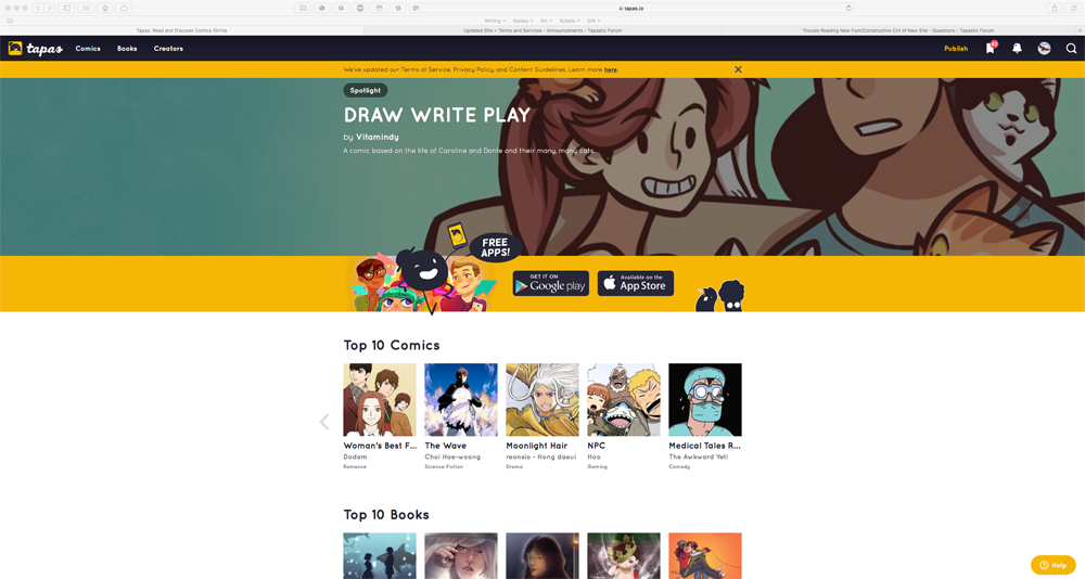
The front page... It really is too much, too much premium, too much top, too much banners.

I know you guys must have a lot of pressure from inside and outside factors, and you need to make money. That's how it's always been, and I don't think it will ever change, is it a bad thing?, not really. The thing is how one goes around it.

If it was hard for a new cat starting a comic, now the sky seems a little greyer. The new and noteworthy section seems filled with previous staff picks, and then you have staff picks with the same comics, why have 2 sections of the same titles?. I'm hoping we need a little more time for the algorithm to catch up.

The trending section was like the heaven for new peeps to get noticed, now it's basically at the bottom of the page.. The amount of scrolling down you have to do to get there is a lot, and if you mage to scroll all the way down, coz I will guess peeps would have clicked a premium comic just before reaching the bottom.

Why have huge banners inbetween the sections?, it's like you're advertising the same comics twice. Maybe adding some new comics to those banners, not from the staff picks obviously. It will be hard to motivate peeps to update (spending time and effort to create a new episode) or to even publish, only to appear (if the made it to trend) at the bottom of a page...

Finally why is the forum back at the bottom of the front page?, I know you'll always cater more to the readers, but I think the forum is such a vital part of this website, here peeps interact, ask for advice, ask for feedback, promote their comics, chat, tapastic staff advertise their stuff, etc.

It seems like all the changes where made to attract more readers and make more money, and not so much on caring for the content creators (aside for the premium and big cats who'll get more readership). I know that your priority is to get more readers, but think about this a little, attracting new creators is also really important, if there are no creators they'll be no readers, one can't live without the other.

The changes you have implemented to get new creators are always "money based", now we have ads, now we have tips, come and earn money. Why not try to have other incentives, like equal chance of exposure, the option of adding multiple creators to one comic, folders for the episodes, getting rid of bugs. I know peeps like money, but the thing is, it's not everything to keep a "worker" happy.

Having one part of the equation (the reader) and the other sad (the creator), it's not that productive, having a balance would be essential. Maybe adding a few changes to attract and keep new creators?, giving them an equal chance to be seen?, and at the end of the day the reader is the one who chooses out of all the options what they would want to read.

The front page layout is really inefficient now. Narrow, vertical layouts are fine for mobile, but on desktop it's just wasting space, especially now that there are so many different things on the front page. Who even uses a monitor that narrow any more? I don't expect pages to fill the full width of my screen, but I'd like something better than this:

3

Also agreeing with the disappointment that all of the user-generated content has been shoved to the bottom, beneath premium comics that you can't even actually read on the desktop site at the moment. It seems very premature to launch this new front page before enabling premium purchases on the desktop site. On top of that, I don't really like any of the premium content, and there seem to be almost no LGBT stories in there, compared the the popular and trending user-submitted comics which are full of them (even excluding the stuff labelled BL).

If it makes you feel better, it does seem like tapas staff intends to raise the Popular and Trending section. If they weren't intending to before, they probably are now considering the feedback. Michaelson himself stated that they would surface the non premium comics, and that the current look is still a work in progress (:

Maybe not premature, but I do agree that enabling purchases will be an urgent matter that needs to be handled soon if this is the way we're going.

I actually have a girlslove comic (with some transgender issues involved along the line too) that I'm planning and have started working on but not yet published. I've been curious about the keys-to-unlock-episodes system for a while, but haven't dared to approach staff about it. Does anyone know if it's open to medium size creators?

Oh my gosh... so much to read... O.O

Honestly, almost everyone here comes off as really upset about the promotion of premium content on the desktop site. I won't say it makes me super happy (being an indie creator myself), but I understand the reasoning for promoting them, and truthfully, I love a lot of the premium comics and books. I do agree that the site looks cluttered as it is now, and the font is a little hard to get used to right now, but I think unifying the app and desktop site is a great idea, (because I'm sooooo sick of having to refer to the site and the app by separate names every time I tell people about my comic).

I do wish that the Fresh Comics was one of the promoted categories on the front page. That's probably what has been keeping a lot of new creators (like me, haha) from being discovered. Also, the categories "Top 10 Comics" and "Top 10 Books" kind of seems... dishonest? Mainly because they are only premium series, and some of the most popular comics on the site are free comics (just saying, lol). And there really are way too many categories promoting premium content. Like, almost all of the categories on the front page are premium. It's fine to put premium content first on the front page, but please minimize the number of categories showcasing them.

As whole, I enjoy the cohesiveness of the site in conjunction with the app, but yes, please keep our concerns in mind (as I'm sure you and the rest of the staff are).

AFAIK, im pretty sure the keys-to-unlock system is only for the creators they approach/made deals with. Its possible that it's the same with books that you can pitch your idea to them, but I'm pretty sure it's restricted to content creators they've made deals with atm.

I'm sure in due time they'll open it up to more people however.

Ah okay, I was just a little curious on it. I'm always on a hunt for new things to try haha xD Oh well.

Actually I think it's open for anyone to apply to, you'd have to contact Michael Son about it.

A downside that I saw was that it has to be a completely new series and can't be a series already published on the site. However if you're wanting to do something new anyways you might be able to figure something out with them. Doesn't hurt to ask wink

It does hurt to ask if you're a shy boi (。・//ε//・。)
Maybe I'll try haha.

"T-tapastic senpai.... (* /∇\ *)"

Does anyone else see that site change? I see that site change.

It certainly looks cleaner! And it's a step in the right direction. But I still want the popular section to be higher up. It's the section that is most likely to successfully pull in new visitors to the site (as it has the combination of being well liked, and free), and it's also the goal that many creators work towards on this site. Trending is a good section because if you utilize it well, you might be able to get more regular traffic which brings you up to popular, which then continues to bring you a continued audience increase (:

With the way you reorganized the display of the premium comics, though, I'm fine seeing them up top.

I just looked at it...better. The font style/selection doesnt bother me; they're trying to keep the interface/format synonymous with the app- I get that.

But I do feel everyone had a point about the former setup benefiting the premium comics more so than the free independent material. They moved the trending to the top & put in a new & noteworthy under that, so I'm appeased.

The only other grievances I have are fixing the uploading pics option here in the forums, and find a possible sustainable/long term advertising for the tipping program; the issue with the lack of ads is causing a massive decrease in tipping.

It already looks better on the front page. I said it on Twitter before, but thank you @STAFF and @michaelson for actually listening to the concerns people have and trying to find a good middle ground for everyone.

Agreed big time! I have been on many sites that basically either abused their power or didn't care about the site users and tapastic is like a fresh breeze straight from the ocean compared to all of that (●♡∀♡))ヾ☆*。

I don't sound like an obsessed fanboy that has a crush on this whole community at all nope nono *゚ー゚