I think that if you're drawing to a beginner level, just drawing a comic is enough to improve because for beginners, just building up a habit of drawing consistently, getting drawings finished and learning to draw and get a consistent finish is enough. Learning to draw fast is a pretty vital skill in being able to iterate on your drawings and so improving.
But once you reach a certain level, just drawing isn't enough. You'll need to draw and actively look to challenge yourself by drawing things you find difficult, not finding ways to avoid drawing those things, and looking for guidance on how to draw those things better.
Let me show you some of my development over the past twenty years or so...
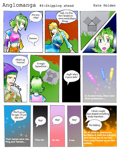
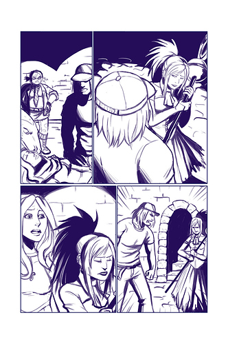
So here we have a terrible attempt from when I was a teenager to make something like RPGworld!
Problems: I was clearly quite slow at drawing and found drawing a lot of work, so there aren't many actual drawings in this comic, and the amount of detail in panels is very limited too. The character designs are over-complicated for the medium, showing a lack of fore-thought.
There's also a lack of technical expertise here; teenage Kate didn't know how to make speech bubbles or find comics fonts, how to do digital colouring well and so there's inconsistency to the style.
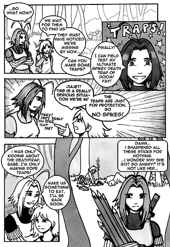
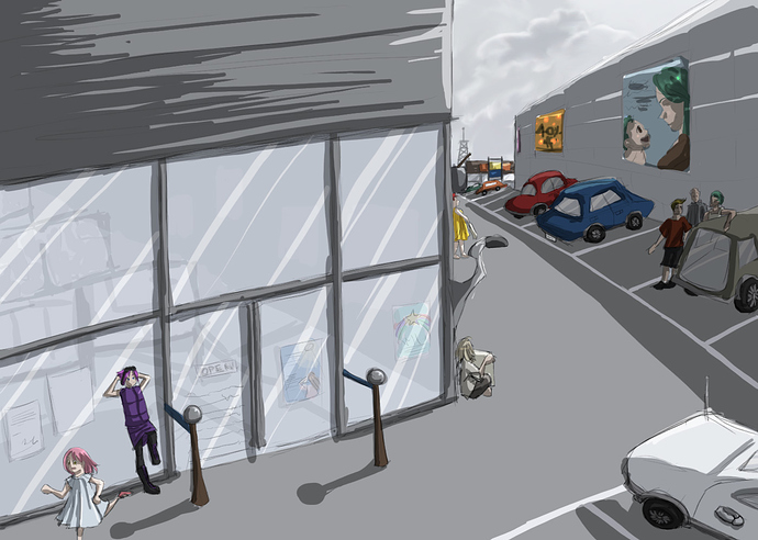
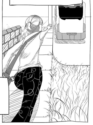
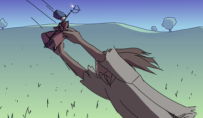
Let's jump ahead a couple of years to the old-old version of what would become Errant, the old version of Fan Dan Go, named FanDanGo (just roll with it, okay)...
Firstly, yes, that is Jules, or Juu as they were called back then, sporting incredible anime hair antennae. I know. Amazing.
So anyway... here we can see some development. More comics-friendly character designs, more fully-detailed panels with full background, and a more consistent art style. You can see an attempt being made to incorporate depth and perspective as well as breaking up depth using value, but a definite lack of knowledge of how to really place characters in perspective and value to make good compositions. The anatomical drawing has generally improved, so while it's nothing amazing, it's certainly better. The speech bubbles are using a proper comics font and using oval shapes... but they're ugly "default photoshop oval" shapes and don't have nearly enough padding. Also there's TOO MUCH FREAKIN' TEXT! Draw the damn story, Kate! Don't just have characters narrate it all!
So, what happened next? I got into the UK small press comics scene, and was able to learn from more experienced comics creators. So with their guidance, I learned a bunch of new skills and...
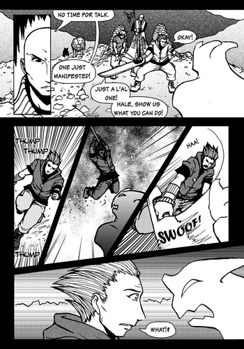
Placed as a Finalist in the Tokyopop UK and Ireland Rising Stars of Manga (Weirdly topical, since it's back) with this comic called "Fell".
You can see what a difference some guidance, practice, endouragement and being pointed at good resources makes here. The style is tighter and more consistent, the anatomy is more solid, the lines are less gummy and more deliberate. There's depth being used to dramatic effect and more clear expressions and dynamic angles. The speech bubbles are a lot more polished, though still with some padding issues.
But there are weak areas like the tone isn't really being used to define depth very well, often feeling more like "colouring in", and the style feels a bit overwrought; throwing in lots of detail and stylistic pizzazz to cover for weaker areas and just ending up a bit busy. There's a general "awkward" look to my art at this time, like I was doing cool stylistic things I'd seen in comics without really understanding why better artists use them.
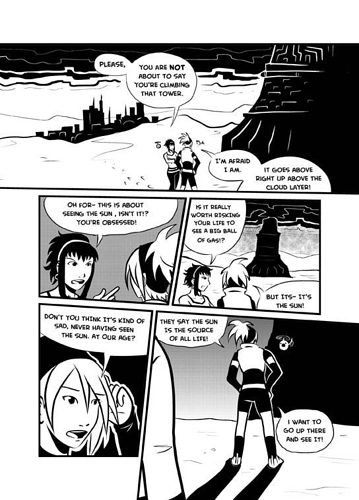
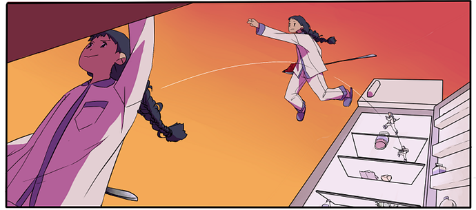
So let's skip forwards two years to what I'd consider one of the best comics I've ever made. Placing as one of the winners of the Manga Jiman competition, it's "Above the Clouds" from around 2008:
Above the Clouds is a confident comic. I stripped back all detail and went with black and white with minimal tones. So even if the art is awkward, it has a confidence to it. The placement of the viewpoint is a lot more deliberate, tones are only used when needed and the few lines all do a job. The font is a comics font, and it's chosen to fit the art style. The bubbles were hand drawn, but at last with good padding and a nice shape. You can see how instead of trying a bit too hard to add detail to cover for weak areas, there's none of that fear here, because by this point, I was doing professional work and had learned to stop and say, "Yes. That's enough".
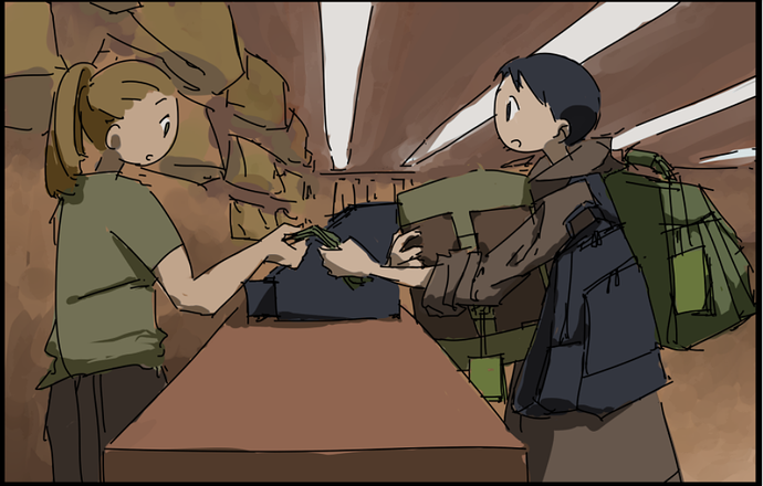
Next, a Marvel pencils Sampler from 2013. The script was from Runaways vol 2...
There's an increasing confidence in the use of angles here, but not necessarily the best use of space or depth, and a slight awkwardness around the style because I was trying a little too hard to not be "too manga" and it bleeds weirdly into the proportions.
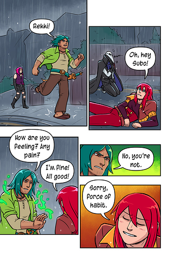
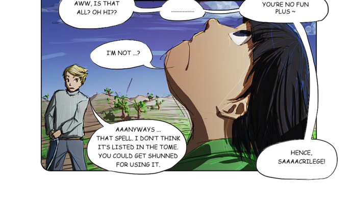
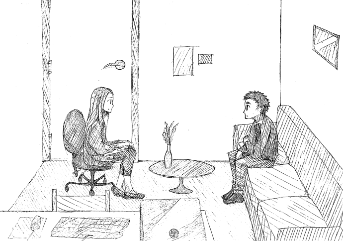
So when you get up to 2019 and Errant, there's further improvement because I went and studied storyboarding and composition, and became a lot more deliberate about where I place characters in a scene and how I use my shots to tell the story by making decisions about what I show the reader...
The speech bubbles in Errant look waaaay better because I got advice from my partner, who is a designer, about spacing and stuff, and changed up how I make them to be a more pleasing shape. You can see saturation and value are used much more deliberately to create depth here, and there's more of a sense of space. The characters are more consistently drawn and with clearer expressions, reducing the amount of text needed to convey things. The time I spent trying not to be manga fed back into my manga work, really helping me think about why I use certain stylistic stuff from manga and how to use it effectively instead of it just being a shortcut.
So in summary... yes, I think comics can teach you things, but you have to be willing to change your approach and open to the idea that there might be better ways to do even things you're very used to doing. You should always be studying good books and other comics, and never assume you're already making the best comics you can possibly make, because if you're just repeating the same approach over and over every page, then they won't really help you improve.