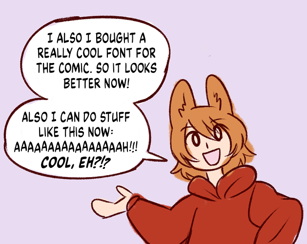
Comicraft Wildwords- I'm using this for my "print only" comic:
Comicraft Meanwhile- I'm currently using this for my webcomic:
Blambot Blambastic- I use this when creatively emphasizing words in a balloon at times:
and planning to use this one for my Patreon exclusive comic that I'm trying to create- it looks VERY close to longtime X-Men letterer Tom Orzechowski's style :
@naheravieri Comic Sans is THAT bad. It pretty much screams "I dont care about lettering for my comic or consider lettering a part of the art"...one of the rules of lettering is you only use crossbar I when the character is stating/referring to themselves- ex, "I went to the store/ I've only got five dollars/I'm as good a chess player as her"...other than that, you use single bar I with in the context of words; Comic Sans for one doesn't look pleasing in all uppercase, and it doesn't have single bar I(only crossbar I).
In the end what you choose is your choice, but after seeing how Comic Sans compares with a number of other comic dialogue fonts, I agree with the general consensus...
@Enzo You want to pick a font that you feel fits your book and your art, but keep it in the overall context of that it needs to be easy to read.