18 / 19
Oct 19

My novel's cover started a couple of years ago, and I changed it over time and got a lot better with my art. My cover is based on two lovers in the ocean as though they are drowning, but they are actually in a dream. In my story, their lives connect more than what they know, and every time they meet, it gives deja-vu vibes. There was an old saying that meant lightning doesn't strike twice meaning odd things never happen at the same place and time. This is what inspired the name of the book cause of all the odd Deja Vu moments that somehow connect the characters.

This was the first many years ago at first I wanted them not touching but after doing re-doing my old banner I decided the change things

Years later after I got better with my Auto desk art system and got my hands on a artist tablet I changed it up I wanted them more like they are in a dream like state when meeting eachother!

  • created

    Oct 16
  • last reply

    Oct 18
  • 18

    replies

  • 235

    views

  • 1

    user

  • 7

    likes

  • 28

    links

When I finished my fantasy and needed a cover, I wanted to show a fairy wearing a mechanical suit that produced ethereal wings. While I studied in my youth as an art major, unfortunately, my skills were no up to the task.

When I needed a cover for The Space Bum, I copied and pasted silouhettes, shapes, and contuors, then added color. For the second book in that series, The Old Man, I tried the same approach, but it doesn't look too good in the smaller size of a thumbnail. The third in that series, Htohmar Har, saw me in pretty much the same situation, but I colored it in manually because I don't have advanced programs.

My covers for my Star Seeders series suffer due to the same problem. I wanted better; I visualized more than I had a capacity to achieve.

When I came to my recent books, Friends, The Regret, and The Gate Of Mor Dorain, I used AI to produce a basic cover, then used art filters to improve the look. On those covers I added a disclaimer on the covers.

My cover was a very last-minute thing. I had my comic all ready to launch, then I remembered I can't upload it without a cover. I just wanted something simple enough to get it done quickly so I could launch the series. :laughing: But ofc I wanted it to look polished too.

I also wanted to make sure it had some aspect of ASL in it, since my MC is deaf.

NOTHING REALLY. IT'S JUST THE WAY HOW FEELS IT TO BE. BTW TRY READING VOLKERMORD

AN ACTION SCIENCE FANTASY NOVEL
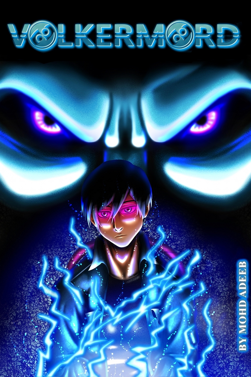
General synopsis: In 2158, global tensions between Arga and Yuropa push the world to the brink of the Third Territorial War. But before conflict can erupt, an apocalyptic event splits the planet in half, wiping out half of humanity, restricting the alive to go and access the resources on the other side of the blinding light. As the survivors rebuild their lives within the safety of Dome cities, monstrous creatures emerge from the chaos, ravaging everything in their path.

Amidst the destruction and uncertainty, a group of soldiers embarks on a desperate mission. Driven by their noble cause to protect and reclaim what is lost, they confront the terrifying truths of their harsh new reality. Racing against time, these brave souls face unimaginable challenges as they fight to safeguard the remnants of humanity and possibly save the entire world from total annihilation.

A link to your story:

Just needed to show the sinister nature of Akala... even if she comes off as approachable and with a sense of humor, she's right up there among the most evil fictional villains. Right up there with Shishio Makoto of Rurouni Kenshin... and Freeza of DBZ...

You'll see as the plot unfolds...


I'll redraw the cover every year or so, but this cover is just our two main protagonists: Haru and Tsukasa, in a background of purple, which I guess represents their strong friendship, since Haru's color motif is blue and Tsukasa's color motif is pink. The title is simple, which I don't like, but it suits the simplistic style and storyline of the comic.

My cover is mainly just inspired by the general personalities of my two main characters. I’m not sure how much it captures what the story is about, but it does give you a pretty good idea of what Suen and Ea’s friendship looks like, and how ocean-centric it is. I do plan on changing it as the art and story evolves, though.

I was considering using this as a cover for a little while, but it made the comic look WAY too scary + the colors were off,

@Krysteena Awesome seeing the progress between both your covers and yep Tablet always makes the job easier :thumbsup:

For sickboy i got excited when I saw Tapas allowed Gif covers. While the actual series follows both Evan and Owen (two brothers), I always felt Evan was the poster boy, also because Owen is usually in 1st person. I wanted to show off Evan's ability to manipulate his spit in order to build his swords and daggers but also wanted a shot hinting of the outbreak (the hands at the end) and gross/action/dark humor elements.

VoycemeCover:
Sadly on other places I've mirrored the comic series, they don't allow Gifs so recently did this as the cover. Voyceme Mirror of Sickboy
This cover is consistent with his current attire and his random bunny bag accessory.

earlier attempt (disgarded) - tried a bright yellow to make it pop but felt it lost the mood

:star: Finally settled with this update, easier on eyes hopefully and much cleaner

for context, this comic is a collection of short side-stories that sort of act as highlights of the characters, so i wanted to give the cover a collage paper cutout sort of look with the characters you'll meet, a couple key objects and backgrounds and even frames of a scene on the top left.

everything is fragmented to match the theme that this is a "collection of memories". although the story does focus on the main gardening trio, i didn't wanna give full focus on them since in the shorts it's more about the world of COVALRIA. i also really mess with the summer feel i gave it with the colour palette. overall, it's dope and you should give it a read


My comic is boring. Main character, Miilo. Other main character ominously in the bg since traveling with her is what gets Miilo into trouble and this whole dramatic mess of a story. Blood on knife because eventually our innocent lead has to get her hands dirty.


And for my short story collection: it features a character of mine. This character is from a private, now likely dead project with my friend. The character is called; "The Seer of Misery and Misfortune" so I felt it was fitting to let him feature as the title page given the short stories almost always feature miserable and unfortunate situations and characters. I make refences and describe this collection as miserable and unfortunate any chance I get because I personally find it funny, even if no one gets it. In other words, what inspired both my covers? My own creations I guess.


My cover was inspired by 18th-19th century illustrated engravings which features a letter from Mr Gilbert O'Vile, a diary and a quill & ink to make it simple instead of featuring the titular characters in the cover to make it mysterious.

My story blends chickens, humans and religions, so I thought a stained-glass icon of my MC would fit the series the best. The bg features the farm/coop on the left- a peaceful scene- and the slaughterhouse on the right- a bit of foreshadowing and forever looming threat.

First Cover (2023 - Aug 2024):

Season 2's cover reflects the same, except I added an antagonist char to show they'll be at odds during this season. Also, everything's reddish to give off a more threatening tone (some blood and cockfighting, as the Red Order believes)

(I had also swapped drawing software between these covers, hence the stark differences)