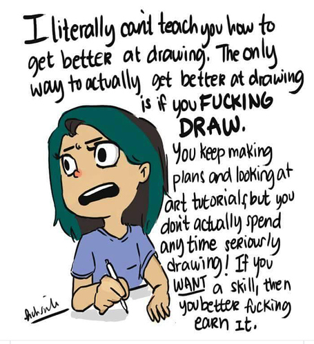
I think making a comic 'pristine' is all about making everything in the drawing look intentional. The world is full of drawing styles; some simple, some detailed, some cute, some ugly. What makes them accepted as 'styles' and not just 'this person doesn't know how to draw'? Intention.
It's hard to describe what exactly makes a drawing look like it's intentional, but I can try:
-Range of Motion
Are your characters allowed to move and gesture in 3 dimensions, or are they limited (like in some cartoons?). Pick one and stick with it. Most comic artists choose Door #1, of course, which means that they need to spend a lot of time practicing perspective and poses so they don't accidentally slip into Door #2. Nothing breaks immersion like characters that gesture into the third dimension while their clothes are stuck in the second dimension...things like that happen when artists don't understand how perspective works.
-Consistency
Draw stuff the same way all the time. Kinda.
Like, if your character's nose is pointed in profile, don't occasionally make it rounded or hyper-realistic; again, pick something and stick with it.
I'm reminded of the Rozen Maiden manga...personally, I don't like the way the artist does profiles. I think the noses and chins are too short and the necks are too thick. But...they do them the same way all the time, with every character. So much so that when their last anime adaptation decided to copy the artist's style, the profiles still looked the same way.
Even if it genuinely looks goofy, it's so consistent that it's hard to think of it as a mistake. It carries with it an air of...intention.
Of course, if you want to change things mid-comic, feel free; most artists 'settle in' to their style over time, so it's not uncommon for later pages to look radically different from initial ones. But if you're gonna make a change, make it, and stick with it for a while. Flip-flopping and experimenting are what sketch pages are for.
-Solid, strong lines
I notice that some of your lines look a little...indecisive. They wobble a bit from point A to point B. This is usually not a good thing for professionalism.
Either all your lines should wobble or none of them should; staying in the middle makes it look like you don't know what you're doing. And if that's the case, you need to go back to the drawing board and practice until you DO know what you're doing, or at least until you can draw confidently despite not knowing (fake it till you make it~).
If that isn't the case, then it might just be that you do draw too fast...or too slow. Maybe you don't pay enough attention when you put down lines. Maybe you have an inefficient pen that warps your sketches when you ink them by changing your drawing speed. Only you will be able to detect the problem and fix it, so that's what you should do.
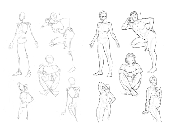
-ANATOMY!
This should've been much further up on the list, but oh well. ^^;
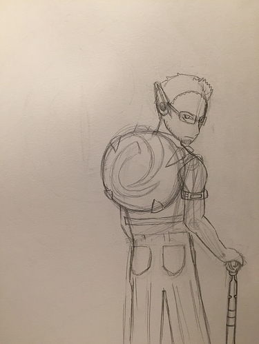
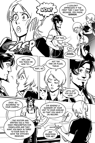
Looking at the 'One Reign Note' group picture, I can already identify a lot of problems...for instance, the blonde guy seems to be missing an ear? If it's supposed to be behind that...thing, then that is not anatomically correct.
You don't have to draw realism if you don't want to (although, your style for that project seems to be on the more realistic side of manga). But you gotta learn the rules before you can break them, so that when you do, it looks stylistic and not just plain wrong.
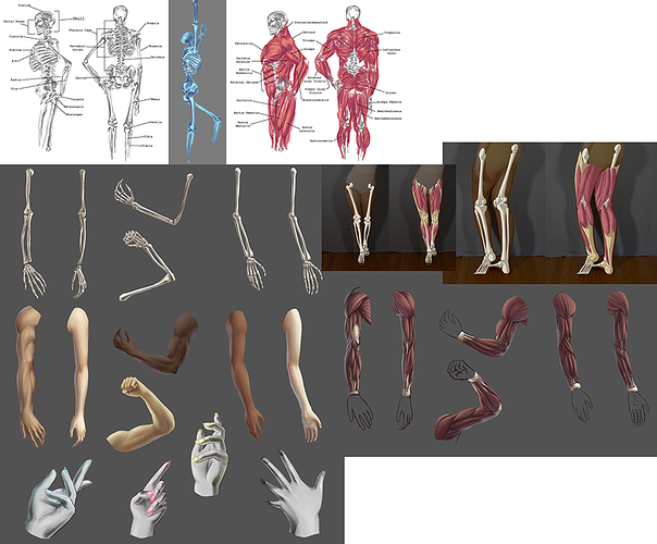
Like others have said, practice, practice, practice. All the pretty colors and solid lines in the world aren't gonna help you if your characters' bodies aren't drawn correctly. Do studies of the clothes and hairstyles you want to use, too, so that you understand how they move with the character. There's plenty of room for improvement.