When someone presents me with something and asks me what I think of the choices, I look at the choices and pick from that. I don't go into what it is supposed to be or what I think it might be or any other thing... I look at what is in front of me and make the choices... that's what you asked for. Also, that's how I was trained to review and critique, you look at what is before you. If the person asking wants opinions other than that, I'm happy to give them.
Thus you'll get no comment from me about what I thought it was or anything else, (except for one small personal choice below)
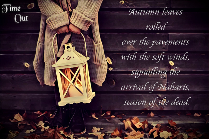
Here are the reasons I choose #1:
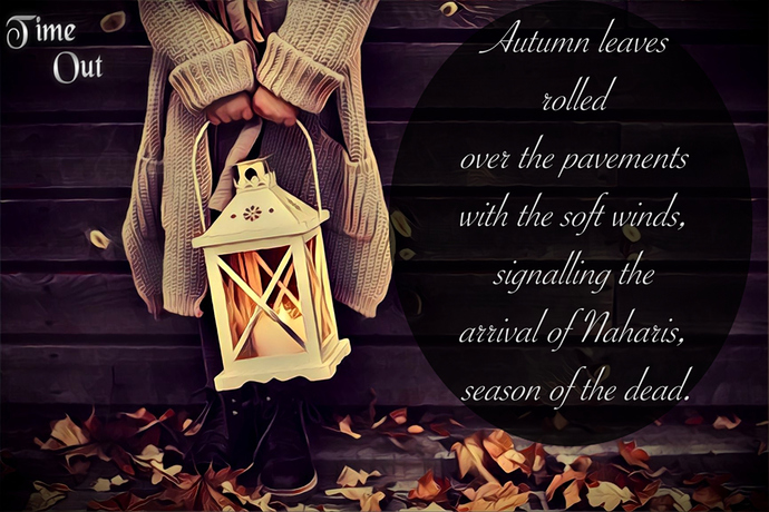
I don't like #2 because the font is too skinny and busy. Also if "Time Out" is the title t should be, in my opinion, the larger text otherwise it seems a little like an afterthought.
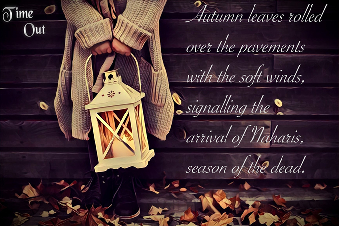
I don't like #3 because the font is too big and overwhelming. And again the "Time Out" reason.
The reason I like #1 of the three is the font has a good weight to it and is not difficult to read. Again, however, I have the same issue with the "Time Out." Is that the title?
If you want to go deeper into the picture/font etc. and how it relates to your story, etc. I'm happy to offer thoughts.
The personal thing I mentioned was the use of the word "pavements." It stopped me from reading further wondering if it should be "pavement" instead. Now, that's just me, I'm sure, but it feels awkward.
But for just looking at the picture as it is, those are my thoughts.