12 / 32
Dec 2020

Well, I just make them visually different (especially when it's only one character in the panel). So then it should be more easy for reader to make a distinguish between two speakers.

Or when I have many characters (like the one attached) I try to almost reach their heads to make it clear who is saying what.

What about coloring - I'm planning to use it in vol 2 when it's going to be 2 characters in 1 body. But for this lifehack you need to start carrying out color associations in advance (color = character) in order to readers be ready when time comes.

Chibi heads help or like the "details". ie if one wears glasses, a little drawing of glasses with a mouth/chin attached like an emote. If colors can't work that is - since sometimes it's hard for colorblind people.

Nice! The chibi head idea is so cute!! I like the idea of multiple colors for balloons to indicate a character, but I can definitely see how that could be sensory overload. I've thought about it though, but at the end of the day It's just something extra that would add more time to the editing phase of the comic and I'm trying to cut that as is.

I really enjoy seeing that done when it's not distracting from the test itself, and admire the extra step for sure! Defiantly nice to not have to worry about who says what when everyone has a signature color :)!

That is a fascinating observation. Though for real that's to funny on the fascinating poot XD! That's some grade a memorable scene making right there. I agree with @likhoradka for sure when it comes to where the tail is pointing. So long as I can tell who it's pointing too I don't mind when I'm reading. Looking at my old pages I noticed that I do try to get the tails pointing towards the mouths, but when they aren't It doesn't bother me.

UNLESS it was pointed at someone's crouch, that would make my eyes cross from laughing.

Bad lil doodle comic my let tit! I'm digging the style and those are some hands I'd like to shake!

Your little heads look great! I like the little heads execution a lot bc it gives more recognition to who is speaking with 0 room for confusion since all off panels character are attached to their statement.

Thanks for sharing :)!

Yeah for sure, I literally just ran into this issue on my last page and was like WHAT IS ALL THIS clutter!? But shiz happens sometimes and I'm learning as I go for sure so appreciate the advice.

I'm seeing the character pops more and more for multiple characters talking in a panel and that's what's up!

Thanks for the input!

Ahhh thanks for the examples. I can see what you're talking about with making the speech bubbles visually different. That's pretty neat! on the last panel, even with all those people on the page I think It's laid out pretty well for being able to tell who is saying what (even if I can't read a word of it :D)!

Playing with color is something I enjoy, and I do like to see it when it's done in comics (so long as there is enough contrast so that the text stands out!).

Thanks for the input ^_^!

OOohhh recognizable short hand graphics!! Minimalist, but still gets the point across for who is talking. I likeeeeee.

And true, thinkin about accessibility is pretty important for me as well.

Thanks for input!

You got a lil everything going on! Colors and symbols, Ok then!

I really like the person with the glasses on icon. So sassy!

Ty for sharing :slight_smile:

Just to lead off this post, this is a big part of why I tackle lettering pretty much in full during the thumbnail process of my comic- I've been burned way too hard in past projects by just guesstimating how much space everything will take up and running too low on space or having awkward positioning/cover ups as a result :sweat_smile: I try not to write off on a panel composition until all of the speech bubbles are comfortably and accurately located.

That said, I do a lot of the same methods that other people have mentioned. Some work out pretty cleanly, others... end up being awkward even if you're careful about it lol. Here are some recent panels that I've done with some speech bubble gymnastics going on:

I'm a big fan of those thin lines that connect multiple speech bubbles by the same speaker which can allow you to space them apart more but still make sense. Also reduces the amount of tails you need. This one also has a chibi pop in like others have talked about. I sometimes do the little chibi heads as well!

This one was rough and really relies on the left-to-right reading order to work. It's not as clear as it could be but I hope it makes enough sense as-is @u@;; This was one where I tried out a few different compositions/angles for the top panel and settled on this one because it allowed for the bubbles to be close enough to the corresponding characters to work out okay. I also like those thin connecting lines to connect between panels sometimes!

This one is a little sketch with no tails or other indicators other than the fact that it's continuing a coversation from the previous panel... I may edit this before I post tbh LOL. Basically though the left/right relationship of the characters and their speech bubbles was establsihed in the prior panel and it's fairly obvious who is saying what with context but... chibi heads may be in order.

Last example. The upper panel here is another kinda sketchy example. The 2nd bubble doesn't fit well in the composition but I wasn't sure where else to put it so I just used a really long tail @u@;; I like the little overlap thing in the lower panel tho!

That's some pro layout advice. I do thumbnails, but only generally put in words since I do the thumbnails by hand and my handwriting is just kinda big lol. I really like how your text bubbles are also integrated into the flow of your panels too. They are a part of the story telling too, so always nice to see them treated that way too.

I really like the layouts you got going on, very clear and easy to follow too.

And yasss connectors are the bees knees! I love those noodely lil fellas!

Thanks for the info :slight_smile:

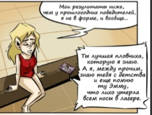
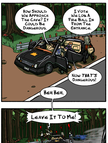
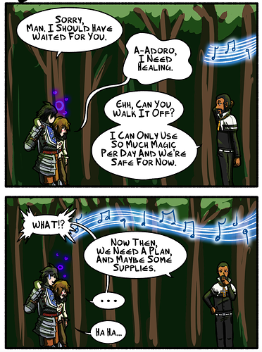
I tend to use the simplest, but most high-effort approach of "show all the people in the speaking". I'm personally not big on the tendency a lot of webcomics have to only show one character in most panels even when two or more people are conversing, partially because it's less clear, but partially because I think the expression or reaction of the listener can add valuable context to what the speaker is saying

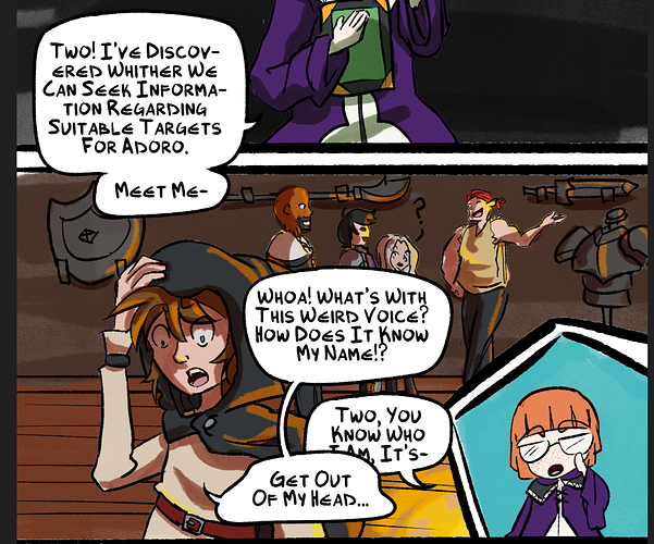
If I can, I try to avoid deviating from "speaker on the left speaks first", but sometimes it's necessary to avoid breaking the 180 Degree Rule. If somebody speaks from off-panel, It's usually because they're far away and are about to enter the area, because if they are near enough to the other person, I'd put them on the panel, even if it's just the back of their head.

Chibi faces can work well in a lighter-toned comic, like say a shoujo manga where everyone's babbling away saying silly things, it would work great there, but it'd feel pretty jarring in more serious situations. Some people find coloured text hard to read (a widely known issue in the Homestuck fandom) and of course, since colour blindness is a thing, you should never over-rely on colour to differentiate things; there should always be some secondary cue; that's just good basic UX/UI design.

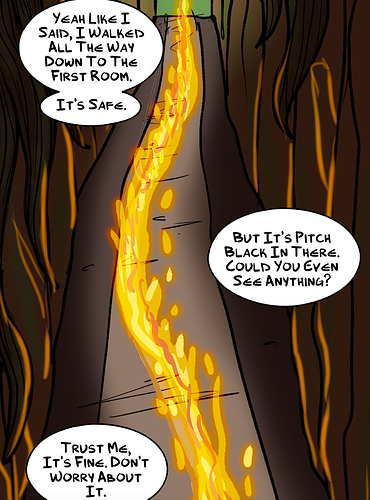
If in the thumbnails it looked like a page was likely to be a clusterbomb of confusing bubbles, I'd probably look at alternative ways to do that conversation to make it clearer, unless I wanted it to be a a confusing babble or voices on purpose.

I hear you. There is totally merit to actually showing characters speaking for reactionary purposes, so that's what's up! It really is an extra mile for adding to a scene when you take the time to draw everyone's face that's involved in the conversation. Looking back, I think that is something of what I wanted to do for the last page that prompted this forum post, but I hit a time crunch and needed to move on. I'm trying to stick with that over redoing it again, but that's defiantly going to be at the front of my mind if/when I get into another scene like that.

I do really try to stick to the left right rule, but sometimeeesss you just gotta go with the flow.

Excellent points here. I don't think it would be out of place in my comic to use lil heads, but I could see it being awkward in a murder mystery or noir series heh. Yass, I'm all for good design <3!

Thanks for your incites :D!

I like what you've done there with the boarders. They stand out without being super distracting. I've played around a little with word bubble boarders, but nothing has stuck as of yet.

Thanks for sharing!

Might sound like a lazy solution but I just write the characters name on the speech bubble, I feel like chibi heads just don't fit my style and sometimes don't fit the mood of the episode. This is isn't something I really care about that much as long as the reader knows who's talking and the flow of the episode isn't disrupted. The names are color coded so its easily recognizable who's talking even if you're just skimming over the episode.

Real talk, this is what I wound up doing. It doesn't take up a lot of time, it's pretty to the point, and confirms characters with speech (also name drops for reinforcing who characters are and I'm all about that). I like the idea of chibis, but that's extra time on a page and I'm trying to keep it moving. I still might experiment with it later, but for now I'm thinking along your same lines.

I like how you placed the names inline with the word bubble boarder and that they are color coded is the icing on the brownie.

Thanks for sharing your procees!

Yeah I honestly think after spending so much time with creating the episode itself there are certain things you can take shortcuts on, as long as it's not overused this method works out (like I wouldn't have panels upon panels of just this) and if it also fits with the overall mood of your comic then go with it.

Other options to consider:
I personally also like seeing colored speech bubbles in certain comics, I only use a different color if someone is talking on the phone or if someone is whispering, it doesn't really work if I draw the whole comic like that because of my style and it wouldn't make sense to switch from white bubble to then colored bubble when the characters aren't in the panel. It works really well in Always Human though, it fits the style really nicely: https://www.webtoons.com/en/romance/always-human/list?title_no=5573

I've also seen a twist on the chibi thing, Gourmet Hound is a food/cooking comic and all the characters have food related names so the icons used for them are the food their name is based on, example: Lucy Fuji = Fuji apple
You can see it here in this random episode I picked out: https://www.webtoons.com/en/drama/gourmet-hound/ep-94-coffee-creamer/viewer?title_no=1245&episode_no=983