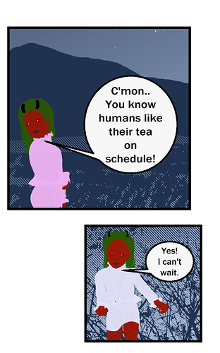
@jensrichard77 Sorry your typography at the beginning threw me off. Its so blocky and I'm not sure what the type hierarchy is. Not quiet a fan of the text outside of the comics to explain what it is. Show not tell. I also think there is too much other info. Use your wall for announcements, so you can keep your comic clean, or easily to tell what is your story and what is other stuff. I also find that your panels are space very far apart, and I need a few mouse spins to reach the next panel, so just put them a little closer. your dialogue also says red, and blue in most speech bubbles which makes the conversation feel inorganic. I get you are establishing characters, but red and blue are very distinct, and this may be more important when you are surrounded by more blue colored characters. Sorry this is long.
@UrMom i would read your comic if i was into that kind of genre.
@BobbyjoeX Your character stats is the first thing that made me not really want to read your comic. I would keep that info in a character sheet or some kind of after chapter bonus info. When drawing a charater you should be able to see their age range, so trust your art. I also want to comment on the wobbly and pixel-ly speech bubbles. I think you can fix that in the future, I'm not sure why they are that way.
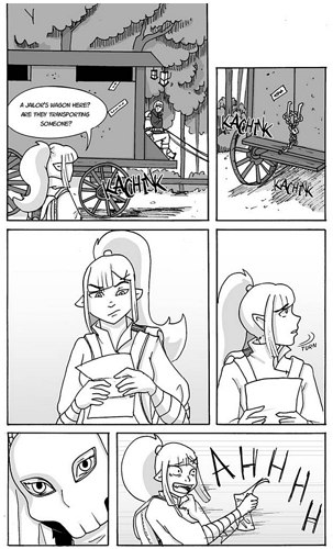
@antimekii I was going to say not my genre, until I realized SPACE. I would read yours if it was on tapas. I don't have a webtoon account, so I can't sub. I also don't particular enjoy the site layout (but that is not your fault, it is just what it is) I think chapter one might have been a little slow for me. But when looking at your comic I would like to see more texture in your environment. Your walls are soo smooth. How you choose to do that is up to you, but I think it will help your characters stand out because I find that the background starts to compete with its pretty, neat straight lines.
@Eightfish First of the pixel art in an interesting choice and unique, but I was put off by the info dump at the beginning. As a mildly dyslexic person large amounts of text will make me turn away. Its why I read articles over novels. Next I noticed that your panels in the beginning have different amounts of black around it. in #1. If feels like it is incomplete to have the blocky background for the smaller panels. I would jsut make sure all the black is the same size even if you are making smaller panels. That way the black surrounding it can help keep my attention in the comic rather than being distracted but the sudden white.
With that said, feel free to tell me what I need to work on.