Oof, I haven't noticed this because you never find your own art confusing, but I can see it now. I'll definitely try to differentiate my characters from the backgrounds more.
This is fair, I've definitely felt the same way as you for some comics. I've actually had some people tell me they like the beginning though, so some of it could just be a matter of taste. Personally I don't think it's too bad because the rest of the comic is also a bit dialogue heavy.
For your comic:
My first impression before even clicking the comic is pretty meh, because your blurb contains some awkward sentences and grammatical errors.
I've edited in the errors I see in parenthesis so you can see what I'm talking about.
Ever since he was young(,) Mihai had always been intimidating and socially awkward(,) making others avoid him. He grew up preferring to stay within his social circle that include(d) his grandmother, (his) two friends(,) and his beloved cat Muffins.... Well, that('s) how it used to be until a new neighbor moves (moved) in with his friend and she turns (turned) out to be the exact opposite of him (This is a faulty pronoun reference. Who is "him"? The neighbor or Mihai?).
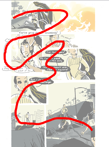
Reading your comic, I also see several grammatical errors / typos. At least a few per episode.
I am a little bit of a grammar nerd, so this kind of thing really sticks out to me. When I notice a grammar error or a weirdly phrased sentence, it breaks my immersion and takes me out of the story, like driving over a pothole on the road.
I think the biggest issue is that you don't use commas enough, which makes some sentences not as dramatic as I think you intended them to be. I'll read them in one long breath instead of pausing at the right moments.
Besides that, the genre and format are both not what I'd usually read (korean-manhwa-style slice-of-life), but that's just me.
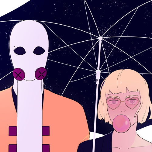
Your banner is really nice looking. I like how it is more detailed and effortful than the rest of the comic, yet I can still tell it's in the same style.