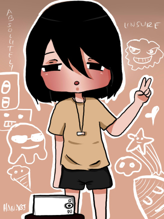
Quite the interesting art style! I like the heavy blushing you did on your characters.
The text is reasonably large and easy to read, and it has good pacing.
There's a problem with neatness, though. Instead of freehandedly drawing straight lines, try using a tool instead (this depends on what programme you're using, I click shift as I draw the lines in my programme).
Also, the characters' head are sometimes flatter or taller than other times. If you find it difficult to keep it consistent, try drawing a circle/use an eclipse tool, then draw the head with the circle as a guide.
Remember how I told you I like the heavy blushing on the characters' face? You don't have to reserve it for just the face. You can also add highlights/hues of shadows to their shirt, to their joints, etc. instead of just shading them. I think that will give your art a more coherent look.
Hope that helped and good luck with your comic!