Salutations!
First thing's first, patience is key. More often than not you'll be in a situation where gaining subs is a slow crawl. This is okay, it happens like that most of the time and the best way to grow your audience is to interact with them across multiple platforms and make connections. Nothing happens overnight, so don't be discouraged if you don't see thousands of people clamoring for your work in a single month. Things just take time.
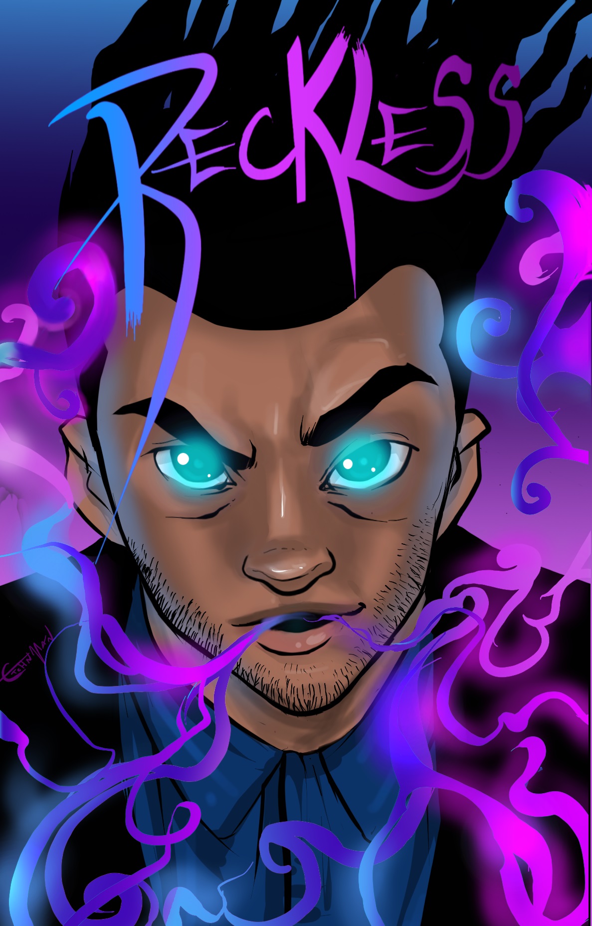
Now, to get a better idea of the issue you're having I sat down and I read the work you have available. I'll start with the first thing: your title. Titles are THE way people find your work and your title is just a single word. Not to mention, if I go into google and search "Reckless comic" I get a spate of other works that aren't yours. I went through several pages just searching that title alone and I didn't see your work anywhere. Now, your title doesn't have to be something out there, and Reckless isn't a bad name by any means. However I wanted to give you the heads up that, you are hard to find with google search results.
When I first started reading Gunnerkrigg Court, I remembered the name because it was so different, and often I spaced the author, Tom Sidell's name when searching. However, if you type in Gunnerkrigg Court in google you get Tom's comic right from the off. Now, this doesn't mean you have to change your title completely or something, maybe add a section to the title that sets your work apart from others with the same name. Example: Reckless - Suit of Time (or space or whatever you feel is best. Haha this is just an example don't take it too seriously XD ). Adding a little something to it, will make your work easier to find if you're coming from other platforms and can even set you apart on webtoons if there are others posted on that site that have similar titles.
So that's the bit with titles. Now onto the work itself: the first thing that hit me was confusion. Not with the plot, that was pretty straight forward. However, your panels are suffering from resolution issues. It's as if all of your drawings were made for a completely different platform and in order to get them onto webtoons you made them bigger or mushed them up to fit a size requirement. There are also panels that are squished into place such that the art is distorted and everything looks off. You also have the problem of losing details and, I've noticed you've drawn over some of the lines that didn't acclimate well to their change in size. In a visual medium when the story needs to be told in a visual way, this isn't something you want to have happen.
Take panel two of episode two where Tyrone is in bed. You've gone over some of the blurry lines and the sections where they've been altered stands out from the rest of the piece and looks as though it doesn't belong. There's also the issue of the resolution making everything fuzzy in some shots, and then in other panels everything is fine. This lack of uniformity puts me off as a reader because I don't get access to consistent detail and important scenes really suffer because of it. I can't concentrate on a story when I'm looking at something that's been blurred and had lines redone over the top of them, because I get distracted. You don't want your readers being distracted.
There are a couple ways to solve this issue. Resolution settings. I don't know which digital art platform you're making your work with but, I'll make an example of the one I work in primarily: Photoshop allows you to reduce the size of your drawing or to make it bigger without damaging the work. You just have to make a few choices when going into Image>size and choose whether you want Bicubic Sharper for reduction or Bicubic Smoother for enlargement. Also keeping "constrain proportions" on will make sure that you don't accidentally stretch the piece. This way, you can draw using a much larger canvas but still maintain all the beautiful details you've put into the piece. Now, like I said this is for photoshop and if you work in a different program what you'll want to do is find out the breadth of their reduction and enlargement settings. If the one you have isn't adequate to the task you might look into other programs that can give you more the results you want in that regard. Another tip: knowing the website dimensions for the platform you'll be working on is key. If you work to those dimensions you'll be able to have the details you want and still satisfy the requirements of your host site so, I'd look into those for webtoon and any other platform you want to use.
Further with the art, your characters don't seem to stay on model and are also inconsistent. Now, this is just something that happens to everyone, especially if you're getting used to the modus operandi you'll be using for your creative process. (It's different from doing single pictures because you have to work in sequence which presents challenges all its own, hahah) However, this is also off putting to a reader because the lack of consistency is distracting and can pull your readers out of the story. Now, you just put your comic out there and there are bound to be consistency issues, it's par for the course, so don't get too worried about it just yet. However, it's good to know it's there so that you can address it and work to keep everything on model. My best recommendation for this, is to draw out character dimensions as references (height, weight, etc. From different angles: front, back, side, and so on). This way, if you ever run into a modeling issue, you've got shots of your characters from each angle and can use your own work as a reference. It's a very helpful tool (and one that lots of people make use of to help keep character's consistent over the course of a work).
I would also include character close ups, face charts, etc. So that as you go along you have general consistency overall. Again, this is stuff everybody has to tackle in their own time and so there's nothing wrong with not being spot on right out of the gate. It's just one of those things and you'll get there in your own time, don't worry. You might also check out some tutorials on youtube to help you with modelling. Another thing you're going to want to think about with regards to your comic is consistent shading/lighting. When Tyrone was kidnapped and in a dark and dingy place, the lighting in the room didn't suggest that intensity at all, it was just about the same as the lighting outside.
One thing about lighting and shading, is that they can put an intensity into a scene that otherwise wouldn't exist, such that you sometimes don't even need words if you have the right shadows playing around in a scene. Experiment with lighting in each scene and see how the overall mood or feel changes. All that being said, your art is by no means horrible. You've already got your style established and you have a strong skill-set at work here, it just needs some fine tuning and polish to really shine. I have no doubt you can make something incredible with your story as you go. Also, be mindful of your backgrounds. You have a problem with them being inconsistent and without shading as well and they're often blurry in sections (which, some of this might be due to the resolution issue) so, I'd look out for that as you go.
Now I know this has already been pointed out but, spell checking is also important so you don't derail your audience with spelling errors. Always run your text through a spell checker (especially if you're working late and your tired hahah) just in case. So, there are a few things that I think can help you out in the long term. You have an interesting story to start with and you do have some strong work. All you need to do now is just polish as you go. I hope the resources and examples I've linked help you out and I wish you the best with your story.