Sometimes I find alternatives to time wasters. I used to shade with every color separately. Now I use just one and it speeds up the process. I love adding backgrounds but one every page sometimes is just too much.
This took me way longer to draw and shade than:
But for the comic I published I just did cell shading and made it black and white. It is much faster than the first comic.
This is my stress relief comic and each page takes 2 hours. It doesn't even have shading and it's the most popular of the three.
This is the part I struggle with lmao I find it hard to tell if a panel doesn't-look-weird without a background, because it always looks weird to me, at least when looking at my own stuff XD I envy and admire those who could make a backgroundless scene feel like the character is actually in some location instead of floating in a void :'D
Maybe I should just shrug it off and reassure myself that readers don't notice this stuff when they look at each panel for like 2 seconds, but I'm aiming for an 'atmospheric' artstyle where the point is for it to feel grounded and 'real' so I suspect I have reason to feel paranoid :'D
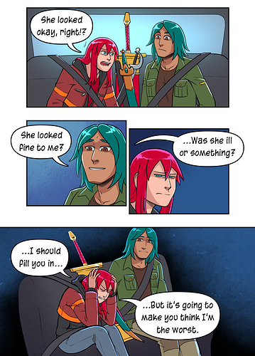
I think sometimes... you just gotta take the plunge and trust that it'll be okay. I completely get where you're coming from though, because it's so easy to be like "...they're gonna notice how weird this looks... they're gonna notice..." The pages I felt most stressed about this have been the car scenes in Errant, where I wasn't sure if people would be okay with seatbelts kinda vanishing off into the ether to avoid drawing a ton of car interiors in every panel (uughhh).
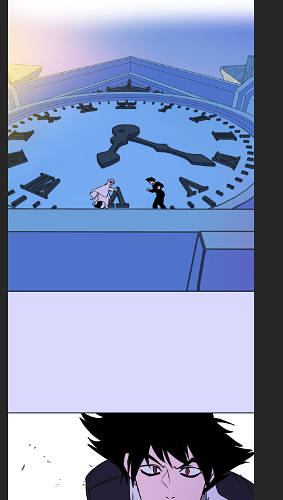
This page in particular, I was like "this isn't going to work...is it? I can't just have the back seat floating in space...can I?"
But.... I think it works! The audience certainly didn't comment "lol floating car seat" (and my audience probably would call me out on something if they thought it looked weird ) Because it does what I wanted it to of preparing us for Rekki's flashback and showing that she's drawing into those memories and sinking into her deep feelings, and right now, only she and Subo exist in that moment, exploring Rekki's teenage regrets.
Basically, believe in yourself! Believe in your ability to make choices that will engage the audience emotionally, or amuse them or dazzle with enough strength that they get caught up in it all and stop really even noticing the stylisation, and the visual metaphors will feel like they're telling an emotional truth rather than simply not telling a literal one. You can do it!
I don't know how to articulate it but I feel we can definitely learn from traditional medium. In digital it's just so easy to obsess on cleanliness and a "finished" look as a digital portrait painter or maybe anime artists would do. While in analog tools, your results are limited based on the tools you use. I try to think about that while finishing my pages alongside planning which details I leave out as early as thumbnailing.
In this page I kept the top panel muted so I can focus working on the background heavy 3rd panel.
Knowing that I'm, my own boss and am doing this as a hobby/passion project also helps ease out my feelings for cutting corners here and there. Or alternatively spending such a long time on a page.
Use 'em where they matter, as people have said.
I use them to establish shots, and little else. It depends on context (as people have also said).
I'm a fan of backgrounds that are simple, unless you're really needing the environment to push the story. Otherwise you can lose the focus of what matters (like the characters) in too much detail.
I've also learned to use models a lot with backgrounds, which can help tremendously. Obviously you shouldn't just drop models in and render it as is, but you can use 'em as a base and draw over/color/shade to fit into your scene quickly.
I used a really basic building model for this and then added all the detailing and curtains and so forth myself. But having the basic structure really helped make it faster.
Now if only our 'not sure of background looks weird' moments were always at story-appropriate moments like that XD I guess I want to get better at implying actual literal place without drawing the place; like the page @TedGravesArt posted feels like it's all taking place in an actual location even though there's a background for some panels but not others -- whereas I can't help but feel like when I do backgrounds sometimes and none other times, it always feels like my characters were temporarily teleported into a void (which you can use to emphasize the mood of a scene like you did, but it's not always story appropriate to do so XD)
That might be the way to go ... though if I start thinking about details, I have a tendency to be unable to stop and then the thumbnails turn into full on sketches XD
Something that's present on that page that might help you is that there are still elements of the environment in those blank background panels. Mentally I still know where they are in the scene. Just because you can't see the whole scene doesn't mean it's gone. The rays from the window, the dust, the light angle and color scheme remaining consistent, and the texture in the background make it feel like they're still placed in the world. Having subtle elements that carry that thread helps a lot.
Also, @darthmongoose's technique of incorporating colors assigned to characters to associate a beat with them is a great idea. I might use that in the future, thanks!
When I first published my manga I was unemplyed and I had all the time in the world to draw my pages. Chapter 2 has an insane ammount of details, I still wonder how I did them. Now that I work and I have less time to dedicate to my manga, I'm finding solutions to speed up the process.
How I worked before.
After reading a manga narrative manual, I think I will apply some of their tricks: do a big detailed establishing shots and use gradients or screentones that represents characters emotions when there are close-up panels. I will add backgrounds when characters are moving or to give the idea "they're not floating around". I also reduced the screentones for the background, they made the page too full.
I'm also using the perspective rulers in clip studio to help me drawing backgrounds, it tooks me less than hand drawing them. I also downloaded pre-made brushes to help me add textures.
Example of how I work now: draw by hand the characters, add the background later in clip studio.
Not gonna lie, from the two images you gave us I don't see much of a difference in quality because they both look good.
For me my biggest enemy is myself -- I want to finish telling a story before I myself get tired of it so I prioritize pushing out full episodes over art quality. And from a reader's perspective myself, I'd take a less polished art if it meant I get more story.
To help me with my time, I don't render.
All my panels are in flat colors with some atmosphere gradients. I do give focus on big important panels by using more time on making the lineart look good+ minimal rendering. Smaller not too important panels get blobby hands and mep faces haha.
My readers haven't said anything negative about the flat colors — some actually said it helps them read better because the panels aren't so busy.
Once again @hakei is my spirit animal. I completely agree and basically follow the exact same mantra, lol. I genuinely have nothing to add.
Honestly, looking at all of the stuff everyone has posted, I think you're all very talented. I found this conversation really interesting, and hope that one day I'll be pushing out "quick" work that looks as good as the things you all have done. Definitely opt for prioritizing the story and having content get out. Also, less time means less stress on you as an artist and you'll have better stamina to keep going. I'm sure we're all our own worst critics or see the flaws in anything we've spent time working on, but all of the faster works people are putting in this thread I think as a reader I would still be super excited about. The only struggle is accepting what you may not think is your best and moving forward.
Gotcha! I guess my problem is I tend to go either full background or just a gradient or smth; I have trouble getting that in-between 'backgroundness' that still shows enough of the environment for there to be a sense of place but stopping myself from drawing the whole thing :'D
Ah, maybe it's the colouring that does the trick; when I do thumbnails that are just small, undetailed sketches, the only 'data' that records for me is the general composition; I certainly can't tell what detailed I did or did not intend to include in the final piece XD
I take shortcuts in different areas than you (neatness instead of shading), but yes, this! This is my underlying attitude towards my stories