1 / 12
Feb 2020

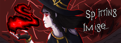
Hello everyone! I'm in a bit of a conundrum here. I made really nice art for Splitting Image that might be useful to replace the icon and/or the banner for the comic, but I'm at a loss if I really should do that and for each. Here's comparisons and what I know is a problem or not:

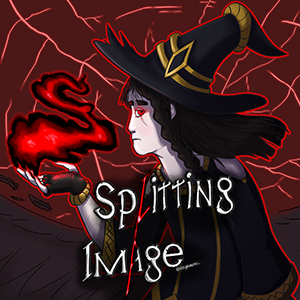
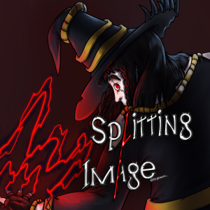
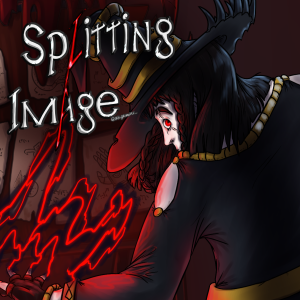
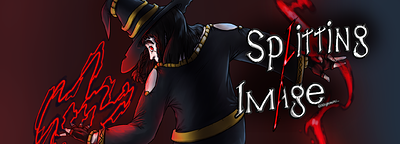
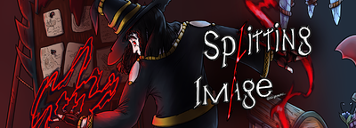
(2 and 3 are with no background and with background)

Pros:
-Nice art on 2 and 3 and replaces the undercooked background and effect
-Better anatomy, coloring, shading
-Reflects the current style better; as well as a less moody first impression
-Storytelling on 3 with the blurry paper notes

Cons:
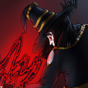
-1's contrast might still be the best, made for just the icon purpose
-Though 2 has nice contrast, the logo has to be smaller to keep the composition nice
-2 has no space for the portuguese version's subtitle (I can just put a PT-BR on the other side though)
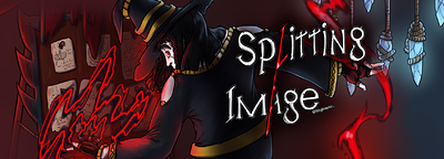
-3 Might be too busy and the logo might be too close to the corner

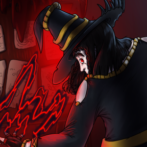
And for the banners:

Pros:
-Covers the even more glaring effect, composition issues and anatomy from 1
-Fully visible color contrast
-Logo is closer to the center

Cons:
-Same contrast problems
-3 Might have too much going on
-If both are changed, it might keep the problem from before where both are the same picture(but since the banner isn't on mobile it might not actually be that big of a deal)

Thanks ahead of time for any feedback, and any other ideas that could be interesting! I'm proud of this picture but it might be clouding my judgement a tad.

  • Keep Icon
  • Change Icon to 2 (no background)
  • Change Icon to 3 (with background)
  • Keep Banner
  • Change Banner to 2 (no background)
  • Change Banner to 3 (with background)

11voters

Choose at least 2 options
  • created

    Feb '20
  • last reply

    Mar '20
  • 11

    replies

  • 1.0k

    views

  • 6

    users

  • 6

    likes

These are very nice, Iris! I like the composition and rendering of 2 and 3 more on the icon (especially the nice red light shading on his hat), but the dark background does make the back of the hat and silhouette disappear--maybe if there was red in the background coming from the top right like in the first icon, you could take what's working for 1 and make it work for 2 and 3? The other issue is that the font is hard to read because it sort of blends into the magic and the magic sort of looks like font.

Personally I don't even have my title on my icon because it's just so small and the title is next to my icon anyway in the app and on the search browser. It's up to you though, it is like your logo, and maybe it just needs a thicker outline to stand out from everything else going on around it? Not sure.

As for the banners, I like 3 because it introduces that light blue, and it's a nice contrast to how hot the picture is and those hanging gems are cool. But, the composition of the first banner is better because it keeps my eye focused on Mortimer, it's like a web. So while I agree you should update and do the new banner with the better anatomy, if there was more contrast on Mortimer's silhouette and if things in the third banner were positioned to keep my eye from going off the edge of the banner it would be better. Especially the things clipped on the right of the third banner are orphaned and so my eye gets kind of stuck there.

I didn't even think about removing the logo entirely. It's in the cover already, and looking at my library, I can count the ones with logos with one hand! Thank you so much for it.

As for the icons, I messed a little bit with that and the background. I wonder if it's any better or the red is too strong now?

With the banner, a lot of it goes straight to the bottom and is already cut off in the full size picture, so that takes a bit more of adjustment. I pushed the crystals down but I hope it didn't cause any new tangents :sweat_01:

I'll just write as a person who voted "keep the icon, change banner to 3".
The banner with background looks awesome =) Love the details and they are not distracting, especially love the crystals in upper right corner. Maybe a bit more of red light to emphasize the hat, but awesome anyway.

Why not a new icon? Because it's too little of the face on it! On the first there is full face with neck and a hand, but there is too small of the face on the second (basically just the eye and nose), so it's quite hard to understand from the distance that it's a face, when the body is cropped. It's a black hat with something-something white. Maybe a face, but not too sure. So when people scroll these little icons on phone, I think the face they can recognize would look better.

That's a good point! It's a nice storytelling pose to have Mort looking behind his back, but it doesn't translate as well when his hair covers a lot of the silhouette - while in the banner you see the other arm and all. Seems like things are leaning towards changing just the banner then, but I'll see over the course of the day if there's any other interesting tips.

Maybe it would be better to redraw the icon somewhat for now until you make something completely new, if you feel like the style is kinda outdated and you can do it better? Because overall it looks great ^^

It's a bit hard to find time, though I could do that for the anniversary in May! My biggest problem is the face, that bad profile view haunts my dreams; though the rest is still mostly okay.

Seems like Keep Icon and Banner 3 are winning by a long shot! I'll probably settle with just a quick transform on that chin for the icon and redraw it later with a similar composition(that doesn't need the logo) then.

All my series banners have disappeared. Has this happened o anyone else?

Sorry to tell you this buddy, but banners have been removed on the most recent update.

Yeah, I thought we also have to upload a series cover now? I have no idea where I can upload those...

Just have them in the right format, we don't know when it will be avaliable.

Also guys you're not reading the OP this was for a change on my comic that's not even relevant now that banners are kill