1 / 7
Apr 2024

Size of the panels, their composition on the page, stuff like that.

The general rule of thumb is, of course, "the more important or grand the moment - the bigger the panel", but I feel there should be more to this than that. I was going mostly on intuition so far, with a self-imposed rule to not repeat a single panel pattern more often than once per several pages for variety's sake.

Ofc this doesn't apply to the webtoon format - since in it the panels just scroll one after the other all with the same width, so you don't need to worry about any layouts, only about how tall to make the panel(to fit what needs to be displayed, I guess). But I hope there are a few people here who at least consider formatting their webcomic to a more traditional page format.

So, what guides your decisions? :3

  • created

    Apr '24
  • last reply

    Apr '24
  • 6

    replies

  • 410

    views

  • 1

    user

  • 20

    likes

  • 5

    links

I try to keep my pages interesting to read whether I'm doing action or not; it's easier for me doing action scenes coz I grew up reading tons of superhero comics and even some manga- the challenge is when I'm doing the quiet stuff.

I usually try to use different techniques and capture shots from different angles and perspective.

i will never shut up about the sonic the hedgehog comics (archie and idw) as one of my biggest inspirations for paneling and general composition of comics but they do it very well imo namely in that there's a very clear flow of action whether its dialogue and moving a convo along or a whole elaborate fight scene and really carrying the movement and actions of the characters from panel to panel

in a general sense tho it's really those same things: flow, rhythm/pacing, and how i'm using the panels and other elements (i.e. poses and speech bubbles, environment elements, props, etc) to guide the readers eye as well as setting the tone for whats happening

that's like i'm constantly looking at not only comics but storyboarding as well as a point of reference and ways to put panels to use and to really shape/frame each panel as well as the full composition. movies to me are always pretty good references for framing because each shot is usually set up with intent focusing on or obscuring something, highlighting whats being said, showing the impact of a hit in a fight, showing distance between places or people through staging and so on

insert tumblr post from a fanartist whose work i look up to but they cover some points i have similar opinions on when it comes to this kind of stuff

there's also different other resources like the comic devices library

or other tips and tuts from folks like griz and norm or jake parker but i try to pool from as many places as possible and then experiment through thumbnails and test pages to see what i feel works best for me and what i'm aiming to convey with each page

thats like even though it's been a while since ive been actively making comics my concern, whether as a reader or the one making the thing, is less about worrying if there's redundant paneling (otherwise how wold the 4 koma format hold for this long) but more about keeping things clear but still interesting in terms of overall layout. and whats great is you can do a LOT with the page format it's just knowing how to put things together effectively, efficiently and in a way that can grab and hold the readers attention [and technically the same or similar can be done with vertical scroll comics its just a matter of framing/formatting (ghosts lights by fantakoi and dream constellation and oblivion tears by livvys in particular are some of my personal faves for that)]

but for sonic related inspiration some of these preview pages kind of give a glimpse into stuff i enjoy seeing


Well, I started this comic drawing completely digital with "traditional-style layouts", mostly panels arranged on a splash page to keep compositions interesting. And arranged dialogue/captions to follow a Z or diagonal down the page.


Example of another "splash" background.

Unfortunately, the only big downside of digital pages drawn traditionally (for me) is text/font size.
And the balloons/captions can get pretty crowded on a few pages (this was before I learned how to resize a canvas, believe it or not...)

For my recent episodes, it's more scroll-friendly, larger panels, and text is readable, but I can't help but feel nostalgic for the "old" layouts...

Honestly, I just wing it, lol. Large panels for dramatic moments. Weirdly-shaped panels for action scenes. A lot of the time it's just a simple "separate the page into sixths" because you don't need a crazy layout on every page.

Some of my favorite layouts are the more experimental ones. They don't always work out, but they're fun to do. (All my best examples are spoilers, though...)

Bigger panels for more emphasis. If there's something dramatic going on or something. Only generally use a couple of sizes.

Small... because just a quick one liner

Big... because it's a full body shot

Oddly enough, despite being born and raised on traditional formatting and literally folding my drawing paper in half like a book before I start drafting a comic, ^this is exactly what I do.
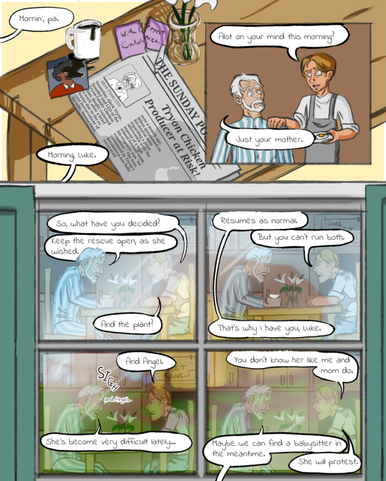
My most common layout these days is just three evenly-spaced rectangles layered directly on top of each other:

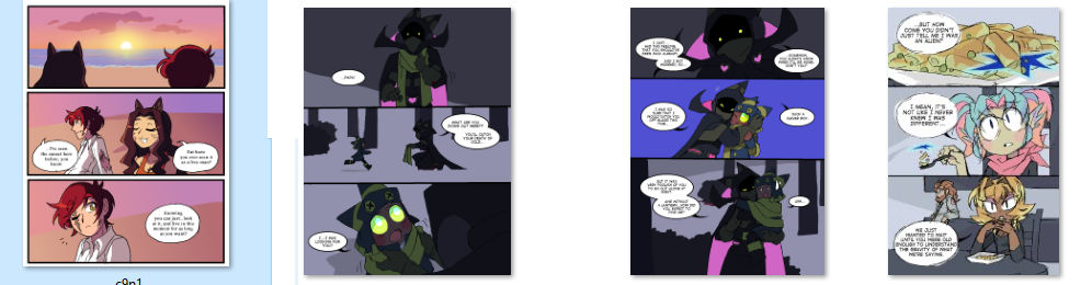
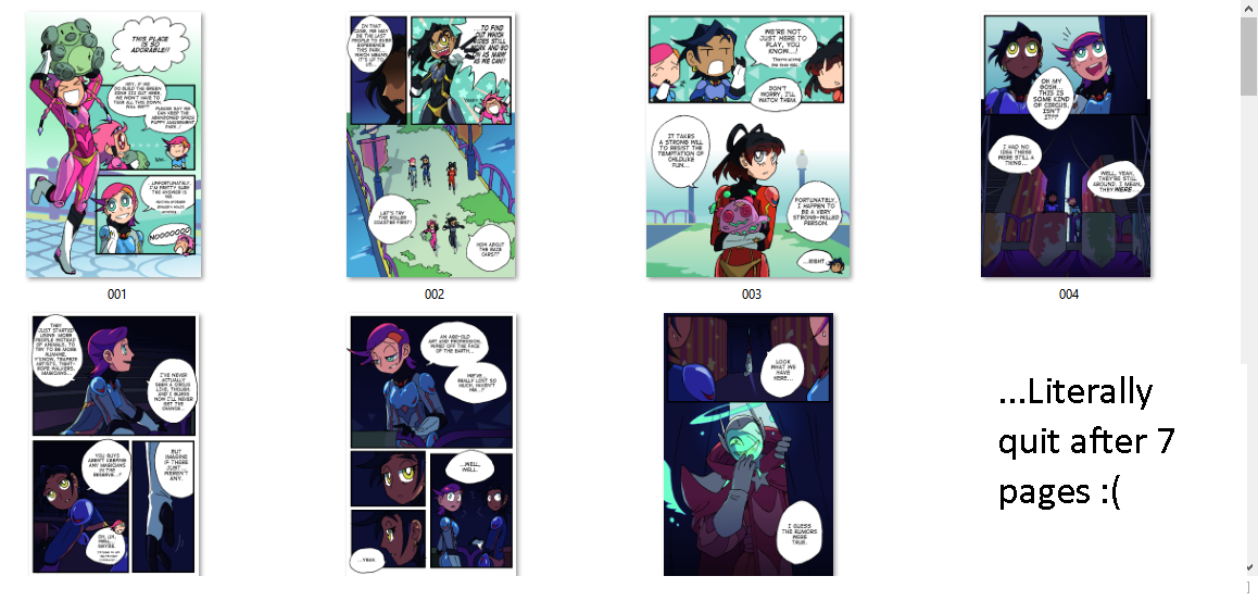
And I used to be ashamed of this, because it's hardly creative and I am capable of more interesting stuff, but then I realized that my longest-running comic projects are the ones that lean on this layout. Meanwhile, the projects where I try to get fancier tend to die after only a short run:

So after a while, I was like...y'know...maybe don't fight nature?? If the art brain wants simple layouts without a lot of variation so it can focus on the drawings within, then that's what the art brain should get to have. ĀÆ_(惄)_/ĀÆ I will gladly "what-goes-in-rectangle" my way through a comic series if that's what it takes to actually enjoy the work and finish it.

Although, I feel like I'm not giving myself enough credit, because even an extremely simple format like this can have thought put into it. Upon closer inspection, it's pretty clear that I use these rectangles to set the pace of the story, in a subtle way.
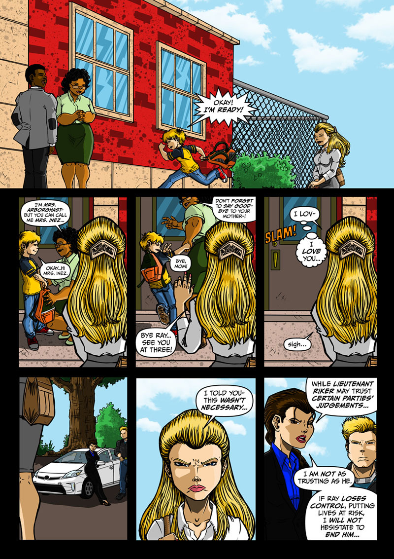
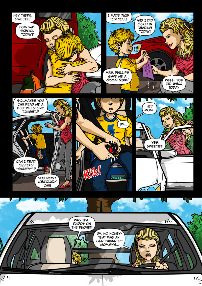
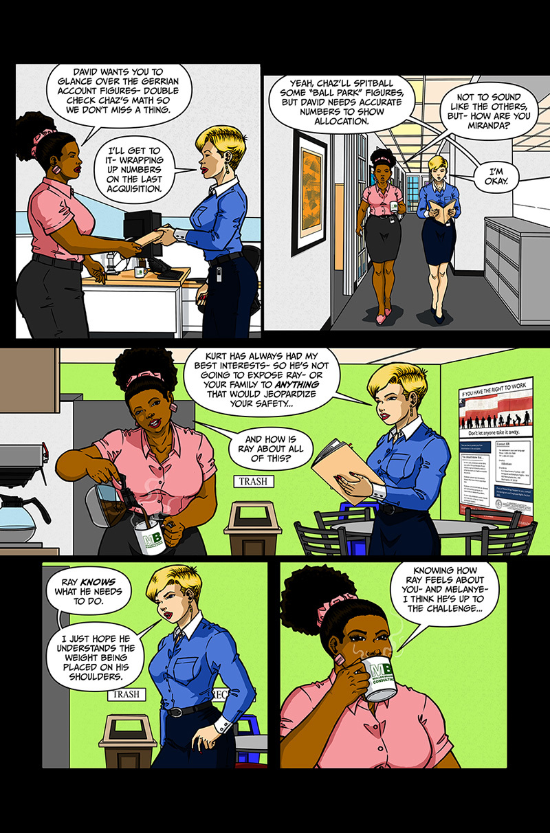
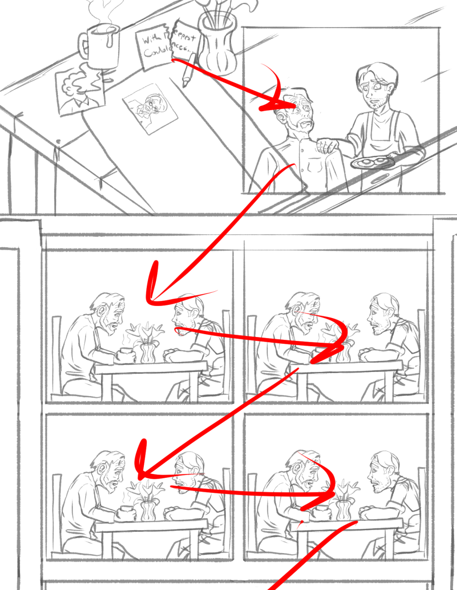
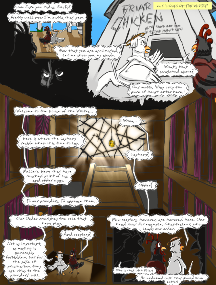
The common 3-stack is "neutral pace", which is why most of the pages use it-- these are the parts of the story that don't have any emphasis on them in particular; either the rising or falling action.

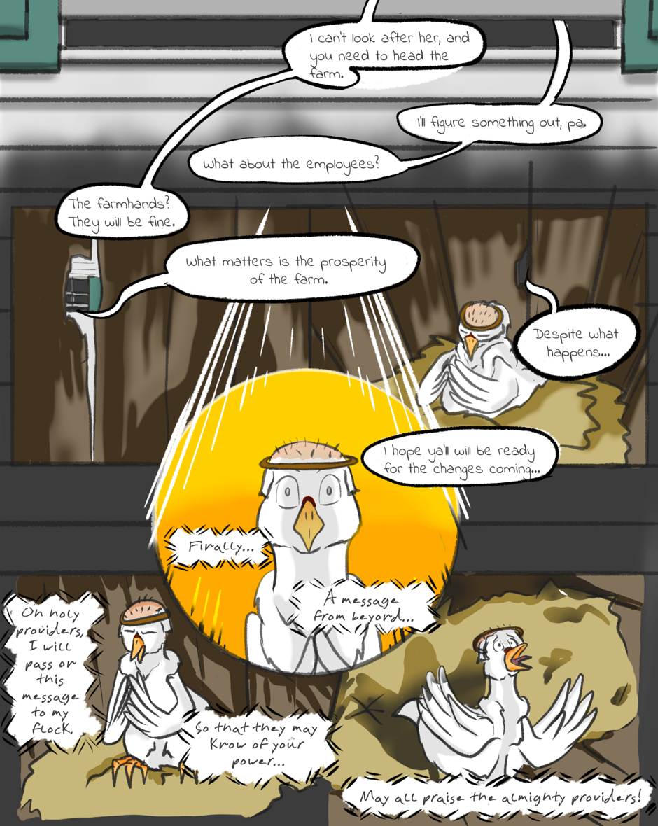
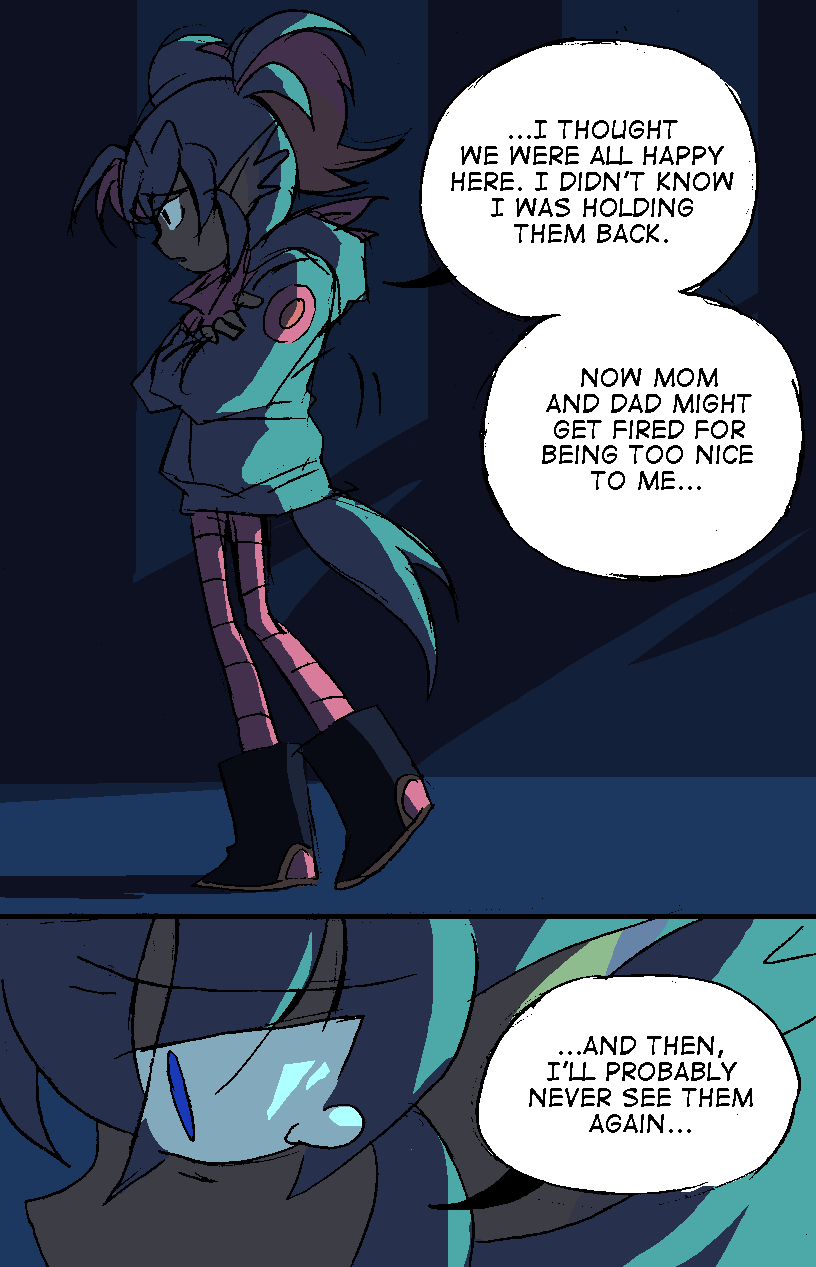
Then there's the 2-stack layout, a slower pace that's used to highlight a pivotal emotional beat: often, the top panel presents an issue, and then the bottom panel presents the characters' emotional reaction to that issue. These layouts usually bookend each episode, showcasing the conflicts the characters are currently facing and the ones they'll be facing next time.

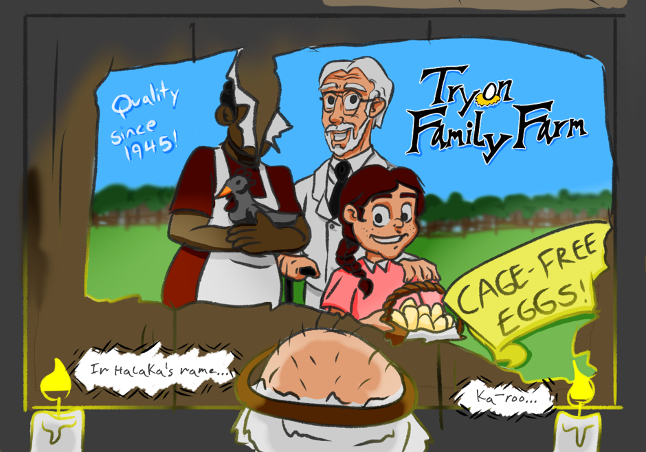
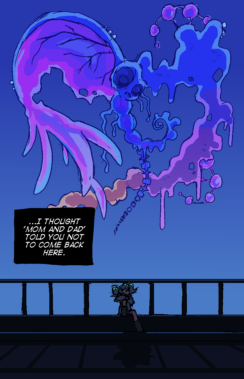
Finally, there's the full-page drawings, which I use for establishing mood: usually moments of deep sorrow or confusion/apprehension. Since these emotions don't usually require much movement, they're well suited to the slowest possible pace.

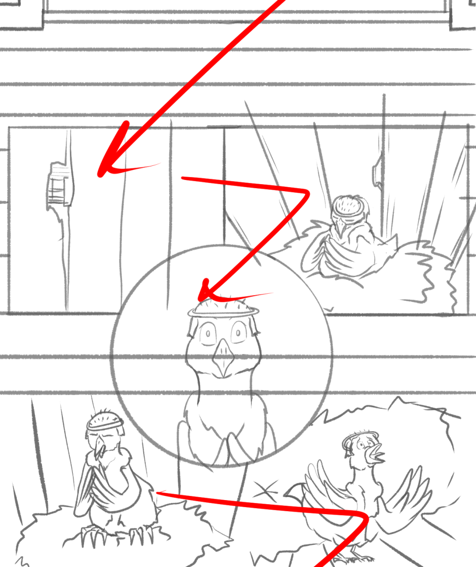
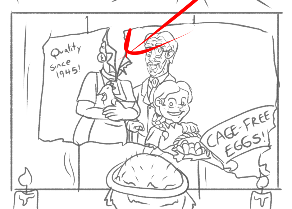
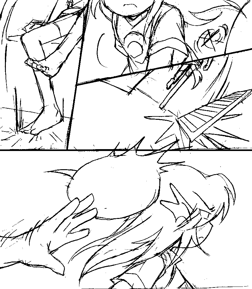
The only times I break away from this large-scale formatting are for dramatic actions, like in fight scenes, comedy gags, or just high-energy moments where I really want to show that a character is moving in a specific way. And the fact that I usually don't use smaller, more-involved paneling actually makes these actions stand out more.

In conclusion: there's strength in simplicity and all that. Basically (like with anything in comics), the complexity or variety of your layouts may not matter as much as how you choose to use them.