
created
 Dec '21
last reply
 Jan '22
- 8
replies
- 340
views
- 8
users
- 16
likes


Maybe it's the lighting? like if the source is from the top right, the hat isn't casting any shadows
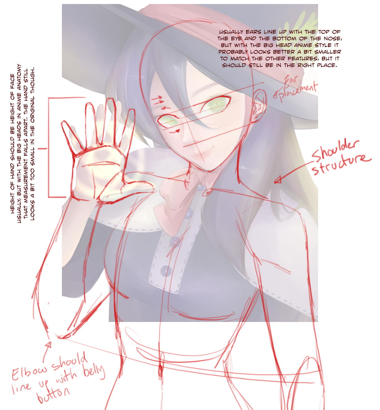
I also think this looks great! After looking at it for a while, maybe the hand, arm and nose are what need adjustment? Like maybe her forearm should be a bit thicker, esp. near the base to better line up with the rest of her arm and the nose should be slightly higher? I think the pinky could also be adjusted. I am still learning when it comes to art though.
Your painting style is beautiful, but I think there are some issues with foreshortening and anatomy. The hand feels too small given the perspective, so to foreshorten tn, I would make it much bigger, which also helps create depth. Also, the neck coming from the head doesn't seem centered on the body, I would move it a bit to the left. I made some quick adjustments below, hope you don't mind.
Here, I did a quick red line for you.
The hand and arm are pretty small compared to her torso, and her hand and shoulders don't look like they have solid structure underneath. I like to sketch outside my canvas bounds when I'm doing my sketch, so I know I'm getting the landmarks where they need to be, then crop back in. Some figure drawing would help that a lot, doing a bunch of life drawing drills would give you better underlying structure for your anatomy.
I use Line Of Action for my figure drawing and I highly recommend it! Set it to 60 seconds per image, and just go as fast as you can for 20-30 minutes. Do this every day for a couple weeks and I guarantee you'll see progress.
The lighting's very vague, and it's unclear where the light source comes from. Should her hand be casting a light on her face from the glowy thing in her palm? Based on the shading, her hat should be casting a shadow on her face.
The lighting on her face is very undefined. There are usually shadows under the eyebrows that give the face more shape, but a lot of the shadows have been omitted here, presumably to make her look pretty, but that leaves the face looking flat.
I was beat to the punch, but here's another shot at anatomy red lining:
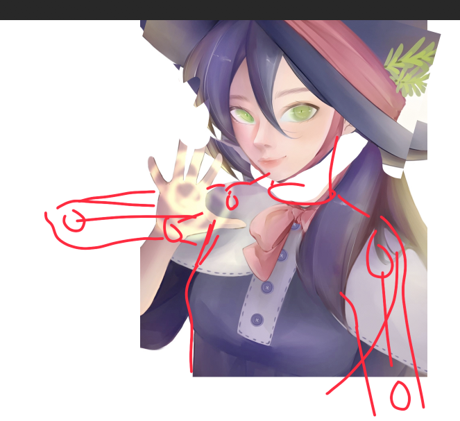
Overall I think the way the character is rendered is really nice  but as others have mentioned, the anatomy is a little off in places, and I think that's the only thing that stood out right away as "off" to me.
For my redline, the notable adjustments are:
I moved and rotated the whole head a little bit. The character's neck doesn't really seem to fit properly in the original version. Using the chest as-drawn as a guide I located roughly where the neck should be, and moved the head into place accordingly.
For the arm at rest (on the right of the picture, or the character's left arm) it just looked a little too far to the right after sketching the torso for the above point, so I roughly located the shoulder and draped the arm down accordingly.
the arm of the glowy magic hand seems a little strangely located- the elbow is out of frame, but the pieces that we do see (upper and lower arm) don't seem like they connect quite properly. A trick I learned many years back is:
you can draw the hand anywhere you want it, then locate the shoulder and wrist and draw a line between them. To find the elbow, you can turn that connecting line into a T and at the bottom of the T is where the elbow goes. It doesn't always work perfectly and you have to be conscious about how long the base of the T should be but it's a nice trick nonetheless.
When trying to get my hand in that postiion in real life, it seemed as though the elbow maybe wanted to go outwards as I've sketched rather than down. Although I think that @TedGravesArt 's version also works! The hard thing to get right, then, is the angle that the hand is facing. The reason that I defaulted to the "elbow out" version is because in the original drawing it looks like the outside of the hand is angled towards the viewer a bit and it was easiest for me to achieve that effect from that angle... but that's a small detail in the grand scheme of things xD
edit:
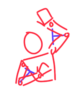
here's a quick example of the "T" trick. the T's in this case are in blue, and- along with using my own arms as a reference to get a general feel for where the arms/elbows should be- quickly let you get the arms approximately correct
Honestly, I think it's the light thingy on her hand. As it is, it looks like she's standing in front of a sigil-shaped window or something and the sunlight is landing on her hand, but 'common sense'/contextual clues tell me that she's supposed to be casting a spell and the sigil thingy is supposed to be light in front of her hand. To make that more obvious, I'd erase/lighten the outlines on her hand at the parts where the sigil continues (to make it look like it's in front of her hand) and maybe darken the background slightly to make the sigil stand out a bit more
1 month later
closed Jan 18, '22
Suggested Topics
| Topic | Category | Replies | Views | Activity |
|---|---|---|---|---|
| New comer, New story upload ,pls support me | Art | Comics | 3 | 176 | Sep '24 |
| Global comic Award entry launched! | Art | Comics | 0 | 270 | Jun '24 |
| Cover for my manga Toranu | Art | Comics | 6 | 371 | Jun '24 |
| How do artists measure face width | Art | Comics | 17 | 813 | Apr '24 |
| Webcomic music video episodes | Art | Comics | 1 | 148 | 8d |