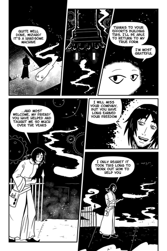
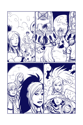
My comic is fully in black and white (except for some red) and it's been a learning experience of how to combine the aesthetics with legibility--because the biggest thing about black and white is that it needs to stay legible first and foremost, and that can be hard if characters are wearing a bunch of different tones.
And my biggest takeaway is that how you decide to color it can be largely influenced by the colors of the page if it were in color, but it doesn't have to. You can get pretty abstract in a very fun way and lately I've been using screentone and accents more to direct the eye than to "color" it, if that makes sense. And since I'm going for more of an Archie-inspired graphic novel comic style, I honestly don't care that who has black hair or a black coat, because it matters more that the page reads.
But occasionally I still will reference the colors of their hair, especially if I want the mood to get darker.
So in this regard, Black and White is a lot freer than doing stuff in color where the same colors must be present in every scene. You can get kind of wild with it and you hardly have to tone everything (in fact, in most manga they hardly tone anything at all, and tone mostly serves as a composition tool than a shadow-rendering tool. Sailor moon is a really good example of this.)
Only caveat though, I've learned through long experience--if you use screen tone you have to have a really dark line layer. I actually multiply my line layer like 2-3 times so the screen tone doesn't overpower it (and, my lines are so thin and have so little detail that I put most of my screen tone at 15-30 percent opacity, it's rarely full black) But it's all a process of learning by doing, so I hope you have fun with it.