So I've been thinking of changing my MC's appearance for a while. Not anything major, mind you - just a tweak here and there. In the story he is described as becoming more powerful as he grows into his magic, so I wanted to add some muscle. I also wanted to get rid of his mullet and give him some proper long hair, and I felt for some reason that his chin should be a little pointier. He grew a small "soul patch" to honour the memory of his father, who was murdered before his eyes (somewhat related fact: I also have a "soul patch" that I wear to honour a friend who committed suicide in 2000 - I have had it since he first went missing and vowed I'd not shave it until he was found. To this day his body has not been found).
So, anyway, here was Daecon before. This was a concept drawing and thus was done in the same style as my other series, Wild Nights, Hot and Crazy Days. Cartoony eyes and mouth, wide but thin wings.
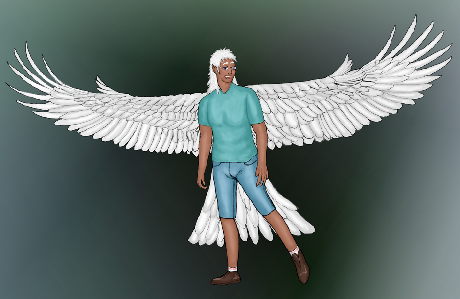
I did not keep that style, I went with more realistic facial features. Here's a newer Daecon (sans wings):
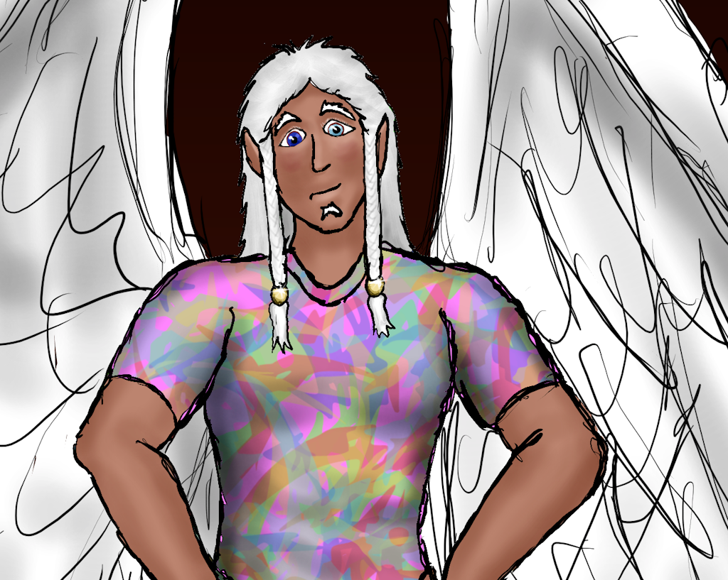
So today, I was screwing around. I sketched Daecon for a "Why u no end hiatus" update. It was really only supposed to be a sketch, but while doing so I decided to play with his features and make the changes I'd been planning. Then I did something I've never done before: I coloured the sketch. Usually there is an "inking" stage in which I draw smoother outlines, then I add the colour. I skipped the ink this time and went straight to colour.
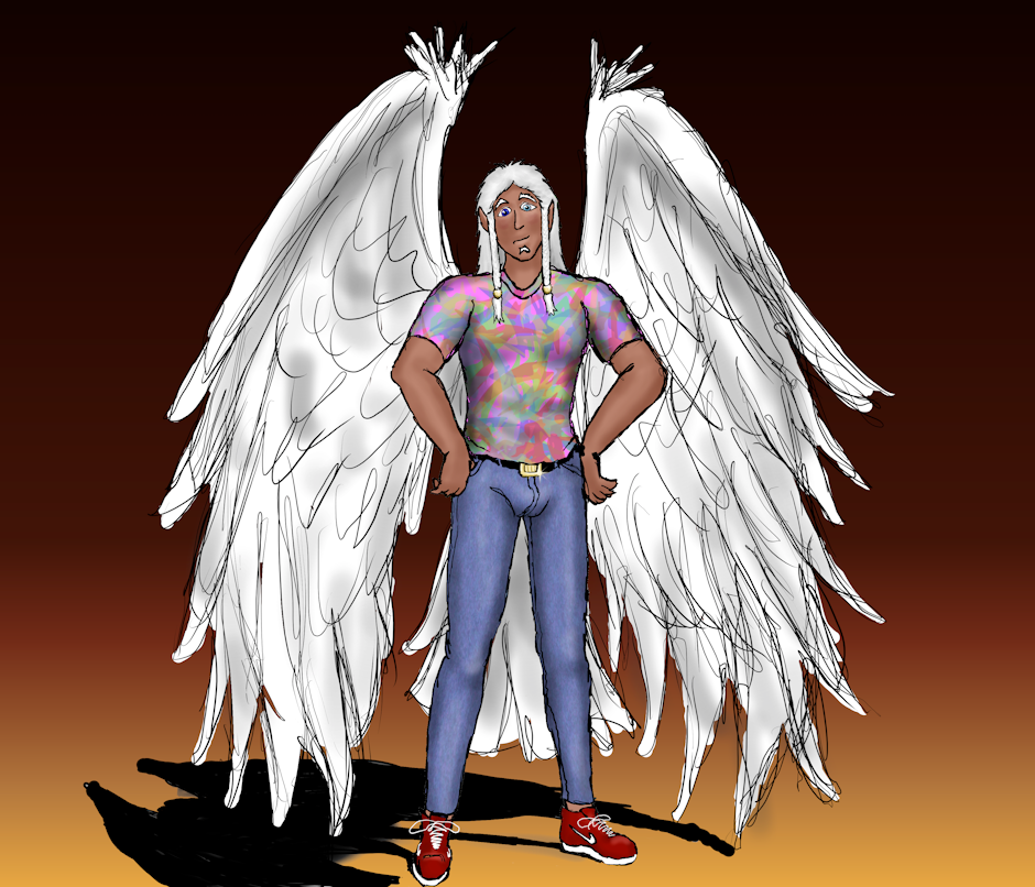
...and you know what? I like it. I really, really like it. I like the rough look over the smooth lines of before. also I added some gold ties to his hair, braided it, narrowed his chin, and widened his chest. The last several drawings of Daecon have featured him in a colourful shirt, and that is now going to be a trademark of his. HIs jeans are 1980's retro "acid wash" denim.
One of my biggest problems before was drawing smooth, straight lines. Parkinson's runs in my family, and though I haven't been diagnosed it's probably in my future. My hands have always been shaky. Even the brush stabilization tools in Krita are no match for my shakes. Can't blame it on coffee, alcohol, cigs or drugs, because I use none of those. It's just natural shakiness.
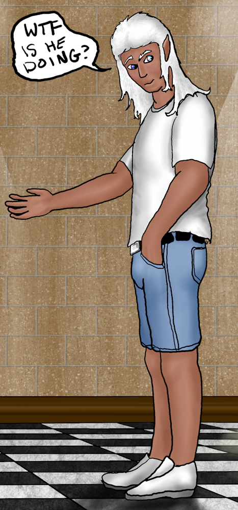
You can see a good example of this shakiness in this fanfic pic I did of Daecon dressed up as The Blue Fedora. Look at how wavy the outline of the arm and coat are:
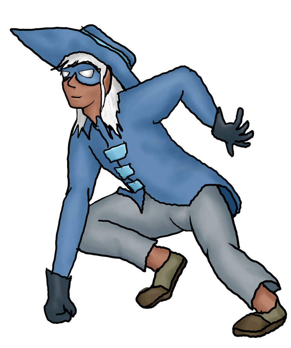
Now look at this close-up of Daecon in the new style. The lines are still squiggly, but now it looks like they're supposed to be that way. Also, I like the rough look it imparts. This is how I used to draw with pen and paper many years ago (yes, I've always been shaky, and pen & paper don't have brush stabilization!)
So tell me, what do you think?


