1 / 7
May 2022

Hello everyone, it’s been a while! I haven’t really been painting these past 2 months, but with SpyxFamily being an anime I became inspired. I’m drawing Yor and Loid dancing and it’s supposed to give off a sexy and romantic vibe!

For a while now I’ve been wanting to explore lighting, specifically, dramatic lighting but I’m not really sure how to go about it.

Any tips, explanation, and examples are appreciated!!

  • created

    May '22
  • last reply

    Jun '22
  • 6

    replies

  • 1.5k

    views

  • 6

    users

  • 22

    likes

  • 3

    links

I love dramatic lighting, the direction and colors you choose really help convey the mood of a scene. I use dramatic lighting a lot for my comic for this reason.
I made a few tutorials about simple dramatic lighting techniques I use, i hope it's helpful:


I think it's a good idea to collect examples of what you're going for, drawing from scenes you thought accomplished this well or art from your favorite artists.

I have a folder on my computer dedicated to snips of art I've come across online and gathered for use as references or inspiration, as well as a sub-folder for interesting lighting/shading ideas, and it's been super helpful in this!

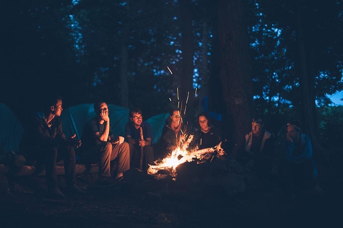
For a romantic vibe, I think of dim, gentle lighting, with soft red or pink-tinted colored light, and splashes of brightness with dark shadows. Maybe having part of the characters' faces cast in shadow and only narrow sections illuminated for a thrilling or mysterious look, with reddish color tones for a feeling of warmth and intimacy.

That's what I think of, anyways, based on the description you gave. There are a lot of different ways you could go about lighting a romantic setting. :]

Skimmed through my collection of lighting refs and this caught my eye as a different approach to a lovely romantic scene. Work is 'In Another World' by elbenherzart on Deviantart.

The lighting is warm and gentle, conveying a sense of gentle affection and love between the two characters. I also like that they're backlit, with the rest of their faces cast in soft shadow. It creates a feeling of cozy, comfortable closeness and intimacy.

Up the contrast! That colour you're shading with? Make it darker! Just do it! (And shift the hue slightly while you're at it :D)

I know it looks weird at first, but the key to dramatic lighting is not being afraid to really push your colours. It's especially important if you have a more 'blendy' style of shading rather than cel shading, because the blending process really softens the contrast

I google search for the sort of lighting I'm looking for, and collect all the relevant reference I can get my hands on. If I have to, I will eye dropper specific colors out of the reference image just to make sure I've got them right. And I try techniques on a practice image rather than on my actual page.

Here are some of the reference images I've used to get specific lighting effects:

Sometimes I'll just straight up do my best to recreate the effects of a moody bit of lighting just to see what I can learn from it. (This one ended up a bit lighter than the reference photo, but that's okay with me, it was an experiment.)

Well put. I agree with this :]

Experiment by pushing the limits, upping the contrast of your colors past the limits of what feels comfortable... and have fun doing it!

I discovered new methods of dramatic lighting/shading by messing around with my art and pushing the limits of what had always felt natural to me. It looked weird at first, but by playing around for a bit I found some new palettes that now feel more eye-catching and compelling to me.

1 month later

closed Jun 3, '22

This topic was automatically closed 30 days after the last reply. New replies are no longer allowed.