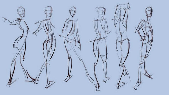
Practice gesture drawing, specifically timed gesture drawing where you only have an allotted amount of time to draw a figure. It will train you to focus on the overall shape and form of the figure rather than the details.
Look up character design tutorials. Most will focus on the silhouette of your character and the function of the design. Streamlining your designs can be very hard, especially if you have a soft spot for them but it is important. Especially for comic characters, simplicity is key, but so is recognizability. Having a clear silhouette for each is important, mainly when compared to your other characters.
When designing character, it's good you have a limited color palette. The palette can be monochrome(different shades and tints of the same hue), analogous (colors next to each other on the color wheel), complementary (opposites on the color wheel, red & green, orange & blue, etc.). There are many more possibilities for the color scheme of your character but what is important about it is that it informs the reader about the character in question. Another thing to keep in mind when choosing your colors is contrast. Contrast between colors will separate the different aspects of the character such as their hair( or fur), skin, clothes, armor, etc., etc.
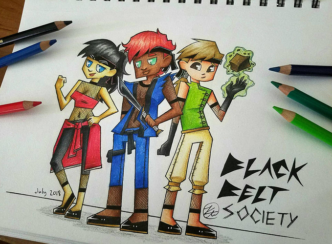
Honestly I don't really like using my characters because they aren't perfect manifestations of character design, but I think I can make a few points off them (even though I don't draw them in this style anymore).
-First I want to look at the silhouettes. If each character were blacked out, it's unlikely that you would have a problem differentiating between them. Their body types, clothing, hair, and face shape separate them from one another.
-Next we're going to look at color. Each character has their designated color, but then they have supplementary colors individually. Lara, the girl on the left, has the main colors of red and black with the blue of her eyes being the supplementary color. This draws the viewer to her face since the blue stands out. Elliot, the dude in the middle, has the main colors of blue and black. The supplement colors, the red of his hair and the green of his eyes, contrast and are complementary colors. This also draws attention to his face. Lastly Tyler, the boy on the right, has the main color of green. The off-white of his pants and dirty blond color of his hair complement the green which are in contrast with his dark brown eyes.
That's a simple over view of my color choices at least. Some we're intentional, other weren't; none of it is perfect. I think your biggest issue in the design of your character is your color choice. Not enough contrast between colors, too many colors on one character, and most are very saturated colors. The skill to draw your characters more naturally and less stiff will come with time and practice. Fortunately so will your color choice. You'll develop a better eye for this the more you look at references in life and nature, other people's art work, and looking over your own previous art work. Keep working at it; your enthusiasm to grow is only an asset to you.