I also really jump at well designed patreon pages. Strong introductions and lots of bright but cohesive graphics for appealing structure. I believe upon landing, it should immediately relay the voice of an artist's work (and in that, it shouldn't look like "a patreon page", it should feel like I'm at a standalone website).
That said, success is not so much in the bells and whistles but in the meaty content and the authenticity of an artist's work. It can be overwhelming to scroll through overloaded pages and tier descriptions that present redundant info or walls of text.
Mana has an amazing video that is overloaded with her enthusiasm and some tremendous reward tiers that appeal to art collectors. It's otherwise straightforward and most importantly, easy to understand.
On top of being a distinctive artist/teacher, this page provides a wealth of resources in tandem with some lovely art. She balances with quite a few public posts as well which offer a nice teaser for what a pledge tier might turn out.
This is one that has fantastic colour appeal (taking advantage of the work's strong suit, graphic immersion!) and the tier system is unique and fun as well as inclusive of the artist's content. It's smart and also presents basic information about how the patreon campaign works as well as funds collection/what to expect. Upfront, transparent!
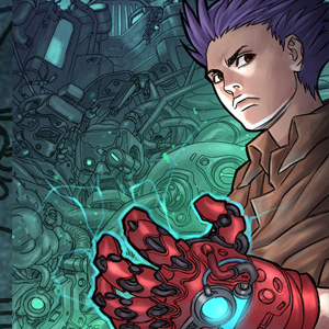
It's quite modest but I spent a lot of time on my own patreon (just recently hit my second goal, oo!). I worked hard to curate a page with tiers that play into the comic's content as well as each main character's visual aesthetics. There's a wide range of rewards both digital and physical (depending on the patron's budget) and exclusive illustrations guaranteed each month.
In order to design a strong page, it really just takes breaking down your resources and what you enjoy creating. Dissect your work for common themes and play off of them in presentation at 200%. It'll come out with a punch and a strong voice!