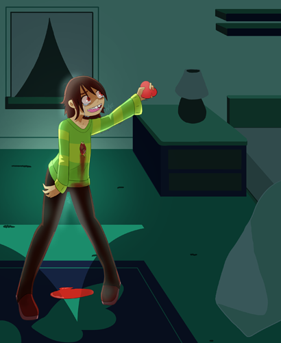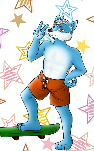
Nice clean lines, the pose is a little stiff, like he doesn't have all 3 dimensions. try exercises like this:
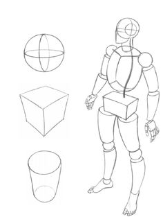
simplify your figures to simple 3d shapes then try to move your "camera" around to be able to draw and pose from any angle and train your brain to think about that 3rd dimension.

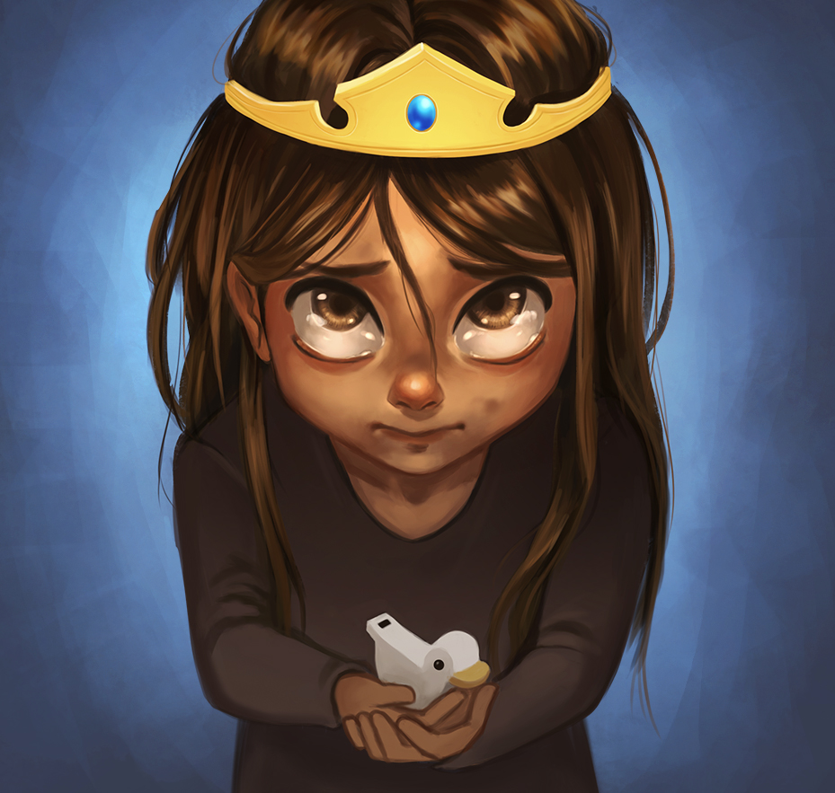
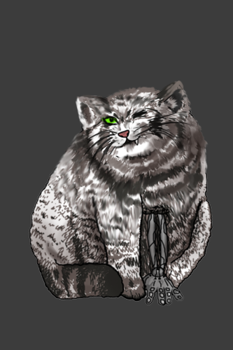
cute colors, love this. It's feeling so soft and calm, but it's very different from the first one. Did you use some kind of reference for it? your water coloring is beautiful anyway, but there are some beautiful properties to this medium that you can use. Perhaps try more changes between different kinds of blues and not just one color in each thing. Try more color mixing that could be fun.
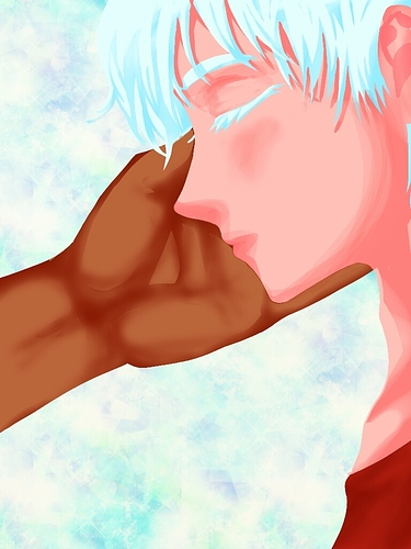
with this one I see you try more levels in shading and you change hues a little which is great. but not in the right direction. everything is bright all the time. and you don't move to the darker colors.
Don't be too afraid to go darker, grayer, or desaturated. if everything is bright then nothing is bright. also the base color for the face is all the way up there.
which means you didn't give yourself enough room to move around with the colors.
Take some photographs of real models and real people, then saple some of the colors around the face. you will see that these colors are not what you expected them to be. I always say that colors are visual tricks in a way.
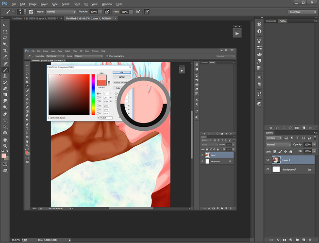
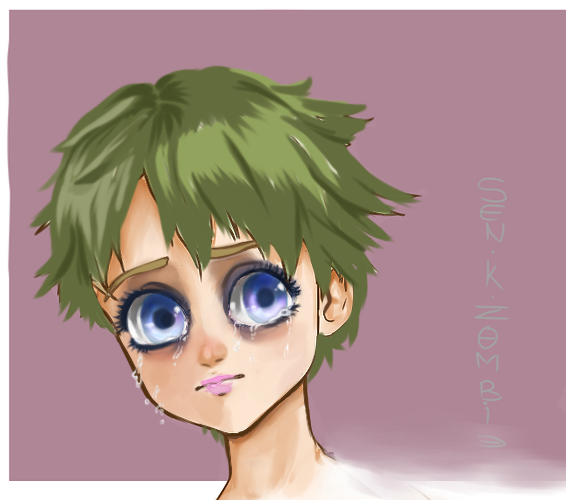
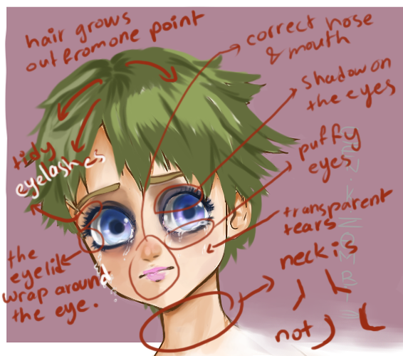
here's my version of this
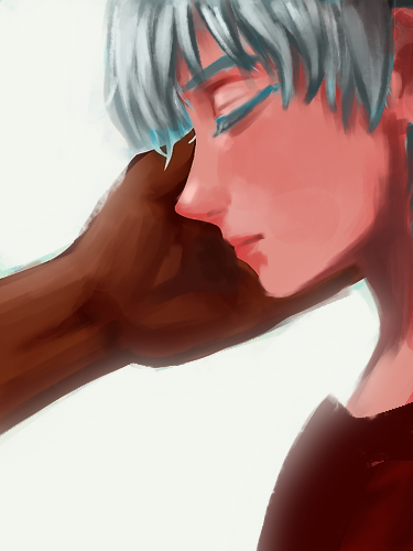
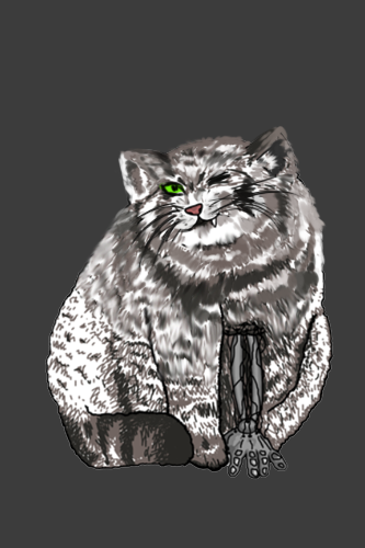
First I duplicated the drawing, muted everything, then set it on multiply so now the whole thing is darker.
I gave him more chest so he can have lungs... the color white in the hair needs more darkness to appear white (yes... I know)
I desturated the skin a lot more so that I can add highlights to the brighter areas of the face, but it could do more if you ask me. The face is too red but maybe that's the character's design? I added more contrast to the hand. and I think you wanted the background to be light? so I made it glow. Either ways you don't need all these small details in the background they are distracting.
TL;DR make the shapes 3d, mix more colors, use darker tones to make things appear lighter. Avoid using the brightest colors immediately.
Hope this helps