6 / 10
Nov 2021

So I'm sure I'm not alone in struggling with drawing backgrounds, especially more urban ones. For me, they usually end up feeling too 'stiff' for lack of a better word, and unnatural, or they don't fit well with any characters placed in them. Anyone got any tips?

  • created

    Nov '21
  • last reply

    Dec '21
  • 9

    replies

  • 524

    views

  • 8

    users

  • 18

    likes

  • 3

    links

Funnily enjoy I was talking background in a server earlier so happen to have this on hand for really simple easy backgrounds for things like covers or character pieces:

Tbh he's a fantastic resource for all sorts of tips and tricks and it's subtitled properly in so many languages. Really great.

My second recourse for more detailed backgrounds:

All the free to use and edit stock photos that aren't stock photoy, either run them through a few filters or trace them, or as I do, take bits and pieces you like of them, smush them together until you get something you want and use that as a sketch layer. You just have to watch out for perspectives with that trick.

do you mean like the sizes don't feel right? Or that the perspective feels off?

I don't know if this is what you're after, but a trick I learned in an architecture class was to base all measurements off of a back corner (or an outside corner--just have one thing in one place to base measurements on.) So, if you have a shop front in the scene, you can scale all the sizes from the corner of the shop front, especially using a door.


Another thing, is something called the cone of vision. We don't usually see these on our ruler guides but be aware that it's there (I use Lazy Nezumi to do my perspective drawing so I can just show it to you) For example, the cone of vision in this picture is that purple circle.

I want to avoid putting things on the edge of that purple circle or beyond it, because that is beyond the human ability to see, we're getting into owl vision if we go too far. this starts to look distorted and strange. So, you can keep things away from the edge of the cone of vision, by making sure that your 2 pts in 2 pt perspective are far enough apart from each other (mine tend to be off the screen) and making sure that you aren't doing a lot of details in those corners. Like this picture right here--I'd probably crop that roof because it looks odd, it's outside the cone of vision.

No idea if this is what you meant btw, but it's a tip?

What does it look like currently?
I would recommend practicing drawing more buildings, houses and landscapes in your sketchbook.

The guys above gave some nice tips on persective already very important stuff on its own like the skeleton to the human body :thumbsup:

Other than that, personality of the location is also improtant.
The questions below can help you design interesting archetecture and props to clutter your environment and make it feel lived in.

Do research on the culture, architecture and climate of existing locations that inspire yours, as you want your town to be believeable, even in a fantasy setting.

Ask yourself questions like:
How old is the location? What period is it based in? Whats the climate like and what measures they use to maintain the place? What are the cultural habits, are they a clean n classy culture or do they leave trash everywhere? What is the financial status of the country/location?
How did their past history affect the location for both archetecture and mentality? What are the views of the people there? Do they enjoy their current leadership, are they oppressed?
Are they a happy, sad or scared town? Are there gangs around? they leave markings etc. What are their cultural habits, is tea a popular beverage, did they decorate for an upcoming festival?

Environments are a great way of foreshadowimg events and side plots too eg. Posters plastered around town for a wanted criminal or grafitti from a gang all over the place,. Your reader may take notice of it in Bg while your Mc is focussed on another task. Later in story your Mc crosses paths with the criminal/gang and it does become a part of the main plot. As the viewer already saw the posters/grafitti it gives them familiarity when the criminal/gang finally interacts with Mc. It's all part of that show dont tell concept.

Based on an Mc's personal space, a observer can gather knowledge of their hobbies, taste and vices and history. Even if most items seen aren't key to the main plot, their presence in that one shot can quicly give the viewer a better understanding of the character involved. Filling out character data sheets can help alot with this. Wishing you best of luck with your envrionments and project :slight_smile:

It helps to use the same techniques for your characters and their environments. Match your line quality, shading style, shape language, level of detail etc etc. If your characters are cartoony, simplify and exaggerate the buildings in your scenes as well. If they're detailed, make sure your backgrounds have little details in them too. Most walls aren't perfectly smooth; even a freshly paved street has a bit of texture that you can indicate with lines.

Here are some examples of what I mean off the top of my head:


(Tintin, Herge) (love that ligne claire style)


(BONE, Jeff Smith)


(Necropolis, Jake Wyatt)

Dan Panosian is an artist I love who does some amazing freehand backgrounds. This tweet kinda stuck with me. Like other people have already said, I think you just need to experiment with the backgrounds and find a background drawing style that fits with your characters. Go crazy; go too far in all directions until something calls out to you! Try stuff you might not normally try. :slight_smile:

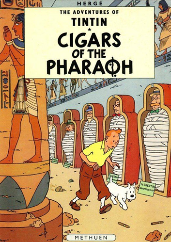
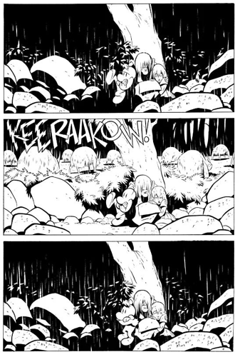
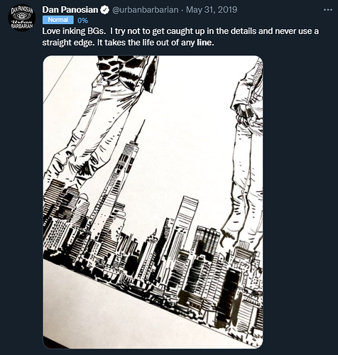
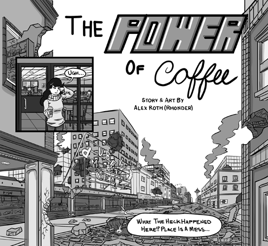
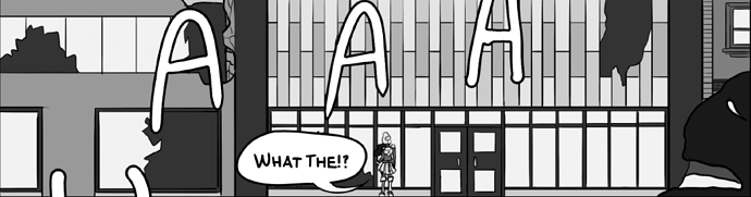
Urban environments have become a favorite of mine over time- I find them a lot simpler to work with than natural environments because so much of them neatly fit within the basic rules of perspective :sweat_smile: Here are some examples from the only comic that has taken place exclusively in an urban environment (it's loosely based on Seattle)

The following are my biggest tips:

  • It helps to practice and become very comfortable with the principles of perspective and how to locate things accurately with it. At least for 1 and 2 point perspective to start, but weaving in 3 (and beyond) as you become more comfortable can help add more dramatic shots to your arsenal!

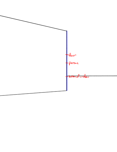
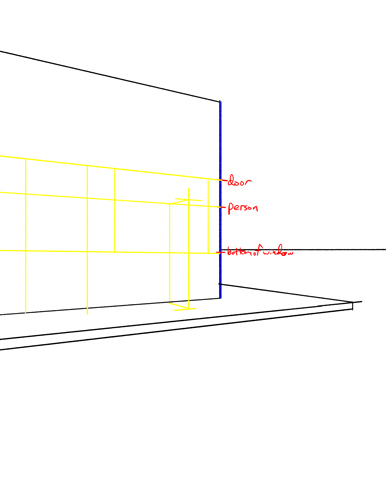
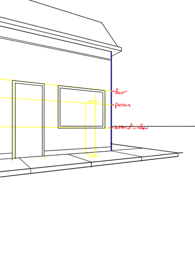
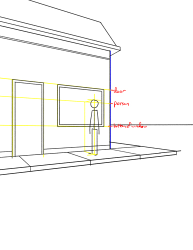
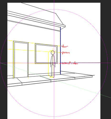
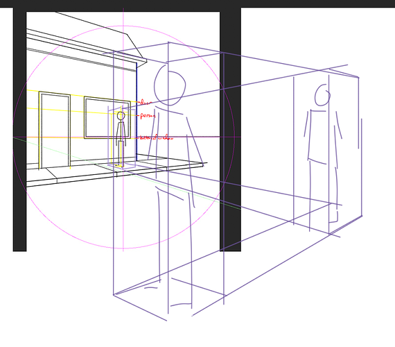
Beyond just knowing how things recede to the vanishing points, it's also really handy to nail down how to scale objects in perspective. @rajillustration 's reply above goes into this. Beyond just locating one person though, a good next step to work on is using elements that you've already placed in order to place additional people or items all in scale to one another. For example, using the same example provided above, you can use the vanishing points to get more same-height people to scale in the foreground if you want to :slight_smile: utilizing this will help you get the people looking like they fit into the backgrounds better because eveerything will be in scale relative to one another.

  • Research is your friend

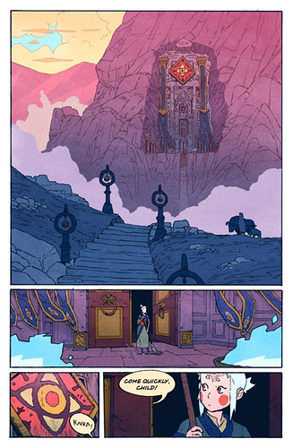
One of the things that immediately started making me feel better about my backgrounds (urban or otherwise) was just starting to actually research the type of place I was trying to draw and figure out what sorts of details belonged there. It takes more time to draw in details, of course, but I always felt like my backgrounds looked so empty, boring and lifeless when I was younger. taking the time to draw in the lines in the sidewalk, or some of the cobblestone texture, or the pedestrian crossing buttons on a traffic light pole, just adds so much to a background. Finding the balance between adding too little and too much takes practice though lol.

  • this is like a half tip continuing from the above, but learn to prioritize. It's okay to go all out on some panels (establishing shots and the like) and "skimp" on others- it'll save you a lot of time and readers only look at each panel for a few seconds on average so there's no need to spend tons of time on each panel. This way you can save energy to flesh out the important panels where it counts without burning yourself out going ham on 5-7 panels every single page.

I hope this was helpful! Best of luck on your background journey :smiley:

edit:

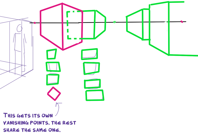
I forgot one of the big ones (regarding perspective rules)! The sooner you learn that any given scene might have several sets of vanishing points, the better! This took me so so long to figure out and wrap my head around lol. Regardless of whether you do 1 or 2 or whatever point perspective, the lines that go to the set of vanishing points that you establish are only true for objects/people that are "parallel" to each other, for lack of a better term. Say you have a row of houses and most of them are next to each other, those would all use the same vanishing points. But if you have 1 house that is rotated not-parallel with the others, it would have its own set of vanishing points. this applies for anything in a scene too- if you have a book on a table that's not parallel to the edges of the table, for example, it would have its own set of vanishing points as well, and so on. I can only do a crude mouse sketch to show this for now, but hopefully it conveys the concept :sweat_smile: This also helps add realism to scenes because if you try and force items to the wrong vanishing points, they always look odd.

thanks guys for all the advice!! i'll definitely be putting it to use :grin:

1 month later

closed Dec 16, '21

This topic was automatically closed 30 days after the last reply. New replies are no longer allowed.