Design wise, I think your characters fit the tone of your backgrounds--the colour choices and general quality of the art mesh together very well.
However, I believe your issues lie in the mismatches of the angles your characters are drawn in, and the angles your backgrounds are drawn in.
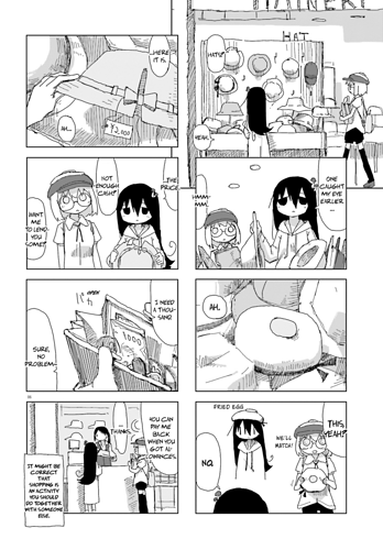
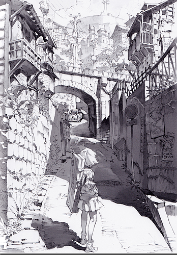
For example, in this panel, though the camera seems to be placed slightly high, the character is drawn straight on--this creates the impression that the character is merely standing in front of a screen with an image of the background. It's a bit difficult to explain, but it's an impression I get looking through many of your panels.
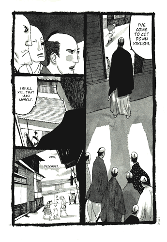
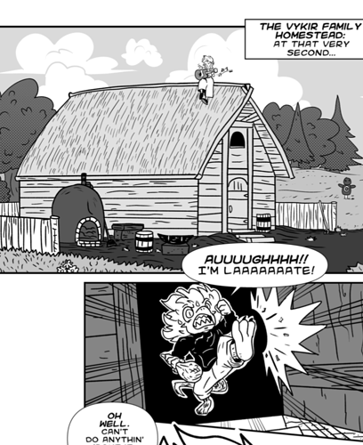
This is something you'll get better at with experience, but if you want to drill yourself on fixing this issue, I would suggest practicing drawing wide shots, where the character's body would be shown in full (I'll paste some particularly good examples below):
In line with this, practice drawing the human body at every possible angle. The more angles you know, the easier your time will be fitting them onto your environments.
There are more technicalities involved in this, like keeping things in proportion (grids are very helpful for this kind of thing), but I think this post will get too long if I get on to them, and to be frank I'm not the greatest at this either, so my knowledge is limited.
Anywho, I trust you'll find whatever resources and tutorials you'll need further down the road, these are just my 20 cents. Best of luck with everything