I am also a person who struggles with backgrounds. However, something I like to do in especially important/impactful scenes is to make the background a solid color, and/or some colored lines to help convey emotion or movement.
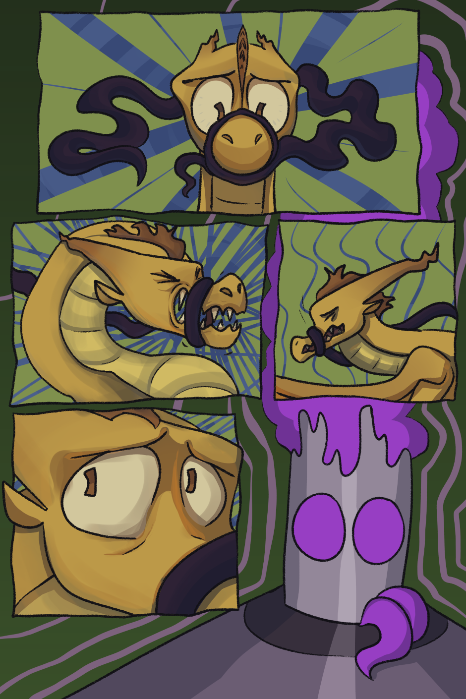
I'm not going to lie I think I overdid it on this one lol
But anyway, not including lines can also help to make specific panels more impactful:
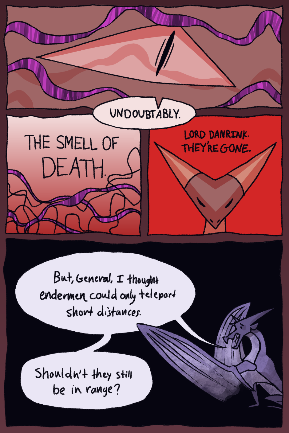
In the third panel, the solid red background accentuates the importance of the words being said.
The biggest problem with this is that, especially in a fantasy comic, it's sometimes unclear what are the background lines and what is actual magic.
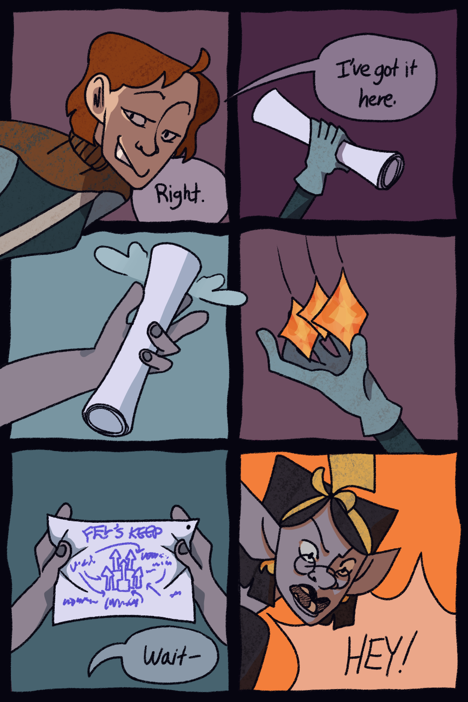
Also, one last thing: try not to overdo it—this is a piece of advice I think I need to listen to tbh. It should be something you do to add on to the piece instead of substituting backgrounds. Doing it too much will sometimes make the page feel really flat, rushed, and undetailed, like this one I did:
Anyway. I'm not a professional so take my advice with a grain of salt.
Yeah ! :]