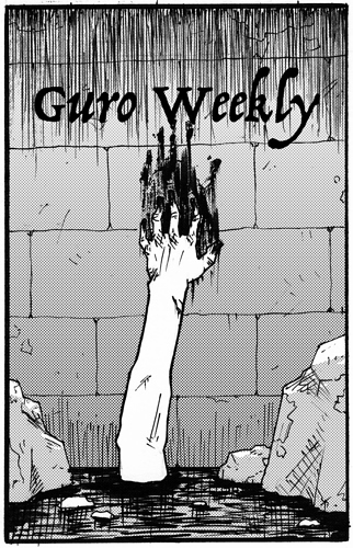
The blood streak should be more of ...a streak.
That looks more like a muddy smear.
The stripes from the finger tips should look like the hand dragged down the wall more clearly.
I think it needs a scarier font.
And that FONT needs to be turned into a title/logo- in other words, do not use that font as it is.
It needs work to be made into a graphic and not just "letters".
I think the rocks are there to help frame the hand which is basic art composition 101.
But in this case, I think the hand should be large enough to dominate the image and the rocks serve to shrink the "pool" or pit and doesn't make it seem like a body can fit in there, between that gap.
Giving the hand more prominence would allow for new details like veins on the arm.
Or the muscles flexed on the arm enough to show a desperate struggle and true terror of sinking into that bath.
I think this is one of those cases where Black, White and Red could work.
Add some red for blood- is fairly obvious and standard....
Red in the tinting of the arm/shadows and red bits in the water as effect swirls, reflections or accents.