This is going to be a long post.
So, you might remember a little bit back I made a post asking for some character design feedback. I got some great feedback out of that, took it away, did some rethinking of the designs and I'm back for Round 2.
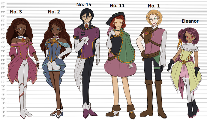
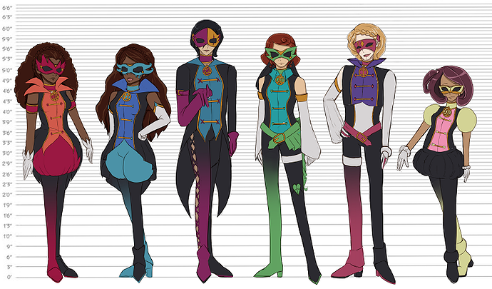
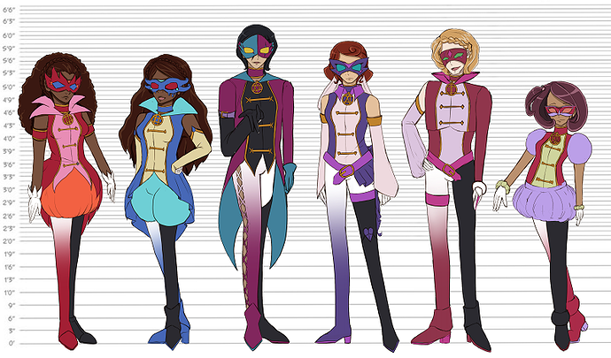
This time around, a bit more context. For a start, more characters so you can see it more in context. Also, names so you don't have to just keep referring to them by colours or position.
Everyday wear
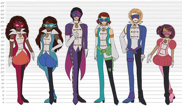
Phantom Thief wear A
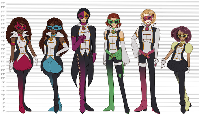
B
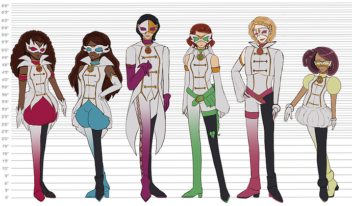
C
D
E (the try something a bit different attempt)
A few others things that came up in the last one or that you might want to know:
- It's a low fantasy setting. For instance, the little gold and coloured circles are life watches, when they start losing time, you're nearing your death. And day to day wear is going for colourful but not bright.
- It's a story about phantom thieves (among other things). There's a TV Tropes page for context, but consider them a lot like stage magician meets cat burglar. In many ways, the theft is a show and the aim is to be seen and still get away, so stealth isn't a huge consideration (although I don't want to go too far out on practicality).
- No 2 and No 3 are twins so that's why their designs are similar. No 1 and No 11 are also a matching set although not related.
- I forgot No 15's glasses, I might just leave them off.
- Eleanor is supposed to have weirdly bright noticeable eyes, it's plot relevant.
- There's no much difference between new No 2 and 3 and old No 2 and 3 design wise because after the last thread I was mostly happy with them.
So, thank you for making it all the way down here if you did. And thank you in advance for any feedback you give me, it really means a lot.
For the original post you can see over here if you want to compare at all or see how far it's come.