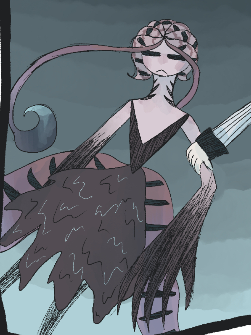
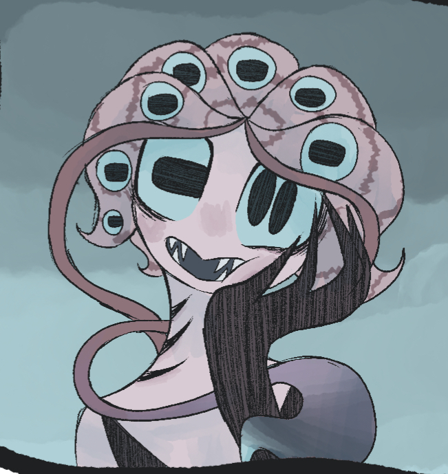
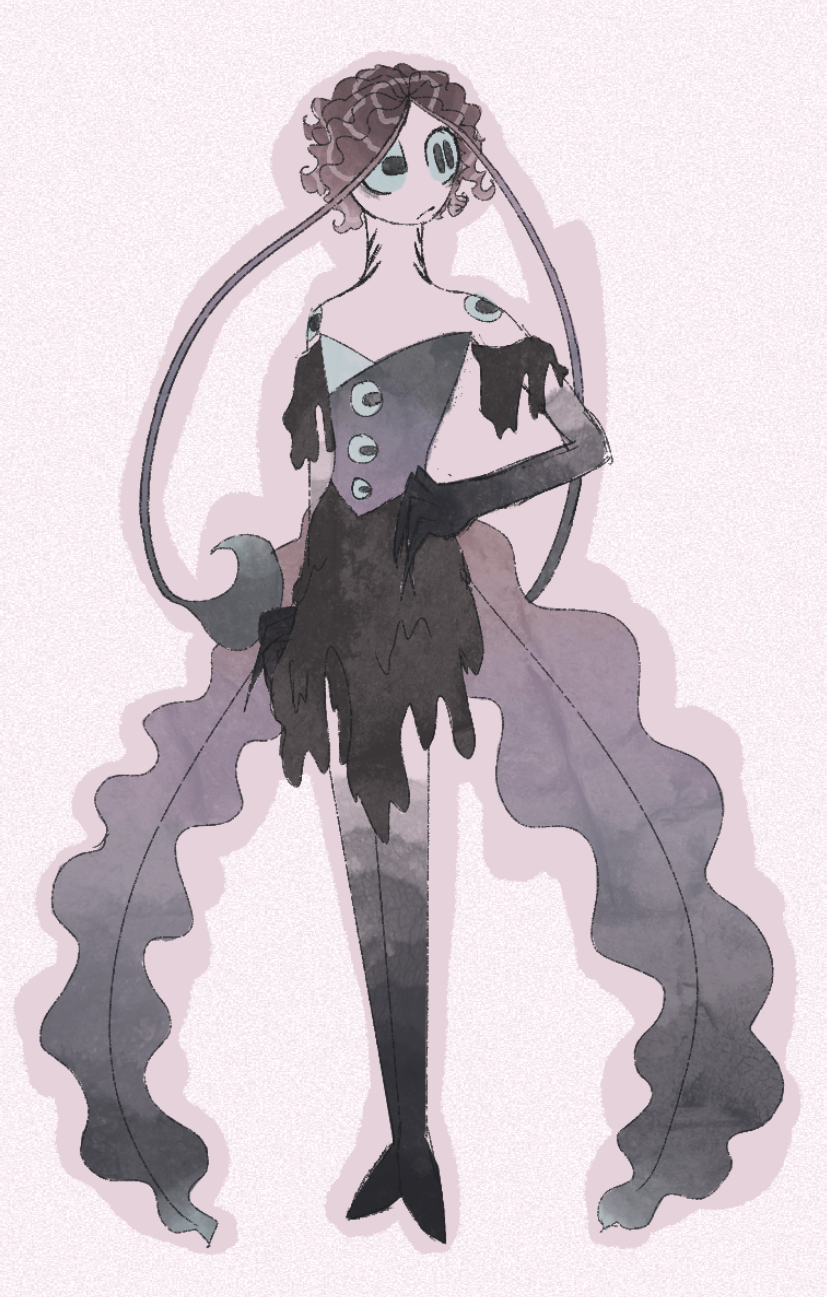
So, for a few reasons, I’m heavily redesigning one of the main characters of my comic. I did initially like Ea’s design, but drawing them over and over has revealed a few flaws. I disliked how many colors I included in their gradients, the extra arms seemed superfluous and offset their ability to almost pass for a human, I kept forgetting little details.. a lot of stuff. After a few tries, I’ve put together a design I like significantly more, and now I want to hear your thoughts and feedback.Old design: And the new one:I am looking particularly for the kind of assumptions their new design inspires, but if any context is needed, just let me know!
I think it's absolutely fantastic! I love the new one soooooo much.
There's nothing that needs improvement. If I had to say something, maybe add a different color to the fingertips? Right now, the hand and the skirt colors are a bit too similar.
Definitely a lot of sea, oceanic vibes, slightly less of a cthonic horror than before. Since she's supposed to pass for human most of the time, I think the new design makes sense. I like the way the skirt seems to be melting or dripping ink.
The dress is simple and bold with its shapes, and repeating the eyes around like buttons and on the shoulders is nice unexpected monster design. Overly, they feel like a very lovely and calm character, but it's possile they are operating under a different set of common sense. (fish out of water) I like it alot!
More sea-debri on cloudy day, Less crustacean than the first design.
The first one kind of of reminds me of Pinky Pie, while the redraw seems much more elegant and refined. I'm not exactly the greatest judge of art, but I think the new one looks much cleaner.
New version is better