I would say, yes and no. ^^; I do use colors to mean things, but often very specific things that I basically spell out to the reader-- that is to say, I make overt 'assignments' of certain colors to certain characters or concepts.
Trying to analyze my work to figure out why I made the curtains blue in a certain scene will likely be a fruitless endeavor: 99 times outta 100, they are just blue. HOWEVER, if you really wanna see how I work with color symbolism, you need only look at the giant neon arrows pointing to what I am actually doing. ^^;
One thing people need to learn about literary analysis: just because it wasn't a hidden message you had to figure it out for yourself doesn't mean it's not good enough, despite what your Language Arts teachers might have convinced you. Sometimes artists and writers tell you what they want you to pay attention to. What a concept. 
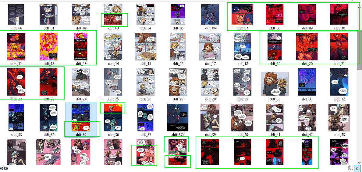
Like, for example, I have this comic where the MC is being tormented by a psychic being, and that psychic being's influence on his mind is always associated with the color red. It's also associated with specific imagery-- eyes, blood, raw flesh--but there's always a focus on red. You can see plainly in the comic when he's talking to it or being given a vision by it, simply by the color of the pages/panels:
To give another example, I have a story where the central characters are all 'products' given designs in different colors, which impact how the MC (and the audience) see them, and allow them to make inferences about their personalities.
Sometimes they seem to match up perfectly: the main antagonist's design is "sickening lime green", reminiscent of cartoon acid or toxic waste, fitting for their vicious personality. Meanwhile, the MC's main love interest wears seafoam green, a calming color that matches her gentle demeanor.
And then other times, the color assignments don't match: One of the MC's friends wears blue, in a cool, professional design that only matches the mask he puts on to survive in an abusive environment-- underneath it, he's a very jokey unserious person, and the fact that his real self is the first side of him that she sees draws attention to this mismatch.
Another one of the MC's friends is designed in red and gold: he looks fiery and dangerous, and he can be when fighting. But outside of that he's actually very sweet and shy...in direct contrast to the MC herself.
Her color is "neon pink", and she hates how loud and cute it is. She feels it gives people the wrong impression of her, making them think of her as childlike and 'entertaining', instead of the serious, hardened warrior she actually is. It reflects how, throughout the story, her antagonists look down on her and oversimplify her motives, refusing to see her as a mature adult just because they designed her to look like an edgy teenage girl.
Of course, throughout the story, the MC's perceptions of these colors change along with her perceptions of these characters, including herself-- In this way, I use color itself as a symbol of who each character is and how they are perceived by the people around them.
...They ARE also fun aesthetics; as a character designer I can't deny that. ^^; But you can always develop an aesthetic and flesh it out by giving narrative reasons for it; two things can be true at once.


