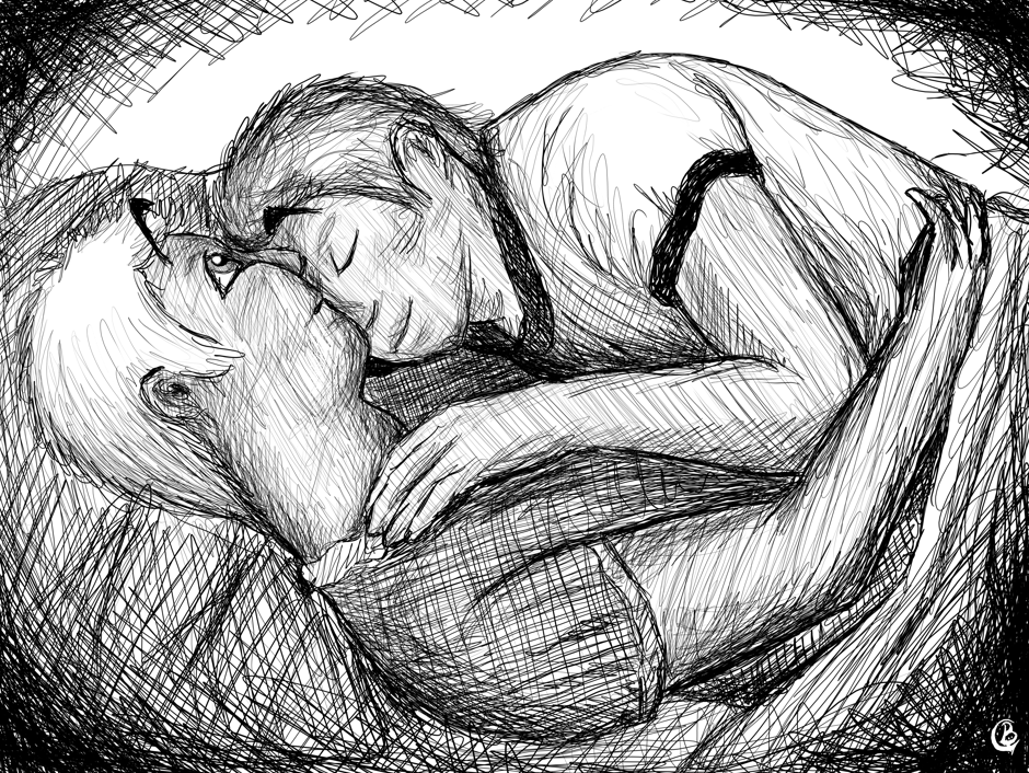
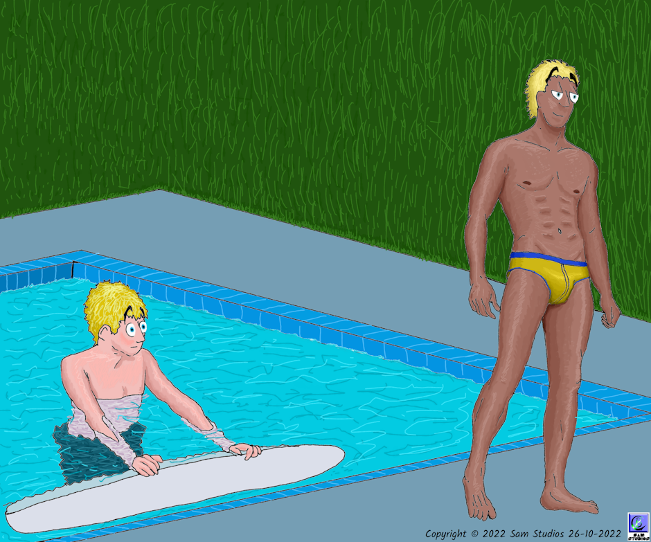
So I'm getting everything together to submit Wild Nights, Hot and Crazy Days for print. WNHCD is an illustrated novel, with most chapters getting their own image. As published here on Tapas the images are all in colour, but obviously colour would not work for a print version. Even as an epub or mobi, most peoples' readers are monochrome. My original plan was to simply pull the colour saturation from my images and publish them in greyscale, but after doing some monochrome work I'm now thinking I'd like to redo the images in monochrome. For those who don't know, the difference between monochrome and greyscale is that greyscale can have different shades of grey, ranging from black to white, while monochrome is either black or white, with no in between.
I gave this a test toast today. I took one of the earliest images, the one from the first chapter (because I will redo them in order so as to not confuse myself), and redid it in monochrome. I did so by hiding the colour layers and starting over with the ink layer, adding crosshatching shading as necessary. I then went back to the original colour drawing and converted it to greyscale.
I present here for your judgement all three versions. I should point out that because this is an early image it is not up to my current standards, but a lot of this was also fixed in the monochrome version.
Here we have colour:
Here is greyscale (which is really just colour saturation turned all the way down):
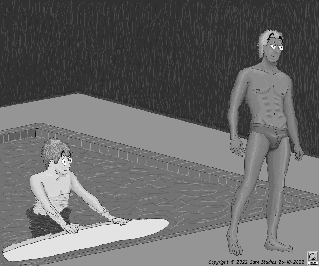
And here is monochrome (I admittedly did allow a little bit of greyscale here in the water):

So tell me, fellow forum members: Which of the three do you think would look better printed on a page or viewed on a Kindle/Kobo?