123 / 149
Jul 2018

Here is the review!

-Art-

I really like the soft almost pastel like color you use, goes really well with the story! I do wish the line work was a tad thicker (not by much, just a bit more so line feel a bit more define). I do know the method you use is a style I see in other romantic like comic, so the thicker line is just a personal preference.

I really like that you constantly change the perspective on the character giving the comic a feeling of movement all around. Great expression and love your 'chibi' style for comedy moments!

The only thing that feels a bit off is the backgrounds (mostly the one showing the building) the line look jaggy or pixelated. If you are using sketchup or something similar (background give that feeling) there is nothing wrong with that, but try to make the lines have a similar style to your characters for a bit of consistancy.

-Writing-

I like the amount of text you use, is easy to read but gives enough information. I rarely mention bubbles, but for some reason seeing them cut-off in the border looks a bit weird to me. I understand space can be a bit hard to achieve sometimes but try to keep the speech bubble completed. I seen some slight typos (most with words that use ' ), nothing major though.

I do like the comedy aspect as I laugh quite a bit, but at the same time there is also heavy subject that are mention and I believe you are doing a good balance of everything.

-Paneling-

Can't say much here, you are using the vertical format in a great way, have a really good number of panels and they all have different perspective or look making them all interesting.

-Story-

I got to say you are doing a great story, it had me hook from the start and using the TV for some exposition was a great use as it allow for it to feel natural and at the same time not feel like info dump at a crucial point. Also she using it like background noise like a lot of us do is perfect. I like that you make it easy to know who are important to the story with the gray layout for standby or side character, it make it easy to distinguish and know the important aspect of the story.

You got a really good comic going here! Hope this help you out and hope you continue the great work :smiley:

Here is the review!

-Art-

I really like the clean art and thickness of the lines, at the same time I like the background and 'mystical' like thing having different feeling to them as line it look more water style and less concrete. Your character design are all good and you have a really great use of greyscale all around, specially in the shadows as I tend to see many just use black for shadows, instead you use variety on the gray scale giving them a nice look.

Also great use of speed lines and effect overall, it really adds 'movement' and dynamic feel to it overall.

I know I mention loving greyscale and is cause I am use to it in manga, but I believe a lot of the audience for webcomics are really use to color and based on the preview thumbnail which is in color it could really help out to bring more audience and interest in your comic.

-Writing-

I feel the prologue drags a bit on, I know setting and explaining things are a most for comics, but for me I like it more when is gradual reveal during the comic instead of exposition a lot in the start. Outside of that I did like the pacing after the prologue. The font goes really well with the art style and is easy to read.

There were some typos here and there, nothing major but something that can be fix, there are many people that like to beta read so trying finding someone to beta read to try and catch such mistakes.

-Paneling-

I feel this uses the mange format and it does it well. Only thing I would suggest is giving a bit more room between panels, it'll help out in balloon placement and giving you a bit more wiggle room. Is just a suggestion as the current space use isn't bad either.

-Story-

You have a good main character which is really important and made the story so far feel nice. Not much has happen so is a bit hard to comment on it, but the setup you have going on right now is intriguing and I want to see how the mission goes!

Here is the review!

-Art-

Your style is constantly changing in the comic, not sure if you settle in a style already or will keep experimenting. I'll comment on the current style use. I like the clean lines, though I see some overlapping in lines here and there. The color are more subdue than in the first which works well as the others felt to saturated. What I am not liking to much is the shadow, a lot of time it looks like smudge colors instead of the shadows, I do like the more solid shadow you use here and there and I think it works best with your current color scheme.

-Writing-

Will again review using the later chapters as I did see improvement in text layout among other things. I would suggest to try make the text a bit bigger. I am reading on a PC so I can read it easily, but in mobile the text can be hard to read. I like the way the talk is in a somewhat crazy aspect, giving them an unique feel and of course makes sense them been assassins and missing a screw in the head most likely!

-Paneling-

Not much to say here, you have nice spacing between them. I'll say it looks a bit weird some panels having outline on top and bottom but not on the sides. Otherwise I think you are doing a good job with the paneling.

-Story-

I never read BL to be honest, but in your case I am glad is not so in your face about this aspect and is more about their jobs as assassin. Most of the cast are insane, but that makes it interesting and stand out a bit from usual 'cool, calm and mysterious' assassins that are more common. Giving it has supernatural aspect to it I am sure thing can and will become more crazy as the story moves along!

Here is my review. I'll try to read as much as possible.

-Art-

Really like your style, it reminds me a lot of Kid's next door with a mix of today's cartoons. It has great bright color, good design. Really like the character design, Honey Bubble's eye are pretty cool. Also like you have variety of characters, great expression and variety of poses. Your background are also good and does give the sense of them moving from place to place.

You also make great use of effect thru out the comic (the flashes, the bubble shield, the sonic wave). You have some really good battle scenes and one can really feel the hits and impact of their actions and attacks!

-Writing and story-

I am combing both since is a bit hard to talk of one without mentioning the other. I am glad you didn't go the prologue route to explain about the two forces and instead slowly lease into it. You made sure to first introduce us to the main character and some of their character traits to give us an idea how they will be in future events. Danny seem weak but he really isn't, just a bit shy but with a strong sense of friendship and loyalty. Danny is the more outgoing happy one but with real care for Danny and knowing to take it easy with him. I ended reading it all, the pacing was perfect, story is intriguing and characters are really fun. The possibility of their power developing and see if their aura can grow will keep me hook.

As for the font, is perfect. I like how you give emphasis to certain words and how you do the 'sound effect' all around!

-Paneling-

You use a single page manga/comic style and it really work, not much I can add. You make great use of inside panel without over using it and I believe you have great spacing between panels!

This thread is amazing! I'm reading through some of the reviews and learning a lot from afar. That being said, it'd be nice if you could review the first chapters of my comic. There isn't much yet, but my friend and I are just concerned about the pacing/art/paneling so far. We tried going for a "storybook" style by incorporating some traditional elements and we'd like to hear if we were successful in that regard...

Here it is!

-Art-

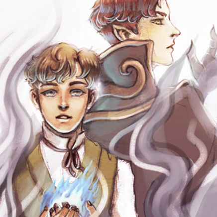
Got to say you have some amazing art. The sketch like line work is really good and the color give a pencil and pastel like quality making it rather unique. It also ties in well with the time period the series seem to take place in. Your proportion are on point and you really give us a nice look of the town using it in a great way for transition scenes.

I normal I leave font talk for the writing part, but I am doing it in art cause it fits more here. I know you selected one for easy reading, but it being so clean and modern clashes a bit with the art style. I think a font like https://www.1001fonts.com/im-fell-english-font.html1 might suit better. Is still easy to read, but adds a bit of imperfection (scribble like) that goes well with the sketch like art. This is a personal opinion of course, just always feel font are really important to go along with the art.

Is just for the text in speech bubble, the one use for effect fit perfectly.

Outside of the font your art is on point, the style is unique in itself, animal, town and people are all done in a great way and you have really good face expressions. As for the storybook, I do believe you nail that feeling with the art. The art doesn't give it a comic like feel even though is format like that, it feel like pages you normally go throw when reading a drawn storybook.

-Writing-

I like that you use different speech pattern on character and give 'accent' to some, make it feel like a more natural speech. I like the amount of text use, it make it easy to read and follow! The prologue is perfect in that it gives a bit of info but leave a ton of mystery and intrigue to keep one hook instead of being an info dump.

I also couldn't find find any typo or error from my reading.

-Paneling-

I can tell you plan for the vertical format from the start and achieve a great method. The panel all flow nicely and you put them in good position moving down guiding the eyes where to go which is important. Great use of black also for clearly tense moment (the crack forming and guy having the scare of his life). Keep up this vertical comic method as is working really well.

-Story-

You just started so not much I can see here, but I'll say you have a nice start in peaking one curiosity on the kid on the tree and what it means so as far as hook goes for the start of a story you did a great job!

Hope this help and you have a really good comic with amazing art!

I'm down if you can review my comic, it's short and I made some very recent improvements to the latest pages. Also the the first few pages are like years old and I didn't feel like completely redoing them, although if you think that's a good idea, I'll consider doing so

16 days later

Hey thanks for the review! I'll keep those in mind when doing future pages! :smiley: On the color subject, I'd really like to put color in my comic, it's just that I'm not fast enough yet and I don't have the time. But maybe sometime in the future...

3 months later

Hello. I would like to get a review, if you still doing them, please.
I know beforehand that my banes are human anatomy, text translation and speed of the updates. =D

Would love a review on our prologue

2 months later

Hey there ,
Can you review my story? Tell me your honest opinions. Thanks in advance.


my comic, i don't know if im outting my comic in right sorry.