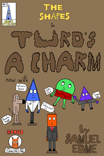
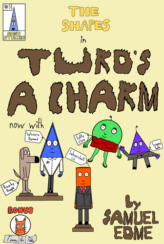
Background color is better but it's not attractive to a random person.
I have not read your story so maybe only your public knows what your cover is about. But for now ... I can't say it catches my eye/attention.
Another thing is you aren't directing the viewers attention anywhere in the drawing/painting.
The first thing you see is nothing.
Take this painting for example:
It is pretty famous since all elements and lightning/shadows are pointing at jesus so the first thing you see is well.... jesus.
Notice how everyone on the right is looking/pointing to the middle and everyone on the left is doing the same.
Also the light is comming from behind jesus. That basically makes you instantly notice him. On your cover your tittle is a dark color but your background doesn't make it shine. So basically you see everything at the same time.
Your characters are the same size with no set positions since no one is doing anything special the viewer can easily overlook your cover.