So this is a review of JETX , which I kinda want to pronounce "Jettix" but it's probably pronounced "Jet-ecks"... but what if it's "Jetks".... or "Jetz"? 
I've reviewed JETX in the past on a different thread, but that was a while ago, so I'm just approaching it afresh. Apologies if the same points come up again.
The overall issue with JETX can be summarised by "this isn't badly made, it's just really, really niche." It's a polished example of a comic for a very very small audience, which makes it hard to review. I don't feel like improving the art or writing would result in more subs here, because the work is already decent quality, it's just in a dated, unfashionable style, and I don't think improving the quality of the writing would result in more subs because it's such a niche kind of comic, "it's like Megaman or Sonic... but for grown ups! So there's swearing and people talk about the intricacies of the evil mad scientist's plot and their plans to defeat him in detail!" The core audience to me, seems to be "nostalgic 35 year old men who maintain megaman wikis and debate whether Robotnik or Eggman is a better name on Reddit", which is a hard sell on a platform that's about 60% 18-25 year old women. It's a bit like a shop selling really well made bowler hats. Everyone can agree that the product is a very nice bowler hat.... but there just aren't a lot of people who wear bowler hats these days.
So while I will be talking about areas for improvement. My overall feelings are that no matter now hard you work and how much you improve, the only way to really grow the audience for your work is either to move more into print and start making stuff for children, and/or to modernise the style a bit, maybe look at how modern Megaman and Sonic art has evolved to make the proportions sleeker and cuter, and smoothed out the design a bit.
Ultimately, there's nothing at all wrong with making exactly what you want to make for your own enjoyment, but I feel like from the amount this comic turns up in promo threads, and the large, repetitive "like comment and subscribe" banners in the comic itself... maybe you're not happy just making this comic for your own enjoyment, and maybe you'd be happier if you made some changes to help your work to appeal to a bigger audience?
I know what it's like to wish you could just draw exactly what you like and have people flock to it because it happens to be perfectly on-trend and right for the audience on a big platform like some people are able to do. Ultimately though, it's necessary to ask yourself that hard question: "Am I actually happy just making this for myself? Or am I willing to change my work to gain an audience?" It's worth mulling over.
Design Talk:
Overall, the design in this comic is decent enough, with a pretty professional looking logo, decent speech bubbles and a solid choice of font. For the most part, the design is strong, publishable quality, so good work on that.
It does however, do one of my pet hates or a Tapas comic, which I brought up at least once in the last thread, which is: "comic that uploads in single pages and every page has a really big banner underneath urging people to like, comment and subscribe". This banner is incredibly obnoxious when archive bingeing (because the episodes are short, you'll see this Call to Action about once a minute when reading) and feels a bit desperate.
If you have to have something like this, it should be smaller, maybe just a simple white background with just a list of social media links, maybe a little doodle rather than art that's more finished and detailed than a lot of the panels of the actual comic. If you're keen for comments, asking the readers a question to leave their answers to in the comments, like the creators of Dolo's Destiny Capsule do on their episodes, is maybe a more effective approach than just telling them to comment.
Art Talk:
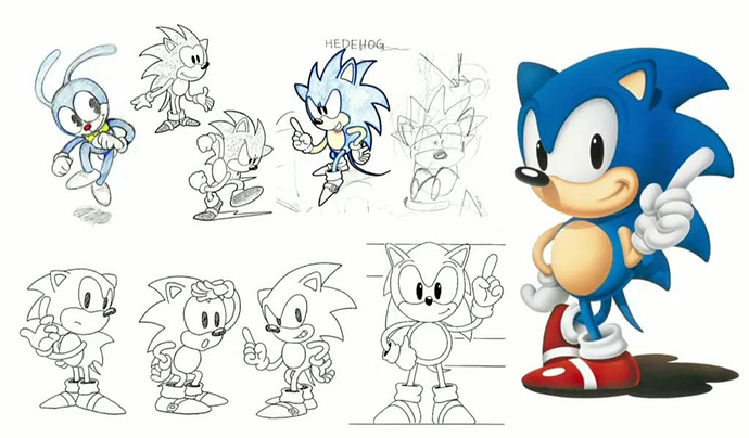
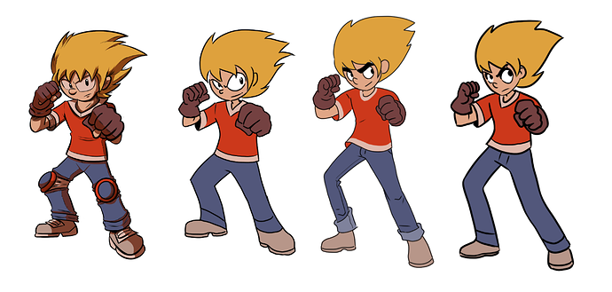
I feel like I said this in the other thread, but my feelings about the art style in JETX are that it's not necessarily bad, it's just really not my personal cup of tea. I was trying to get my head around why the art style looked familiar and then I realised what it reminded me of. The Sonic the Hedgehog cartoons from the 90s and the Sonic the Comic mags I read when I was a kid at that time. Sonic cartoons from the 90s are kind of fascinating in art style. Nowadays, we have a lot of artists like me who grew up with manga and Japanese games and have a more "clean" aesthetic to our work, influenced by those works, but in the 90s, when we were kids, we were all absolutely wild for Sonic and things, so companies wanted to churn out Sonic content, but the pro illustrators of the time were drawing cartoons more like... the Bash Street Kids, Viz or Garfield. So comics from this brief period feature characters who have the proportions and design elements of something from a Japanese video game, but rendered through the cartooning of people who normally draw knobbly-kneed kids with these protruding eyes with big eyelids and dimpled cheeks. Whether intentionally or unintentionally, that's the look the artstyle of this comic immediately evokes.
Now I can't see the future and nothing is certain, but right now, obviously, this is a really unfashionable art style, and I'd be surprised if it came back into fashion any time soon. If anything, cartoons seem to just get sleeker with cleaner lines as animation trends move towards vector lines and 3D models. So as I said earlier, it's not that this art is bad, it's just not fashionable. It's really your choice if you want to stick it out in case of a cyclical trend, but personally, I'd advise modernising the style if you want to build an audience any time soon.
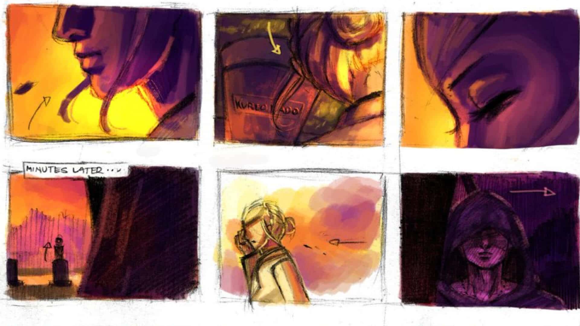
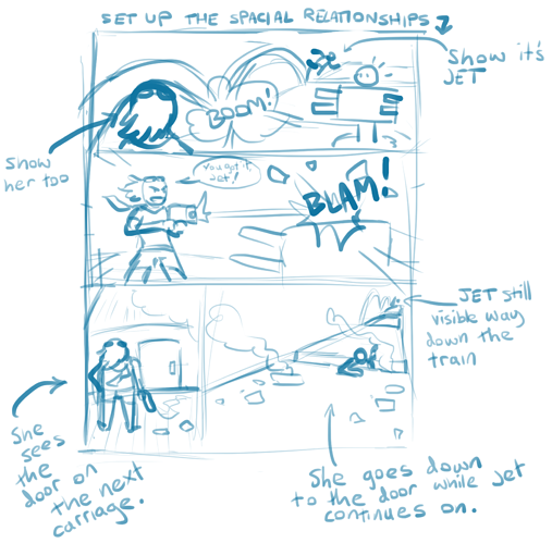
As a general area for improvement in terms of visual storytelling, there are often too many panels in this comic in a way that makes the action really drag and feel slow. Like on this page as an example: https://tapas.io/episode/1540834 What is the function of the bottom left panel? The visual storytelling would be clearer if it was something more like this:
So here, we set up the scene in panel one. Jet has just smashed through one of the turrets and is speeding off down the train and left Katrina to take care of the other. We see everyone in this panel so we know who is where.
Then Katrina shoots the turret in the head! Boom! No problem!
She sees her next destination: The door to the next carriage.
She climbs or jumps down to it, while we see in the distance, Jet is still whizzing up the train and he's already in the distance in those few seconds that have passed.
This streamlines and clarifies the storytelling. There are generally a lot of reaction shots of characters in this comic where there's a whole panel showing a character's face, looking at something, but a lot of them are unnecessary, because the character isn't reacting to anything or pulling an expression that shows a particularly strong or interesting emotional response. So it often feels like there are fight scenes that go like: "Enemy is running" "Close up on hero looking vaguely alert and interested" "Enemy attacks! Hero dodges" "Close up on hero with expression of mild exertion." "Close up on enemy looking vaguely annoyed" "They both land and look at each other." It feels like maybe you're drawing lots of panels on a page, then looking for ways to fill them rather than thinking about the sequence and drawing only what's needed to get across the most important info.
The other issue is that sometimes when there are lots of panels following a thing moving in a linear trajectory, they not only make it feel like the thing is moving slowly, but also make the trajectory confusing. Like here: https://tapas.io/episode/1724750
Baddie shoots a beam, moving diagonally up-right, we see another panel of it diagonally up-right, then when Jet saves Kat from it, it's going horisontally right. We can tell it's the same beam, but there'd be stronger momentum if it was moving the same direction every panel.
Writing Talk:
I feel like really the plot of this comic is pretty much just a barebones excuse for the action to happen. That's not a bad thing, like John Wick is a movie I love in which the plot is just "ex assassin's dog gets killed and now he's angry." It doesn't need a complex plot really, it's just the minimum needed to set up all the amazingly elaborate fight scenes as Wick fights his way through the entire mob.
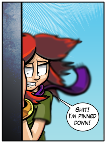
I do feel like when the plot comes up, there's too much text crammed into as few pages as possible, resulting in a speech bubble traffic jam like this page: https://tapas.io/episode/1540858 I feel like a lot of this info could be simplified down into less dialogue, or it could be spread out over more panels to build suspense and personality as the characters discuss their feelings and motivations.
Right now, the characters don't have strong personalities. The villain is a pretty typical stock evil mad scientist, the hero is basically Sonic the Hedgehog; a cocky speedster who doesn't take things too seriously and isn't particularly studious but is determined to stop the baddie, and the other two characters are kind of his more sensible sidekicks with the girl filling the typical "girl in a boys cartoon" role of basically acting like the protagonist's mum or teacher and rolling her eyes and scolding him for not paying attention but always forgiving him.
There isn't really much "downtime" where the characters get to actually pause for a moment, reflect or show any kind of emotional vulnerability, so it feels a lot like a cartoon for young boys. If the intention was to make this for kids, this would make sense but... and I know I've brought this up, and I've seen other people bring this up.....
I just don't get why there's swearing in this comic that seems like it's for kids, or adults who want to enjoy simple, innocent comics like the ones for children where there's no sex, blood, alcohol etc. It just feels out of place and like it's unnecessarily narrowing the audience. Kids are the biggest growing audience for comics right now, and if you wanted to succeed with a comic like this, it'd just make sense to legitimately pitch your work to that audience, either in print, or by making a child-friendly website for it. Simply removing the swearing would be enough to sell this as a comic for children.
Overall, as I said, it's not a bad comic, you just need to think about your goals and what kind of audience you want to build, and the possibility that you might need to make something different or change it a little or try a different platform to get seen.