I actually thought about this waaaay too much when I was planning Errant.
In the past, I always lettered all my comics IN UPPERCASE because that's how localised manga tends to be lettered and that was my biggest influence. But as well as a manga fan, I also rather like other comics, and I noticed that Marvel particularly contrasted DC and other superhero publishers by using lowercase lettering.
When you look at the effect this has on Marvel comics compared to other comics in the same genre, it gives them a grounded feeling. Marvel comics are about superheroes who are ultimately very flawed people with often surprisingly ordinary problems going on alongside the big heroic ones they have, and writing the dialogue in normal sentence case makes it more like ordinary speech rather than heroic proclamations or exclamations. DC comics use uppercase lettering, and it gives them a grander, more heroic feel that suits the tone of their universe.
On a practical level:
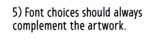
THE MAIN ADVANTAGE OF ALL CAPS IS THAT IT'S EASY TO READ ON SHORT SENTENCES AND HAS IMPACT.
Sentence case lacks that impact, and on a single word or a short sentence may not parse quite as strongly, but if you're rambling along in a conversation, perhaps with lots of punctuation; semi-colons and such, you may find that reading a sentence of such length would become quite uncomfortable were I shouting all of this.
So in other words, upper case works best if your comic has small amounts of short phrases of dialogue or captions. Like an action comic that's dialogue light, or a gag comic that's got a punchy tone. Lower case works better in comics with longer, more complex sentences or paragraphs of text and more naturalistic writing.