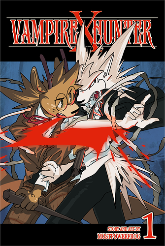
@BoomerZ thanks for the feedback! i think im gonna test putting the title in front of the characters to help with legibility  and good note about the lack of contrast on the shadows, i totally missed that!
@sunshineyon hey thanks! yeah i think folks are having a hard time reading the title since its behind, im gonna change it and see how it looks!
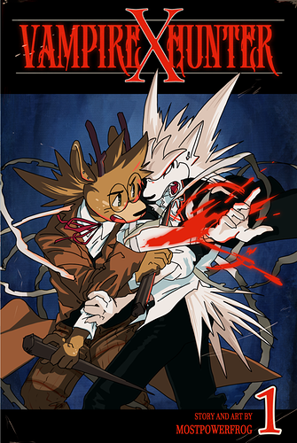
@artamazon good point about the font being too delicate for an outline, i hadnt thought about that before! im gonna test out maybe thickening the font or just using the red and see what looks best! same with the font at the bottom, i think that’ll really help
thank you guys for taking time to give me some great feedback!