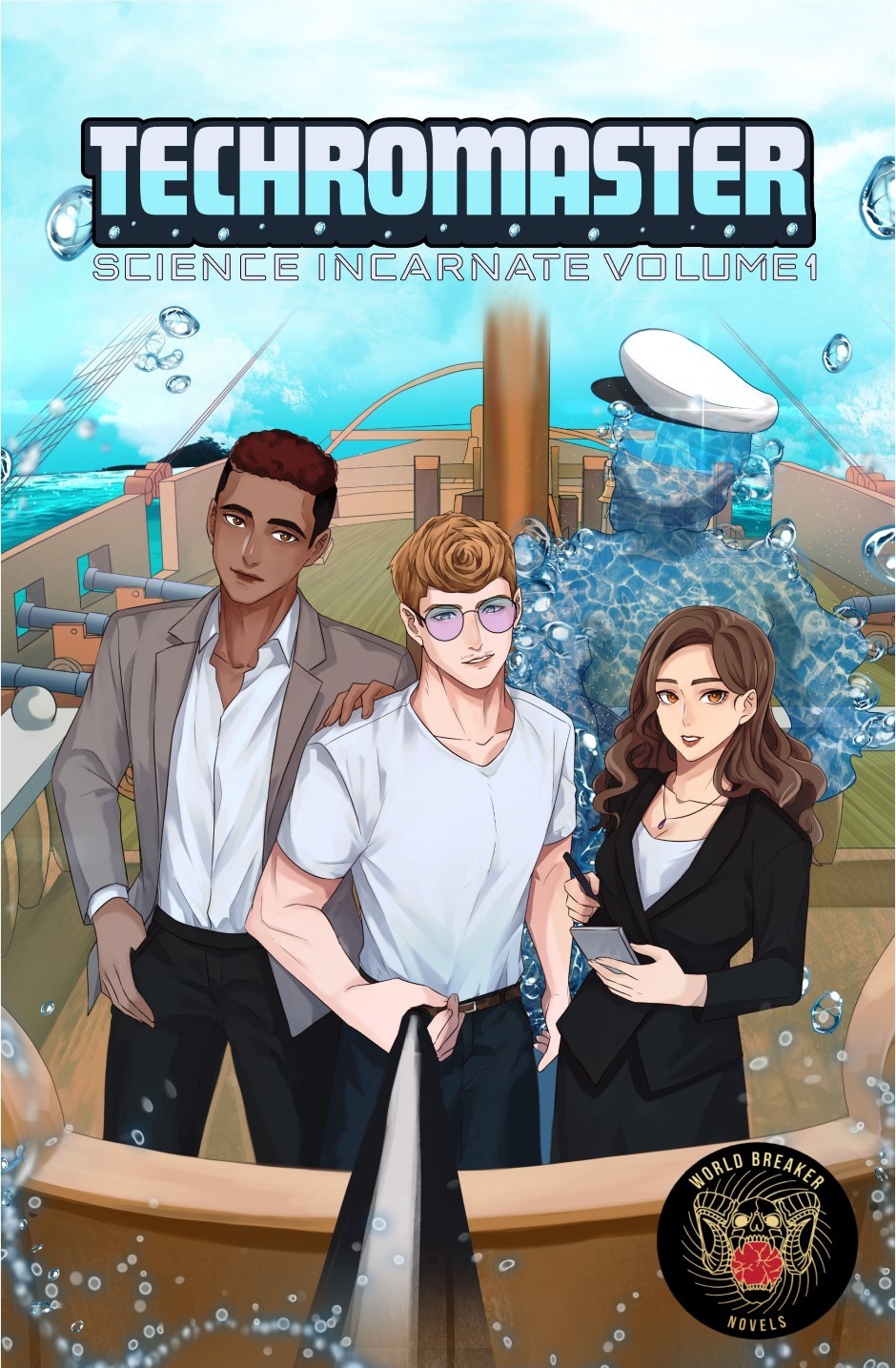
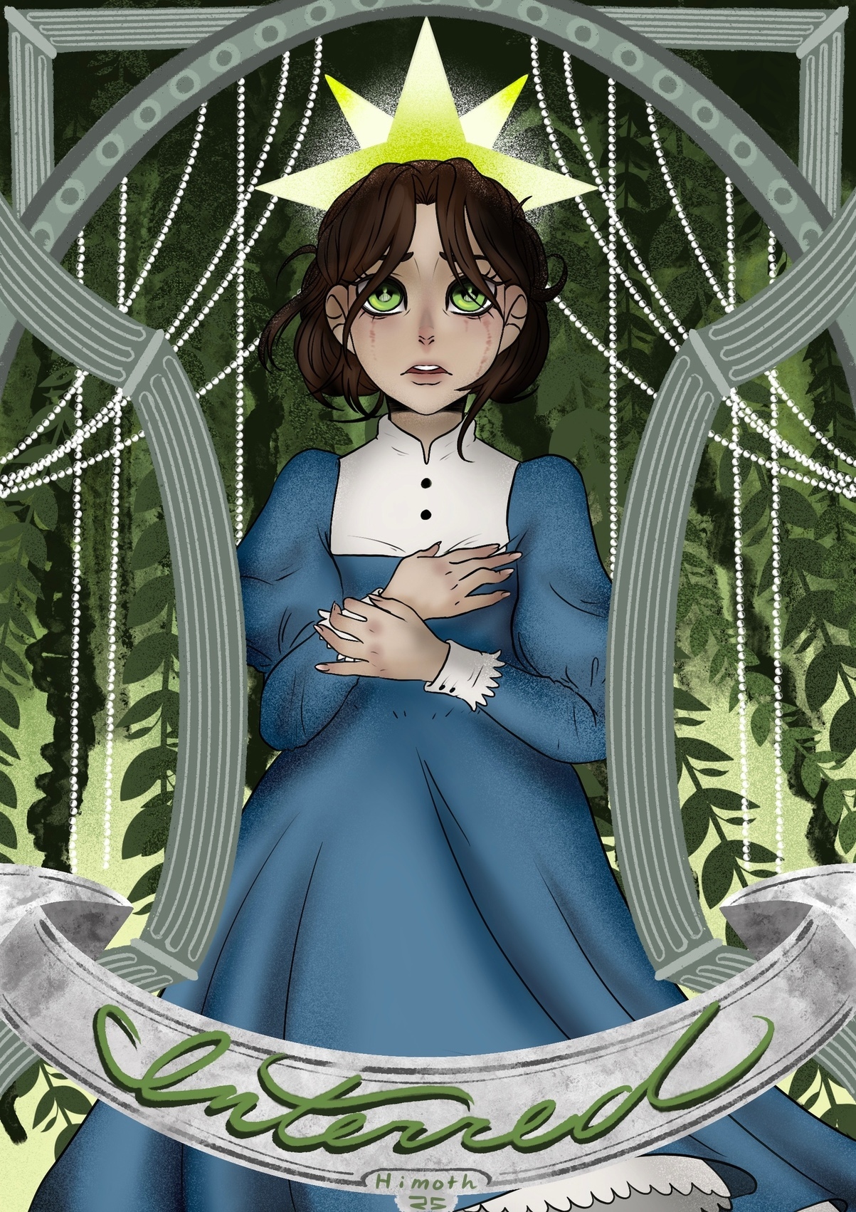
I do prefer the second one better, I like the colors and the poses, If anything I'd push the poses even further but that's just preference.
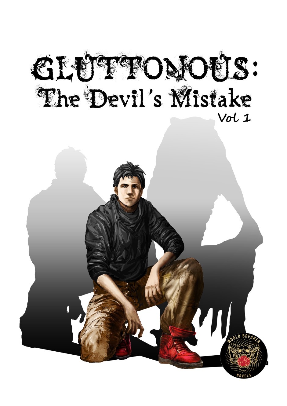
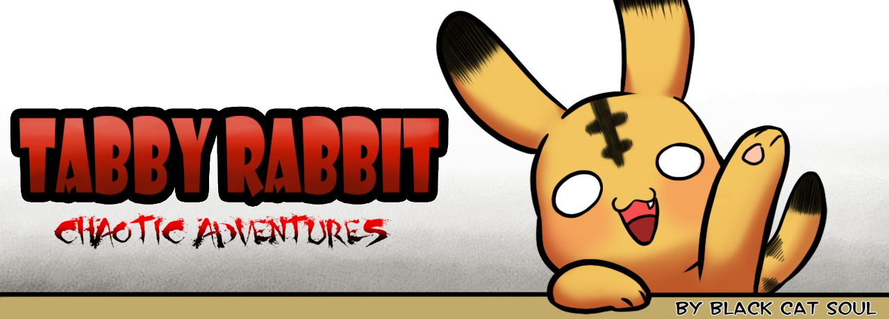
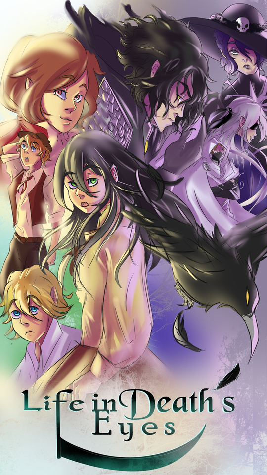
I like the logo and the pose, I'd like to see the character get a little bit more protagonism, I feel he's a tad small in his own cover.
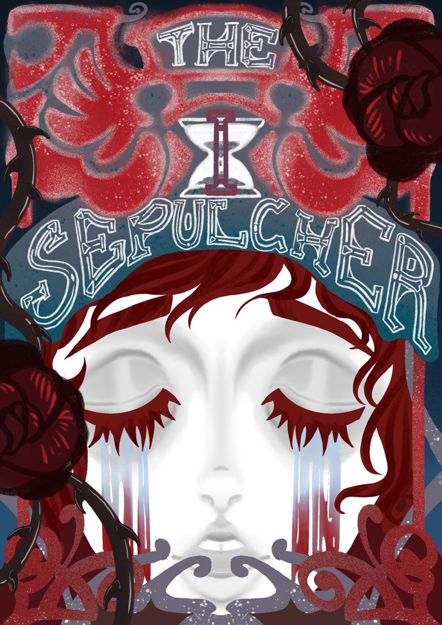
While I like the duality theme it has going on, I feel like the logo could use some work, like the letters could be different or have different colors, or the shape could be different for both sides or something like that.
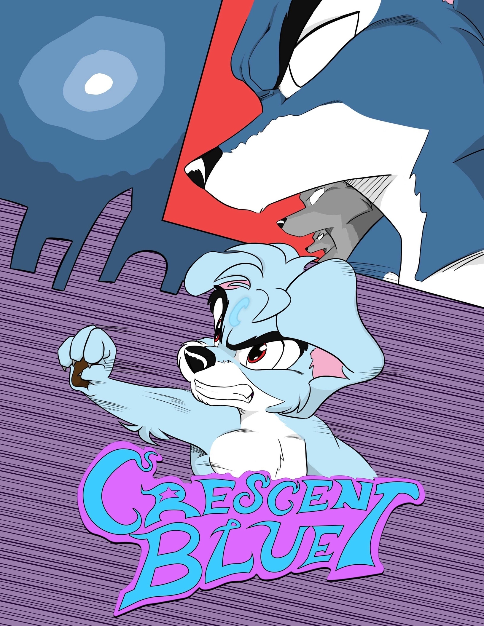
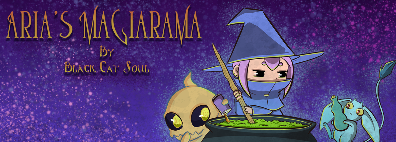
Oh I like the action in the first one, but I feel like the bg works against it. The new logo and cover do look better overall and does a better job of presenting the characters, I'd add a bit more action like in the first one, but that's just me.