alright, i wouldnt mind a critique for There was a War (but bear in mind the art changes and improves significantly in later episodes)
as for abby normal. lets start by saying this is so cute. from the tone to the characters. i really like the potential for a (grand)mother/daughter type relationship here, rarely seen in comics, and i love how carefree nana is. also, your palettes are very nice, and add to the kinda sweet vibe you got here. the switch to blue for the later pages is really nice for drastically changing the mood as well. im not sure abt the warm pinks used in the first few pages though; they seem to contrast with the emotions being expressed, and i wonder how a lilac palette would effect the mood. that said, its not smth i dislike, like the low contrast and saturation makes me think of summertime depression, so its still got an effective emotional connotation.
your composition is also nice and clear, and its clear you understand the concept of throwing a light on the area of focus. but i think you could increase your contrast between light and dark; have lighter lights and - more importantly - darker darks. i dunno if the slightly faded look is intentional, but i think higher contrast could really increase the pages' impact sometimes.
your backgrounds are very nice, detailed enough and effective at drawing the eye to the characters. i think theyre very pretty and set the scene well, and i love the kinda felt-tip-pen looking starry skies. they remind me of childrens illustrated books, you have to show me how you did that. but again, levels could be your friend here. like:
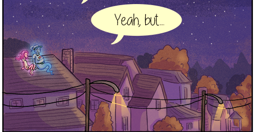
this is a very very nice background, but what if you darkened those trees? what if you made the buildings more shadowed as they move further from the characters, and higher contrast on the light thrown on the building theyre sat on? it could really increase the impact. (this isnt a definite 'do it do it its better' btw. it could be that this softer look all round is far better for your tone, i just think its worth trying to see what you prefer)
also, i think you should do backgrounds for more panels. like this one
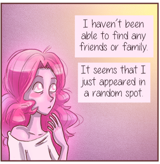
because its fairly big, and right after a panel that also doesnt have a background, it looks a little bit odd. you could frame her / her thought caption in a window, maybe. have the rooms walls in a dark pink, and the view in a light orange. something simplistic like that wouldnt take away from the character, but would maintain the sense of place.
your villain(?) designs are clever, taking away key details like the pupils and noses and generally making them a little less human, and more reminiscent of 'bad' ghosts in pop culture. its effective at making them look sinister, while also cool. im personally hesitant about the decision to make your first poc a villain, but since the comics in early days and i know nothing about these characters im definitely not finger wagging. the other villains design is really good though, with the spiky line language that contrasts really sharply with petunias soft curly design.
i say this next bit mostly bc i say it to everyone, look into the concept of gesture / motion to see how it can improve the alive-ness of your work. its an area of weakness for most people, and it will really open your eyes and put your pages on the next level. proko has some brilliant videos on gesture on youtube. speaking of fundamentals, id say your anatomy and form are good, for the cartoony style you have, although its always worth looking more into form for similar reasons as gesture.
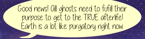
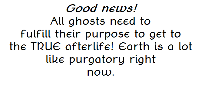
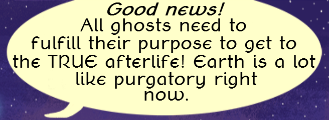
also, with your lettering, you might find youll have a far easier time fitting stuff in if you put your text into diamond shapes. eg:
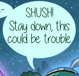
becomes
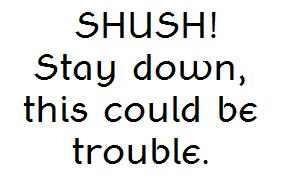
(ignore the font) which takes up less space and fits a text box easier.
another example:
becomes
becomes
ill finish this critique by saying i really like your concept, and im very very interested to see where you go from here.


