1 / 36
May 12

So I visit the forums very sparcely nowadays, and now that I have visited it again I might as well set up a thread to get more involved

So here we are! If you want, I can take a look at your art and maybe I can give you help if you need pointers on something you wanna work on.

I do have a disclaimer, if you are better than me at art there is a good chance I may not be able to help you :grimacing: also if you can't take critiques it might not be such a good idea to take part here

  • created

    May 12
  • last reply

    May 19
  • 35

    replies

  • 807

    views

  • 1

    user

  • 42

    likes

  • 11

    links

Hello DualDragons, It's been a while. I know you may have seen some of my pages and gotten to know my art but can you tell me how far my art has gone by comparing the first page to the latest? I don't mind the critique, so long as it helps improve my pages.

Hmmm my biggest advice would be to make use of more space. Both for panelling and the content of the panel. If you do that, you can create a opportunity for yourself to draw the eye to something you want the reader to focus on.

Right now a lot of things and panels are very closely packed together, which can make it hard to determine what you should be focusing on in the panel. If you keep this in mind when drawing your panels you may have a easier time determining how to draw said panel.

Hmmm I think there is a lot to improve, but lets start with anatomy. Can I ask how you construct your figures? Your characters feel and look rather flat at the moment.

So more space for both the panels and text bubbles. The problem for me is that Tapas tends to reduce the quality of the page, which is why I want the panels to be as big as possible.

I will upload the next page by May 21st but with your advice and see how it goes. Do you read comics/novels on Tapas by using PC or phone using Tapas app?

I almost exclusively use my phone (simply cuz more often than not when on break I do not have my pc with me)

Don't know what your "art-level" is, but feel free to judge me as brutally as you can :slight_smile:

Keep in mind that I've been working on this since 2020, so there's a noticable evolution in quality from the 1st episode to the most recent one.

I draw faces by muscle memory (not sure if should keep doing it), i only try doing boxes when there is a action sequence but it doesnt happen very often.

Hmmm I would recommend you really should start with using shapes and guidelines. From what I saw you use digital art so you can use different layers to help you out. Then once you lay the groundwork/sketch on one layer, you can draw the actual details (hair, clothing, eyes etc.) on a new layer.

And don't be afraid to use references. Drawing from memory can be handy if you are comfortable with what you draw, but if you aren't then google is absolutely your friend. Countless others have gone before you and I, and we can learn from them.

Not bad at all, infact what I'm seeing is really good. I think you nail what you are going for (and you are better at foreshortening than me xD)

I may have some nitpicks (like that you could use a bit more space between panels for some "breathing room" if that makes sense. And I think the shading on the background is a tad bit dark sometimes combined with the soft shading, it gives a muddy feeling for me. But those are most likely my preferences so take it with a grain of salt

The render style for the background is actually something that has been bothering me as well for a while haha.
I was actually planning on switching it up come Chapter 3.

Got a concept of it here (ignore that it's called Ch04 concept, that's referring to her costume design haha)
https://www.artstation.com/artwork/VJOe2n2

I'd prefer you provide critique for the recent chapters starting from season 2 since that's where my artistic approach takes a significant shift (tough you're still free to read the earlier stuff as a basis for comparison).

Something's been bugging me about my current art style, but I can't really figure out what? Def open to any pointers/tips you might have!

First three episodes are remasters from late 2023 so everything after that will be at least two years old lol aka major dip in quality

Sorry been a bit inactive atm, cuz the weekend is over.

I did notice everyone posts links instead of art, and while I understand it does make it to be frank, very annoying. So I'm gonna impose a new rule: please post your art instead of a link to a comic. That's what I'm more interested in critiquing anyways

Didn't realize you preferred art instead of links, my bad!

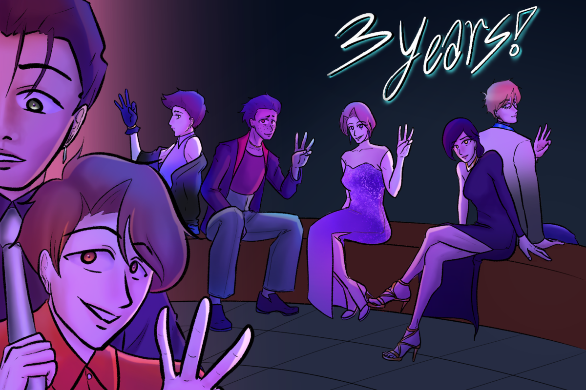
Here are some pieces I made recently, the styles kinda flop around but maybe there's one that looks "better" than others? If you're only looking to critique one specific piece instead of general art, feel free to just choose one!

I think my current concern is landing on a rendering style that fits my art best, also colors, I never feel good about the colors ;__;