22 / 23
Nov 2020

Idk, it's hard to say. I observed techniques used in the styles of my favorite artists and used the ones I liked. There was a lot of "Oh, I like the way this artist does noses" and "Oh, I like it when I eyes this way". I'm still developing my style, so I let it change as my story continues. Lately I've found myself detailing my character's faces similar to how Hirohiko Araki does, but I still have the same style of noses and eyes as before. It also helps to keep in mind the tone and feel you want for a drawing.

It takes a lot of time spent drawing and referencing other artists to get an art style you like, so for now you could try to be flexible and experiment a bunch. That might make it easier to find a style you're comfortable with :smile:

I tried for years to draw pretty girls and sexy characters that looked as amazing as the great comic book artists but I just couldn't do it. So I made peace with my crappy stick figure style art and just used that. My desire to make the comic was greater than my disgust at my terrible drawing. But I think it is unique at least.

I change my style dramatically depending on the project. Like there's different types of illustrators, and I'm a chameleon type illustrator that isn't really hung up on drawing a style that looks "iconically me"

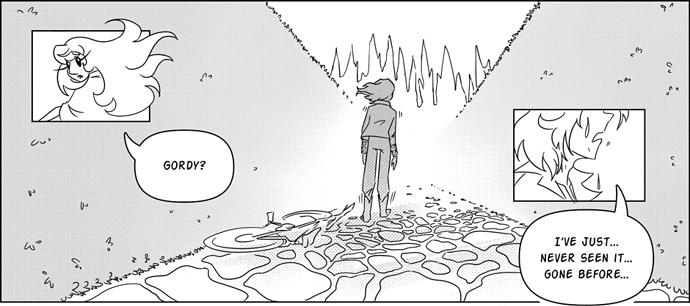
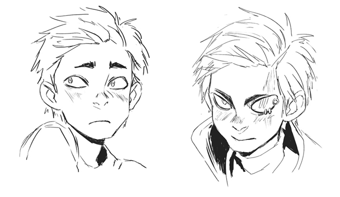
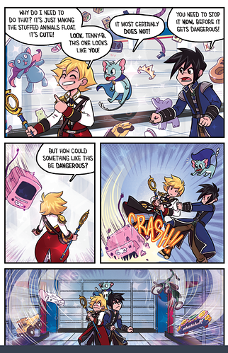
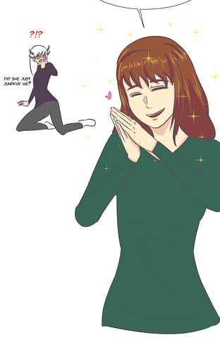
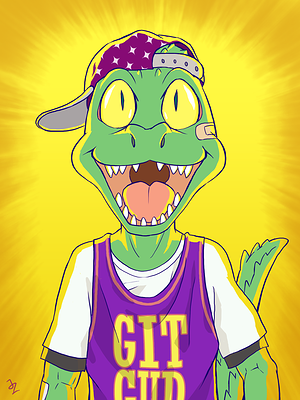
So for Alchemist Burn Outs, I needed something quick and flexible, but also something that really felt nostalgic--I wanted it to feel more like a Sunday comic vibe. I wanted a little bit of a TinTin vibe, and as I did studies of different linework, I really gravitated towards simplicity. It was light enough for the more sillier moments of this story, but I could still reign it in to get serious if I needed to. Yet while I could make things quickly, it was not in a format that is easy to read on a phone, so it suffered for it numberwise, despite how much I enjoyed making it. Which is fine, I wasn't really planning for it to be a sensation haha.

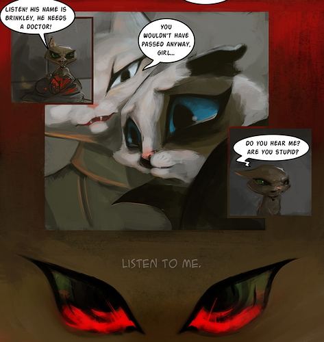
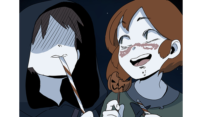
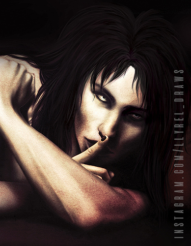
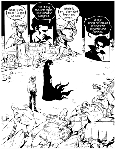
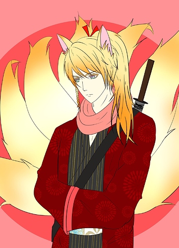
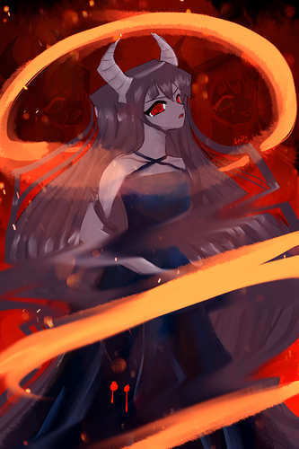
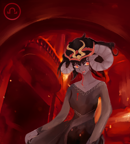
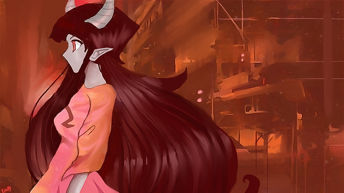
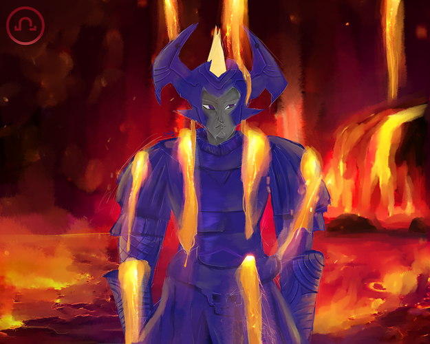
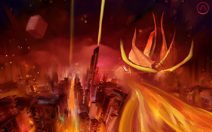
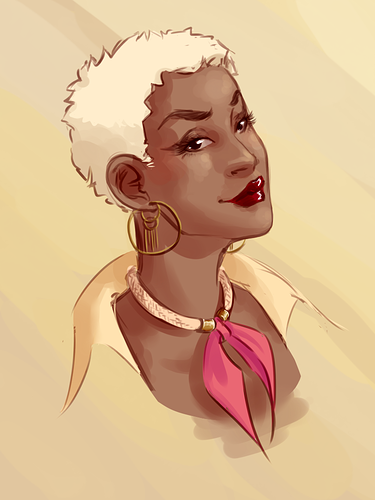
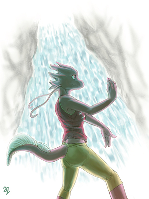
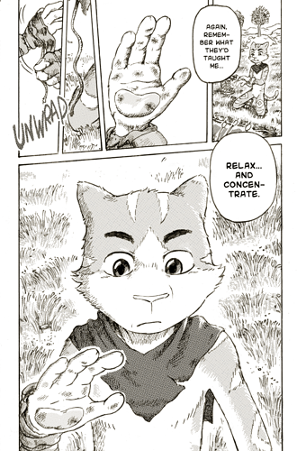
For another project I did, Avu, I did it very painterly--and I think part of why Alchemist Burn Outs is so simple is because...I was sick and tired of doing painterly comics. I still enjoy em, I still update Avu on occassion, but I just can't do it very often. It was kind of my first legit comic, and it really shows because I didn't really make a sustainable model. I chose painterly because the world is so strange and weird, I felt like I needed to really show it 1:1. It's got cat creatures, and magic, and unlike other projects I've done, it's hard to know what's going on storywise, so I was hoping that the realism could keep it grounded (it didn't.) I created it during a time of carpal tunnel and so now I have this problem where I paint completely differently now than I did before...so...I'm figuring it out, but my style for this project will need to change because...I just can't do it anymore.

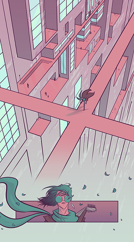
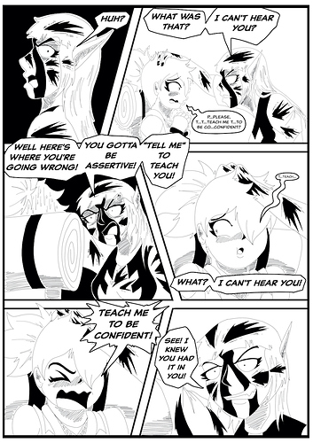
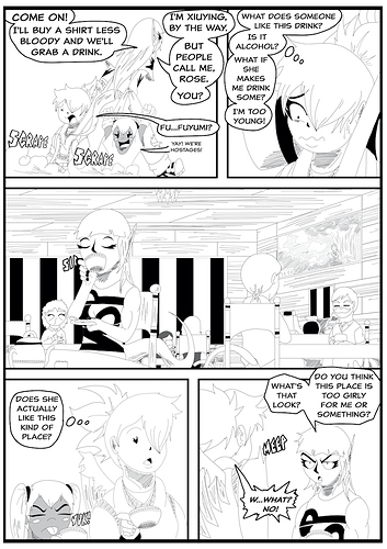
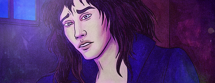
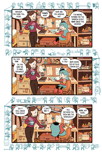
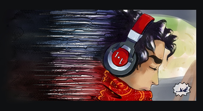
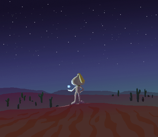
Then (gosh I have so many comics on Tapas now) I did a short story where I wanted to make it very quickly in time for the Webtoons contest--so I knew I'd need color, and I knew it'd have to look good on the phone, and so I made a quick color palate that I thought looked cool, and then just messed around with gradients. The look and feel of Bardsong is one I like a lot, but it was entirely out of necessity that it is the way it is. The linework is simple, I used a program to get the flatting done, and then I just plugged in clipping layers on top of gradients, which looks complicated, but is a nice simple thing to get.

Like this is a big illustration quick tip--you don't need a lot of colors to tell a story, and making a limited palate just saves so much time, so this one was just a love letter to that muted color of turquoise, I just love that color so much.

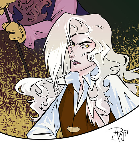
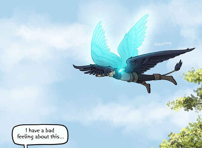
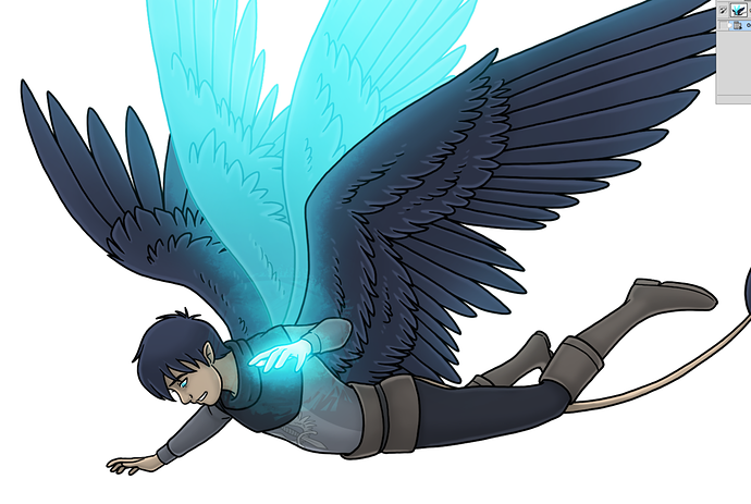
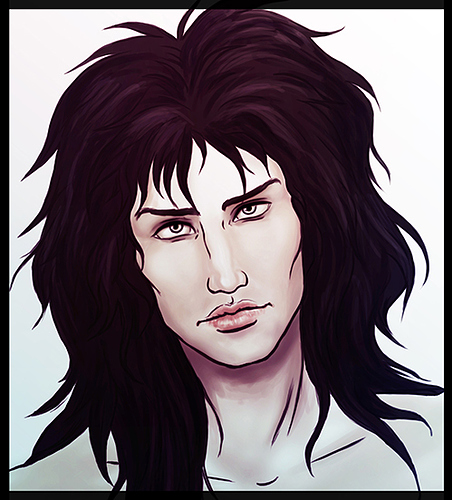
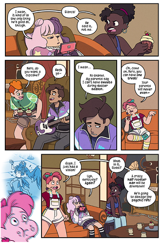
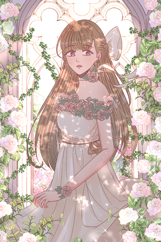
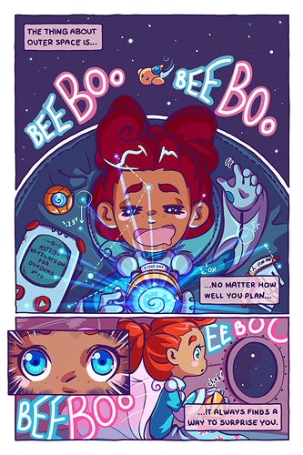
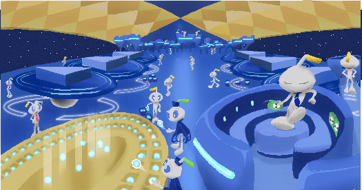
Then for my current project which I post little panels of occasionally although I haven't updated it yet (which I really need to make a name for, I...suck at naming comics) I decided to bring back color, but to embrace what I learned doing Alchemist Burn Outs and what I learned on Bardsong and cut down on time. So, to do that, I used a thicker brush that I fell in love with while doing Bardsong, so that it would be easier to do flatting. I have the coloring style I have because I have it attached to actions, so it's a little easier to get clipping layers laid out. I have simplified figures but I put more detail in to hair to balance it out. I do things to get the semblence of painterly comics without...busting my hands for it.

And as far as my style for writing novels goes? I read way too much Terry Pratchett as a kid, that's really all there is to it.

I was originally trying for a semi realistic Anime/Disney/Ghibli (backgrounds). I don’t know what it has become, but I’m happy with it. Currently trying to be more expressive with my characters faces (and more consistent) and exploring more exciting compositions/page layouts. :blush:


I really want it to be an experience for my reader - as if they were watching a movie? :thinking:

Other things that are important to me are anatomy, lighting, emotions, hand gestures (so many hand closeups lol!) and body language. I like little details and Easter eggs too (though I don’t think anyone has spotted them yet). :sweat_smile:

I started with pure anime style, then went through the awkward "realistic" phase, then just sort of mixed them and here I stand.

I didn't changed my style for it to fit anyone's expectations, so I think some may find it too cheerful and maybe somewhat inappropriate for the comics I am making. Would my comics be better if I make them more "mature" looking? Maybe, but then I want to be comfortable drawing them, so it has to come naturally.

Overall I think my style is pretty generic :sweat_smile: Sometimes I tweak things a bit for them to fit the particular comic I am making, because I see all my comics somewhat different. Maybe I need to push that a bit more, but everything I draw is constantly changing anyway.


I kinda fell into drawing a manga style.
I really liked Dragonball Z and started drawing Spider-man and the X-Men in that style, not knowing that that style had a name or was even from another country.
Then in High School, I discovered a series of books in the library called "How to Draw Manga", and just kinda took it from there.
I thought about going to a more traditional style to look more "Western", but it felt too limited. Manga felt more expressive; like there were fewer limitations on how someone can look or express themselves.
Pretty proud of how my style turned out.

Wish I had some old art to show how far I've come, but I kinda threw out the older stuff I couldn't bear to look at anymore.
Back when everyone's fist was clenched so I didn't have to draw fingers.

For me it was more of a "let's go with what I can do best without spending too much time on each page" than any super conscious style choice, lol :sweat_smile:

I mean, if I had all the time/resources in the world, this is the style I would have loved to use for my own comic:

Too bad that doing a single page in this style would probably require from three to six months, which is... not very feasible at all, lol :'D

So I decided to simplify... a lot:

And then, since working digitally would still take a bit too much time, I decided to switch to traditional art, while also simplifying some more (eyebrows became a solid shape instead of having individual hair, the lips don't have any lines at all and there's a lot less shading going on in the hair):

Working traditionally also had a pretty heavy influence on the colors I would use: markers and watercolors are best suited for brighter tones, after all, so I tried to combine bright/colorful palettes with a spooky atmosphere:

...And that's pretty much what I'm still trying to do, even after switching back to digital :'D it may not be exactly what I'd planned at first, but it's something I can do quickly without constantly feeling like I want to cry 'cos I can't achieve the exact results I want, so I'm happy with it XD

In my case, I'd been focused on manga art in the past, and even placed in national manga competitions here in the UK in the mid-late 00s, but then over the years as an illustrator with manga being less fashionable had less and less opportunity to draw manga-influenced work, so when I got the opportunity in terms of time, to draw a webcomic on a manga friendly platform, I was happy to indulge my weeby love of drawing that way, which is why Errant has a manga feel.

The colouring style I wanted to push for a balance of polish and speed. I really liked the strong edge highlight in stuff like Spiderverse or Persona 5 and did some experiments with it. I really liked the result and found that the highlight was flexible because I could change the colour to change the tone of the lighting in a scene, and also meant I didn't have to shade most of the characters. Very convenient!
The colourful explosions and just generally brightly coloured aesthetic were...er... because I really like bright colours hahaha. :sweat_02:

Writing-wise, one of the most impactful decisions I made was "no inner monologues". I'd written the first draft of the script and mostly used other people's perspectives on Rekki, but had one scene where she monologued to the audience, and it felt really out of place that we only heard her thoughts in that one scene, so I thought... why not go for a cinematic feel and just not use any thought bubbles?

Overall, I'm happy with it, but it would be nice to do another comic with a different approach some time for variety!

I don't and I don't think generally you should. I think you should learn the fundamentals and study artists you like and let a style develop naturally

I decided on my style once I started to stray from anime and wanted to do my own thing; so I got a semi-realistic/natural art style that I like and now regularly use. Which, by the by, is still developing as I learn new art techniques.

For my series, I just went with my style and will go with it for the other series I have in mind.

I always like to think about what the mood and feel of the story overall is going to be, and how to best portray that through the artwork, and balance it with how quickly I need to be able to complete pages.

So whether it's supposed to be super shiny and full of fun anime nostalgia...

Or a little more grounded, desaturated, and real-feeling...

Or I want it to feel like an animated cartoon...

Or like a grown-up manga...

Or I'm trying to stay on-model for a licensed property...

Or I want it to capture the feel of contemporary American comics...

Or I want it to feel like a children's drawing...

Or I'm limited to a greyscale color palette and have to keep it simple for very short deadlines...

...you get the idea. There are a lot of things to take into account, and sometimes there's a lot of trial and error or experimenting to get the mood right before I jump into a new project. But I typically know what I want it to FEEL like before I even get into it, and then it's just a matter of making it LOOK like how I know I want it to FEEL.

I really like how in Hollow it flips between the colourful cute (innocent happier times) pages and the more mature (uh life! Is hard) pages.

Hollow is one of my absolute favourites - and I’m really routing for the MC. :heart:

Aw, thank you! That genuinely means so much to me. And I'm really glad you like the style shift, that was one of the things I had decided on very early into the scripting process, because I love playing with different styles and tones so much. It was definitely a bit of an experiment, since I've never used multiple styles in a single project before, so I'm happy that it's been a success!

Experimentation. When I started my comic I barely new how to draw at all. It took me about 20 episodes to solidify my art style and the general aesthetic of the comic. I tried lots of different techniques and styles along the way. Now I’m going back and redrawing the earlier stuff to match my current style so that the project feels cohesive.

When I first started my art journey in 2017, I immediately went straight for an anime art style (hugely influenced by the fact that I just started watching anime in that year)

Fast forward to many MANY drawing practices with cute anime girls, I switched to drawing ikemens because I was inspired by a person I looked up to on Deviantart who only drew pretty boys

... and so, that began my 2 year art journey to hone my skills in drawing anime pretty boys :sweat_smile:

Which unfortunately stunted my skills at drawing females

Those images above were from my abandoned webcomic in 2019 btw :joy: After that failed comic attempt, I stopped drawing girls because I just didn't understand how to draw them... at least until this year when I started a new comic ^^

Andddd... that's where I'm at now :grin: I know that anime art style is pretty similar to korean manhwa style but imo korean manhwa style has its differences being that it has a more semi-realistic undertone to it. I'm aiming for a latter but I haven't quite gotten used to unattaching myself from anime art style so currently I've somewhat fallen in between those lines now ^^

Not a comic artist (yet) but I do write a novel I do the art for. I've been, uh, drawing the same kind of early 00s manga since... well, the early 00s lol! I'm also influenced by 80s anime and cyberpunk movies. Deciding on my style was easy because since I was a kid, I wanted to be able to draw like this (but well). :grinning:

My "default" art style kinda leans more towards realism/sketchy-ness/messy painterly stuff with super low contrast because I am Le Bebe when it comes to choosing shadows. Actually I'm really unsure about sharp/soft shadows so it takes me a forever of floundering to get a picture done in my normal style. So, there was basically no way I'd draw a comic in my normal style because it would take me a year to finish one page.


There's a concept in graphic design (and elsewhere, I'm sure) that suggests to lean into your strengths and away from your weaknesses (I did not learn graphic design, obviously, as you can see from lettering in my comic... But I did learn this concept and thought it was kinda cool). My art has been primarily complimented on its a) appearance of movement and b) lineart (when I used my brain) so I decided to go for a style that leaned heavily into both and was super simplistic when it came to shadows (literally one cel-shaded layer on multiply...). An earlier comic attempt tried to marry the movement and the painterly style and that uhhhh took too much effort from me because it was too far away from how I normally draw, so I knew I had to stick closer to what I knew. Since I knew this comic was going to take me a few years to draw, I also wanted to keep the style so simple, it could be replicated on any drawing program or device should I ever need to switch computers. So I made it so that it would rely on using just one normal-ass hard round brush 99% of the time. I've been developing a cartoony/simple style for a number of years and felt like it suited the story pretty well, so after agonizing about the exact size of the character's noggin (3 heads tall? 4 heads tall?), I settled with what I have here.

Tone and Target Audience are how I decide my art style be, and it has to based on projects.
Though I tend to draw more cutesy things and have never done a mature rated stuff.

I did have some other art styles before my comic series.
Without any other webcomic I have, so i use my game art instead, 'kay?...

This one's is a family friendly cooking game. Artstyle & promotional arts looks clean & semi-cartoony.


Here's another game with opening screen/end screen art, This one is pixel-art oriented.

Overall because the games are family friendly, they're in the CUTE side (with larger heads) , with saturated color.


I drew some clean furry arts some years ago but now I don't do them anymore (all passion now went to my comic). This one doesn't have target audience and i draw whatever i like to draw, sometimes experimenting styles. It ranges from drawing more realistic bodies, to something cutesy or 'Sonic' inspired.


Back on my current webcomic, My target audience is young teenagers (and furry lovers), because of the story of a young teenage cat boy. It features semi-cartoonish animal people, but it has a dramatic tone underneath the peaceful setting to the story. (even if it doesn't show recently) So my art decision is to design a mix of cartoonish side characters and more manga-like main characters (that able to do emotions better)

Art direction can go different ways for different artists. I'm just very influenced by b&w mangas and want to create that manga look. (the formatting is only a bit different) Well, drawing traditionally is part of a style, the uneven organic lines work nicely on my fantasy countryside settings, so it's a huge plus. Oh I wish i can keep inking tranditionally until the end!

That's all, folks!

My writing style tends to vary a bit between stories, but with my current novel it's particularly different due to being written in first person. Eryn, the narrating character is essentially my inner monologue personified, so they narrate they way I think and talk, for the most part. Occasionally though, other characters will jump in the narration and describe events in their own voice, which is something I'm experimenting with for the first time.