
Yeah thank you! It's good to hear goe process and its something to consider changing the icon. I wish our gains were as much as yours, then again maybe its the competition becoming that much thicker. I really appreciate it. If we gain a following, as I don't wanna come off as opportunistic, would you be interested in cross promotion?
Whoo!
@cabbage is right, my original comic is in black and white (and its still up if you want to see it36) and I was picked up for feature. However keep in mind I was picked up despite being in black and white :^D The other aspects of my comic were strong enough that they considered me even though the art wasn't meeting their standards!
Making sure I would color the comic was like, the first thing my editor made sure of though, even before I got the contract. They are serious about all new webtoons being in color. They weren't going to force me to color it, which is why he asked me if I would color it before he even proposed the featured offer. And of course I'm going to color it, I like money XD I kind of did want to color it on discover but I had weighed in my mind before I started the comic that I wanted to get a story out more than anything, which meant weekly 60-80 panel updates that would not be colored (or else itd take way too long.) I wasn't aiming for feature, I just wanted to tell a story, and I think me prioritizing story over anything else and being so motivated to do it every week out of just wanting to show my story to an audience was a big plus in me being picked up (since I never missed an update, in fact I updated more than once a week with multiple 60 panel updates sometimes kfjdsf)
edit: oh yeah and re:violence and langauge, my featured version (its not out but these arent spoilers since its in the discover version too...) uses foul language a LOT (scarlet says fuck constantly) and shows lots of people getting killed onscreen (with blood)) so yeee its not been a problem for me at least
Okay! So the first improvement that is relatively simple and I think will bring up the quality a lot is increasing the font size. It was readable on my computer, but not on my phone.
Also, make sure to proofread your text! Grammar and spelling is an exceptionally important thing in a comic, if I have even one typo in a panel my editor will make me correct it and reformat THE ENTIRE CHAPTER (even if I have it already saved to the final flattened versions) - Always double and triple check!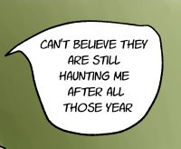
For example, this should be "I can't believe they are still haunting me after all these years"
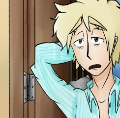
Make sure to also double-check the artwork for errors. The elbow here is cut off.
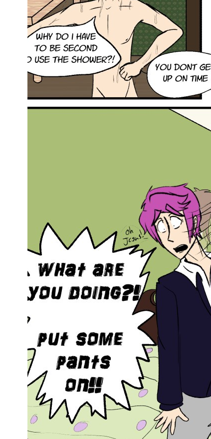
Here's some more errors where the bubbles/lettering is cut off. You honestly have decent art and can put things in settings coherently, I know what was going on in the first chapter pretty well, but these small errors like typos, line problems, etc can drag down comics that would be like a 9/10 to a 4/10. Make sure to be super neat!
The sudden transition to black and white with tones is a problem, but I'm sure you're well aware of that so I won't go on about it! Consistency is important for a reader to feel like the story is flowing well. I actually can't really comment on the story after this part because the transition was so jarring and confusing that I couldn't understand the panels at all.
Going onto your most recent chapters, in general study what I've recommended prior multiple times: Anatomy, color theory, but additionally perspective since you do seem to like to do shots where their bodies are at angles (which is good to do, definitely would be expected out of a featured artist) - You can try many online sources for figure drawing such as this5 and just practice once a day for at least 10 minutes. You'll need to do it daily for basically, ever, but expect results in about a year. As for color theory, here's an entire pinterest8 with tons of tutorials. Read them all!
Just want to thank you for the advice. We've been working all day ann's picked up books to work specifically on our rock spots of clothing and form. I wanted to show you our progress to show that your time wasn't wasted. We do use the model as reference, but have learned ourselves to simply sketch based upon it to allow our style to show more. I myself am a painter, so we both are drawn more to the realistic look, but we have lowered our saturation more. Anyway, thank you for your advice, and we are always open and welcome any more anyone has.

**EDIT: Please read before critiquing! I'd love a critique now if you're still taking them  I'm redoing my story's first 3 episodes. However after reading your valuable suggestions, I've decided to rewrite more things and move certain scenes from my story around so the reader will know what they're getting into, so I recently uploaded an alternative. (both in link below)
**#3, #4 and #5 are the first option and #6, #7 and #8 is the alternative of the intro ( ignore the first two updates):
https://www.webtoons.com/en/challenge/test-1-prol/list?title_no=278786**4
I'm not sure which one is better. Also sorry about the roughness of the last chapter, I didn't have time to do anything other than rough storyboard for the last scene.
If you want, here's the rest of the chapters from the current one (read from #4 the boy who defied heaven, anything before will be replaced): https://www.webtoons.com/en/challenge/pseudo-wings/list?title_no=2086353 but you don't have to crit this if you don't want to  sorry if I'm asking for a lot, but I reeeeally am serious about this.
My concerns are that my story has elemental stuff which is age old, but I'm putting a twist on it by approaching the magic from a personal standpoint (each character's power branches to unique) and match their emotional state, but this is hard to show in 3 chapters, I was planning to slowly reveal this.  With these chapters I'm trying to show this has a fantastical side but it's still a personal relatable story. I don't recall a featured webtoon that has this magic system though. And I know angels have been done before but my character isn't an angel, but a fake trying to be the real thing. I try to remedy the age old fantasy aspects by making it character driven (I think characters are my strongest point, but feel free to state your own opinion). I don't think my plot reinvented the wheel, but I do think I have something unique to say in the message and characters growth. How can I better show this is not just another elemental story with angels? I have a complex story and it's hard to decide what to sell first and reveal later I dug myself into quite a hole haven't I?
**Also I changed styles. I started off with a painterly style then switched to line art since it was efficient. So that's the reason why it starts off with line art and painterly in the middle, then line art again was cause the parts in the middle were started off first.
Thanks for your time.
I just wanted to say, I feel you in goe entire journey. It's complicated knowing it's a popular dream, to have elemental powers, but to do it originally. I do think what you have is unique, and at the end of the day, it's all about how you tell your story, and showing up to the plate! I am keeping my eye out for you! @denaliah
This might be hard to answer since I know who you want to keep your anonymity but... is it true that the... pay is decent?
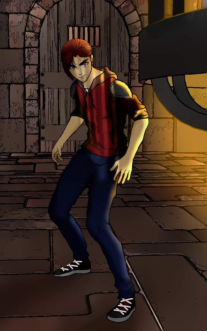
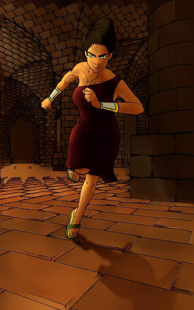
So right away, I found the first panel excellently done. You, however, present a really rare case- The backgrounds are super excellent, and the main characters are not quite up to snuff. What I found distracting immediately was that the main characters had very fuzzy outlines with really oddly varying thicknesses, and the outlines were unusually dark compared to the beautiful washed-out backgrounds.
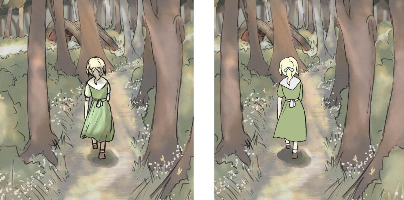
For an example, here's a panel I redid with more confident linework. There is a merit to scribbly lines in some cases, but WT will probably just see it as messy rather than stylistic.
Your more recent chapters have much better lineart but I do see you resorting to scribbling the lines in some panels, which is not a good habit to have! Here is an article of how to produce more confident lines.10 My friends draw 100 cylinders and 3 pages of lines daily and I have seen a really great improvement in their linework.

Now you're certainly not bad at shading, I think the style you use to shade is fine, but you seem to use a very washed out color palette which is fine, but you elect to shade in similarly washed-out colors.

Here's a screenshot from Violet Evergarden which has the same kind of misty and hazy vibe I feel like you're sort of going for, but still notice how dark the shading is while still giving a hazy vibe. The light colors are distinctly warm, and the shading is distinctly cool. It's not kind of blended together.
This was the panel I'm looking at in particular where I think that being more confident in your shading would go a long way. We have a light source coming from the right side of the screen, yet the shading on the characters is kind of blended everywhere, kind of robbing us of a really beautiful atmosphere.
Here's an edit of the panel, I pushed it about 50% further than what it probably should be to make it really apparent what I'm doing with the shading. We have distinctly cool and sharp shadows, combined with a hazy warm light source. Having some confidence in your shadows rather than kind of airbrushing around in the general area of where they should be will go a LONG way!
Anyway, reading the story, though I'm not particularly interested by episode 3 (three episode rule, I talked about it in an earlier critique), I find your paneling, grammar, speech bubble placement, and consistency+quality of character interactions to be very high quality. I think you should condense the events of episode 1-6 into episodes 1-3. 3-6 is kind of where the events that establish the plot happen, and most people click away at episode 3 so having early events not in the immediate three episodes isn't too good. Also I kind of feel like even by episode 6 I don't really know what the story is about- There's magic, some kind of disease, and werecats? Though there are some things that should be revealed slowly, making sure the audience knows solidly what your story is about right away and how all the aspects "link" together is super important.
I think with some elbow grease you can get this series up to a potential featured quality. Good luck!
There is a base pay of $2000 a month for all featured artists. This isn't a secret, you can find this in an interview with JunKoo Kim19.
There is additional pay based on ad revenue and fast pass. This leads to a huge difference in the payment between Webtoons people want to keep reading, and Webtoons that people don't really care to keep reading.
What does that mean? Well, though a series may be popular (like a slice of life or comedy), people aren't really dying to read the next episode, and thus won't buy fast pass. Series' that rely on plot and being real page-turners will make the most since a huge portion of income will come from people buying fast pass.
^ This is entirely based on my own deductions by the way, I only have my own statistics to go off of. But I'm pretty confident in the assumption.
Ad revenue isn't really a secret either, anyone with a series on discover knows that ad revenue is pretty small. You can kind of do the math proportionally to figure out how much big series' make off of ads.
.... Basically, pay differs a lot for every featured artist. For me, pay is very good. Some people in Korea are making 80,000 a month (x) ... Don't expect to make that much on the english-speaking webtoons, but the potential to grow that high is there.

Hey, I found your analysis of the other comics really helpful already,
so If you got the time at some point, maybe you can take a quick look at my comic
I´m honestly not aiming for this one to get featured, the Art is kind of inconsistent (bad at the beginning ^^´), and the plot isn´t groundbreaking. I think there are a few spins on the genre, but they are only in the details.
I´m really looking into starting the next big series once this one has ended, and trying to gather feedback on how to improve as much as possible, so your take on it would be hugely appreciated, so I can use it in the future.
Thanks again for doing this altogether, I´ll be bookmarking this topic... I especially liked your presenting of big shots and how they help establish a scenne.
I'm glad I can help. Before I was featured I looked everywhere for any kind of information I could find and really couldn't turn up anything, and now that I have enough knowledge in it to figure out this stuff and realize... It's not really a secret, Featured artists are just really introverted (haha), so I'm happy to fill in the blanks for people.
Additionally, I learn best by critiquing, so this is advantageous to me too. I'm looking at some of these Webtoons I'm correcting and realizing sometimes I make the same mistakes, and I should definitely be constantly improving as well.
Say, @Cabbage how many of the series being posted here will you critique? I kind of want to finish the new episode for my comic before I post it here.
I actually disagree with your assessment. I won't speak to knowing better, but I actually prefer how you're doing it. Your lines seem very expressive to me and less restricted my rules. Similar to cow lore Olympics is expressive. I won't speak to colors or anything and your changes are up to you, I just wanted to offer a compliment because I love your art style and find it very classically beautiful.
You're free to have this assessment, but again, I am speaking from a perspective of a potential featured Webtoon. WT will always favor more professional and clean looking work. Lore Olympus uses a crayon brush, but has very confident shapes and linework.
For example. here in a very recent panel, though the style comes off as messy it is beyond precise and the artist has a masterful control of line weight. There's nothing wrong with having thick lines, but the "chicken scratch" needs to be resolved as that will just be viewed as unprofessional work.
Thank you for taking the time to take a look, Cabbage! I like to tell myself that "this isn't even my final form!!" - so I definitely appreciate your fine points of areas to focus on going forwards.
You're the first person who has fleshed out the shading choice, which is something I've been cautiously experimenting with every chapter update - and your notes come at a great timing as I'm currently working on chapter 10 so this will be top of mind to incorporate. Acknowledging Blackburns direction has been said to be somewhat ambiguous, yet I've not quite put my finger on the best way to balance between slow-reveal vs. reader direction - agreed that "link" is super important and something for me to noodle over.
Big thank you again 
So though I understand what kind of style you're going for, but overall it ultimately comes off as messy. Having a white base with colors being applied on top is very very risky if not done perfectly, so right now the panels look a little incomplete.
Here, I cannot read the sfx at all. Though I understand you want this kind of, messy aesthetic, SFX, text bubbles, and panel borders should not be effected by these. Readability is #1.
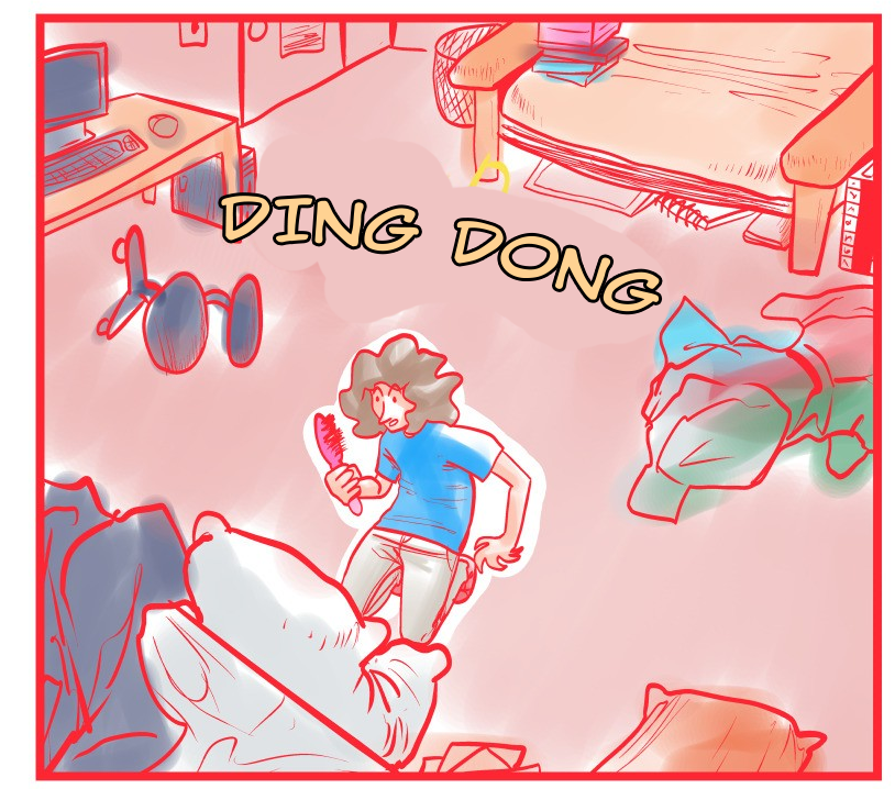
And example of how to make it readable.
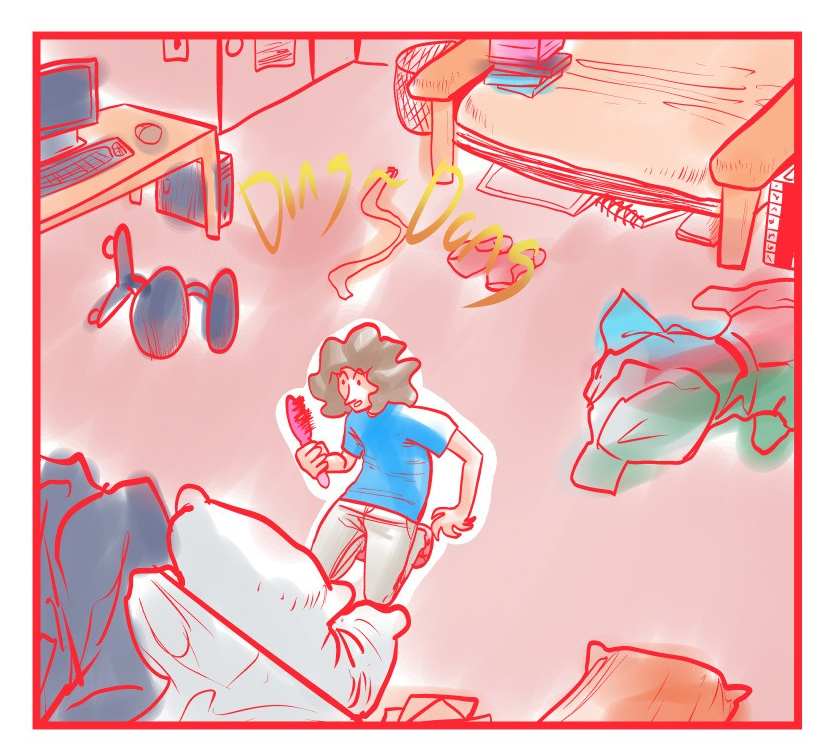
Another problem I can see is you do basically everything with the same red line color, and similar line weights. This leads to a lot of confusion when I'm looking at these panels.
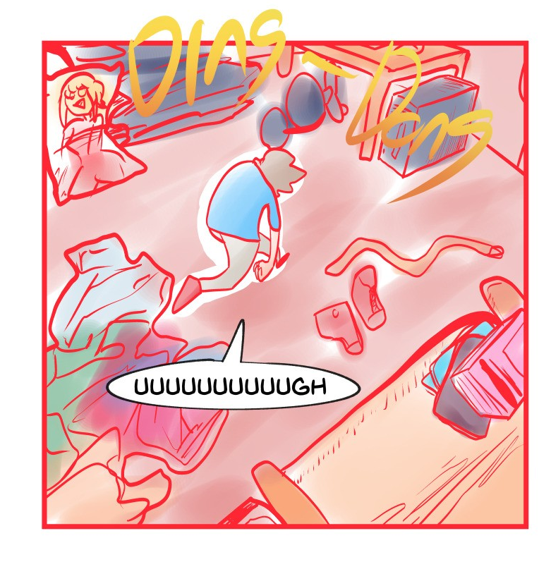
Since you're drawing the objects super messy (I can't tell what some of them are), and the main character likewise is super messy, this looks like a huge jumbled mess of confusion.
Here's a panel from Edith, which imo is probably the messiest art style I see on featured, clearly differentiates the character from the background by putting the background's lineart in a different color and a more muted palette.
I'd actually recommend going through Edith and using it as a reference for how much you should allow yourself to get "messy". In general I would recommend against the bright red outline, you should usually pick a dark outline that is less saturated than any of your main colors. It really hurts my eyes to look at.
In general, be really careful with how you place the characters. This girl kept switching from facing right to left which made this whole sequence really hard to understand. Always keep the way characters are facing consistent, and if a character's position changes, have a wide shot first to establish that they moved before doing the face close-up.
Overall I find the series pretty humorous, but I get a lot of whiplash from how much the tone can change. Right now there's a lot of random humor, but you also seem to have a sort of overarching plot that gives off a slight tone of severity, which will confuse the reader since the constant cracking up and low stakes (death is treated extremely mundane) doesn't fit the tone of an overarching plot. Try to decide if you want it to be pure comedy, or a series with a plot with humor thrown in between, and rewrite some of the scenes to either be 1. more whacky or 2. more grounded depending on what you decide to go with.
Good luck!
thank you for all this advice! readability and tone of the series has been something I've always struggled with so this was really helpfull! i was gonna ask if you think it would be best if i restart but you already answered that with your response to momojiji. I've actually been thinking about starting a different webtoon for a while now and now that i know what to focus on
i think i can make something much better. thank you so much again for your input!