@ItzaMeLuigi I kinda do very stick figure like sketches of a bunch of pages to decide the panel layouts, but I move stuff around sometimes. My biggest fear is to make the page too crowded so it's difficult to read lmao rip.
@Legendofgenii I low key think in animations, but don't have the skill \ patience to create them (Yet?). I guess it's sort of translates into comic panels? And I think you should go for it if you feel like doing a more experimental layout! If you feel like it of course!
@nathanKmcwilliams omg that page looks SUPER cool! And I use Medibang for panels and Procreate for everything else. I should definitely try spacing stuff out or have speech bubbes sort of burst out of the panels 
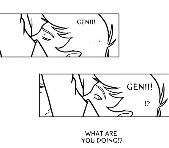
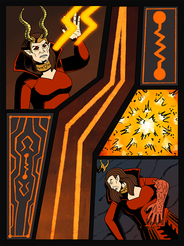
@RosesnWater I think the balance between dynamic panels and readability is key. I kinda experimented with layout a little bit in my second comic and did this weird zigzag page:
@pilot-obvious
Same, I do traditional comics, but I think you can kinda have best of both worlds. Vertical format allows for kind of dramatic pauses and lots of space for text and speech bubbles (one of the things that inspired me to do comics is Noblesse), and I think its possible to use the effects in a regular page as well. I did that when adapting the prologue to Bestia's Wrath for webtoon cause my text was just too small for it to be easily legible with a small image.
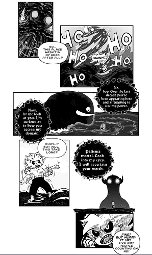
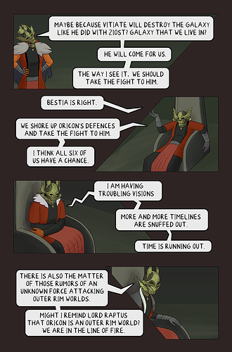
They used to be all crowded in the bottom of one page. Maybe I'll do a similar layout if I have another page with lots of talking in it again lol.
@dewarcomics honestly SAME. I'm readability \ accessibility first. I miss the ability to add image descriptions that Smackjeeves had tbh.
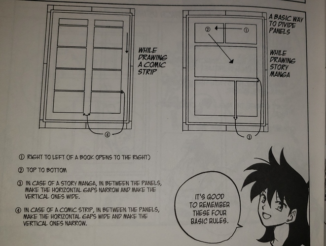
@CrystallikeICE I kinda just do stick figure layouts on the big page. Easy to modify similar to small thumbnails, but i might give thumbnails a try too.
@honeyandcreambutter Sparkles sound really fun tbh. And yea making panels is hard but I think and hope I've gotten better at it. I kinda went from really crowded hard to read pages to pages that give the characters space to talk and do stuff. Maybe they aren't the most dynamic but again, i'm more focused on readability.
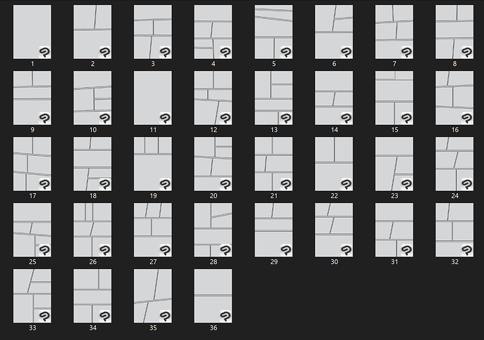
@seiraph These look really good IMO. I quite like number 35.
@akemikae I absolutely agree on readability. I didn't really know about the zigzag thing but it makes sense.