Like I said, there's personal preference and different schools of thought about the spacing when it comes to webtoons. The point is not to blindly 'leave larger gaps' or 'put your panels closer together' because someone said you should, but to think about using the space you're working with effectively to convey mood, tone, and pacing. Sometimes that calls for more space, sometimes that calls for less.
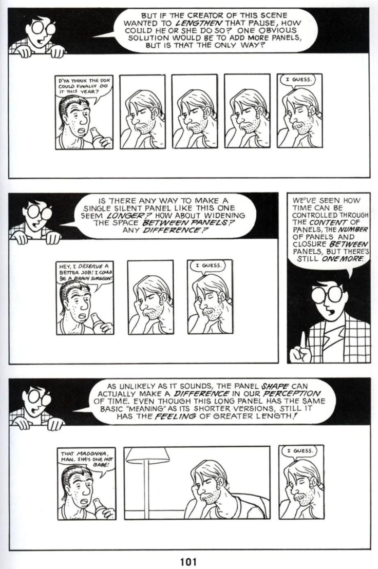
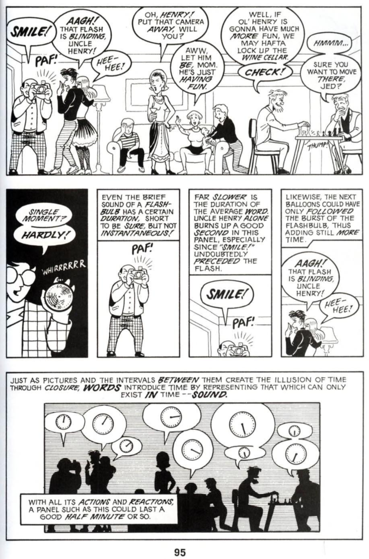
Scott McCloud has a couple of incredible books on the topic of comics and how to construct them, and while he's working in the more traditional page format, he delves into the use of physical space to illustrate how you can handle pacing and flow by manipulating how big or small panels are, how much space is between them, and where you place them.
As far as the sound-effect text labeling thing, it's a similar situation: it's less about 'do it' or 'don't do it' because someone else thinks it's a good strategy, it's about using those things effectively to convey the story in the best way possible, and that means thinking about the reason why the words are (or aren't) there in the panels. Take a look at this page from Scott McCloud's 'Making Comics' where he breaks down the different 'categories' of possible relationships between words and pictures in any given comic panel:
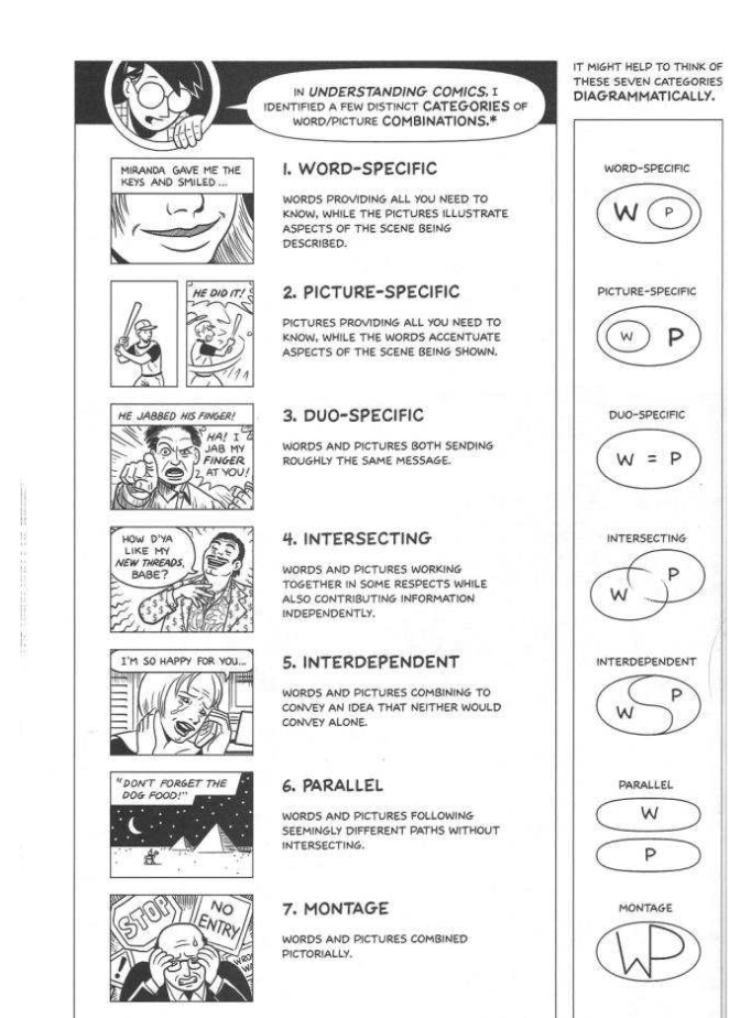
He goes on to explain how each of these types can be used, and what they bring to the table.
Y'know what? I'm just gonna leave a link to a free PDF of both of his books on comics here, because it is one of the single best resources for comics creators.
You'll have to trust a random link from a stranger on the internet if you want to read it, but I can guarantee that I have loaded this link and my computer did not, in fact, explode:
https://pdfcoffee.com/qdownload/comics-scott-mccloud-understanding-comics-the-invisible-art-pdf-free.html
http://www.yorku.ca/yamlau/readings/Making_Comics.pdf
hatch marks don't in and of themselves make the drawing more 'good looking', they're just a thing I'm a fan of for adding depth and form. Plenty can be done beyond that. Like I said, that's just MY sensibilities and how I like to do it. I do think that using the same pen for both your lineart and your shading will help the art feel more cohesive; sort of like how legos fit together because they're all built with the same base components and structure. I've seen it in a lot of comics: Soft, painterly colors with thick, bold linework, smooth and crisp colors with chunky and messy linework, etc etc. Making sure your colors 'mesh' well with your linework can be a really difficult thing, but it can also REALLY help make your artwork look more cohesive and complete.