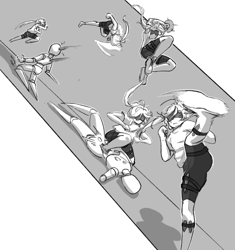
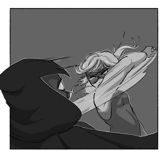
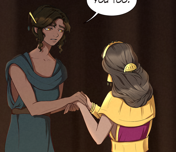
okay, this one confuses the hell out of me, because you've got sequences like this:
which are top notch, but then you'll also have action panels that look like this:
which uh... not so much.
I have two guesses as to how this happened.
1: you are spending a very inconsistent amount of time on each panel, leading to some looking great and others looking rushed, in which case you need to spread that time out more evenly and give your panels the time and attention they deserve, or
2: you're an extremely talented (as opposed to 'skilled') artist who has only recently started drawing. If this is the case, awesome! you've got a real leg up on the competition, but you need to work on finding references and doing life drawing to build up your internal library so you can draw a wider variety of angles and poses.
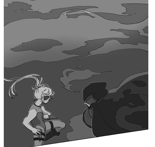
There's definitely some anatomy and perspective flubs here and there, like I said, the panels are really inconsistent.
This one:
stood out to me, with her back being dorito-fied to the point that her arms look like they're not even connected to her back. For the majority of panels, this doesn't seem to happen, and I am baffled as to how it ended up THIS inconsistent.
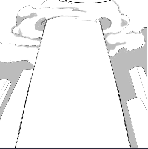
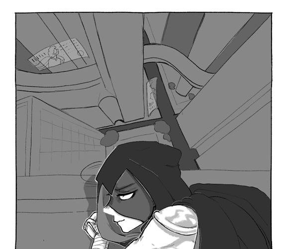
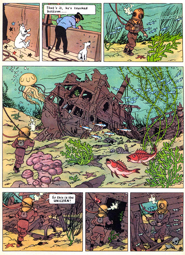
In general, when you do environments, they look good, but I just have to ask...
WHERE
THE HELL
ARE ALL
THE WINDOWS!?
Seriously, you decided to do a superhero comic and then decided to puss out on windows? It's an urban superhero story. You gotta draw cityscapes, and you gotta have windows on them damn skyscrapers, them's just the breaks.
What you have drawn is great, but your environments all feel completely unfinished. It's a pain in the ass, but you can't get away with an urban city setting like this and then just leave all the buildings blank. For stuff that's super far distant, yeah maybe you can pull it off, but like...
LOOK AT ALL THEM WINDOWS.
THERE'S LIKE A BAJILLION OF THEM.
GIVE ME WINDOWS.
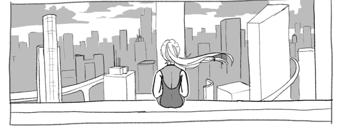
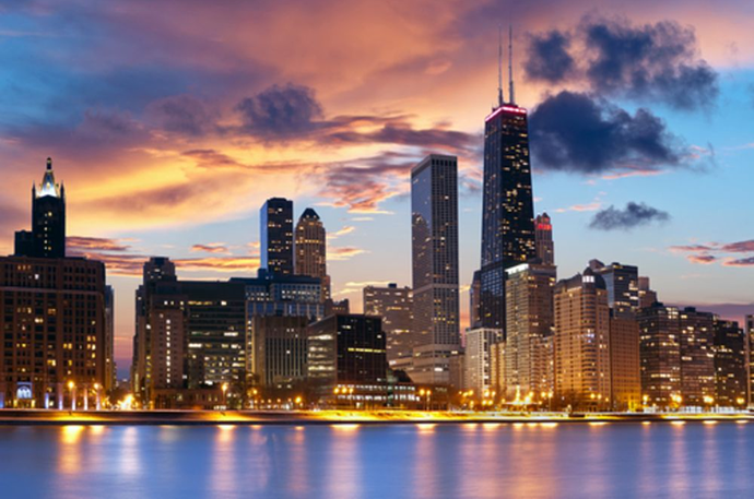
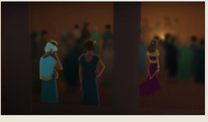
Shots like this:
and this:
show me that you CAN and DO put a lot of love and effort into your environments. see some of my other critiques and you'll know that I think they need a little more grit and texture; all 100% smooth surfaces makes things feel eerily pristine and untouched by human hands. Put some fingerprints on it; little tick marks of texture where it's not 100% flawless, where a tiny bit of dirt got missed by the janitor, where someone bumped into it and scuffed the paint, y'know?
That's honestly a pretty small complaint, just a quick thing you can do to bump up the 'realness' of your environments, but the windows? Nah, fam, you gotta commit to that. There's tons of tools out there that can help make it easier, from Google Sketchup to custom brushes, but every single building in a major urban center looking like the Washington Monument completely takes me out of the environment.
Speaking of environment...
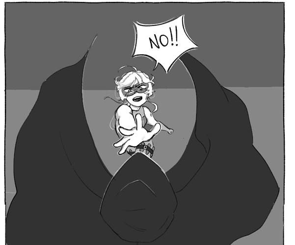
Resolute determination part three:
panel 1...
Panel 31...
between these two panels, there were uh... 3 indications of an environment, I think? And they were nothing more than a couple of lines. I have no clue where these characters are fighting anymore. Have they moved closer to the edge? Jumped to another rooftop? circled around each other? Are there vents or AC units they could be using as cover? is the roof clean and smooth in a weird dystopian future way, or is it lived-in and grimy like most rooftops are after a while? I can't answer any of these questions. Your action scenes are great, and the characters flow from panel to panel pretty well (aforementioned anatomy inconsistencies aside), but I get so little sense of space that it's hard to feel like this story is actually taking place somewhere, you know?
Honestly, it's pretty nice. I'mma sub to it because the story, while basic, has a good amount of charm to it, and when those action sequences work, they work DAMN well.