I legit can't say a damn thing. How the hell are you not working for a publisher already? this shit straight-up blows anything I can do out of the water, and even many full-time professionals working on marvel and DC comics right now. Absolutely stellar.
I could probably give some really small little individual panel-by-panel critiques, but I highly doubt I'd be able to tell you anything you don't already know.
Also
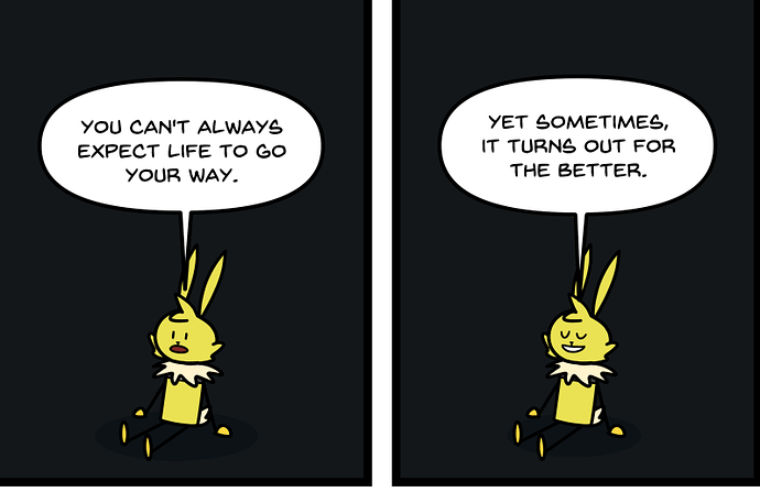
best easter egg I've ever seen on this site. Good show.
A'ight, first off
why this comic starring Weird Al Mothafuckin' Yankovich?
Anyways
First thing I noticed, you're being real hasty with these fills and tones.
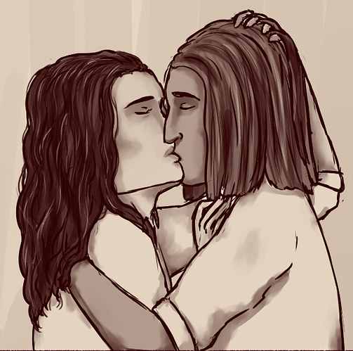
Lookit this; I just took about five seconds to go clean up all those little white bits in the hair where your paint bucket didn't catch the corners. They may be tiny, but they REALLY stand out and become distracting. I know I can't say too much, because I've had this issue in my own comic on a few occasions, but making sure there's nothing from a technical or craftsmanship standpoint to get in the way of your comic being readable is a pretty big deal, and when you have a sketchy style like this, you can't afford to sacrifice much in that department.
now, biggest issue I'm seeing overall is just some flatness and lack of construction drawing. The characters look stiff and emote in pretty bland, robotic ways. Not a good look for any comic, but in a romance story, especially, subtle body language and character acting are like the biggest of big deals.
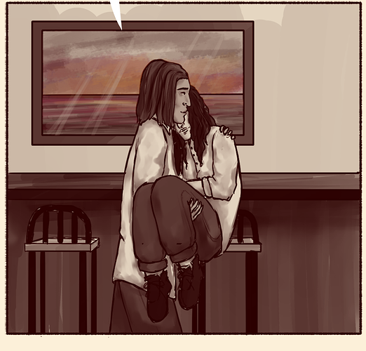
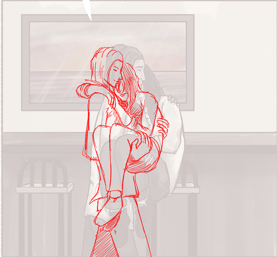
I can tell with this panel, you just didn't look up ANY reference. Like... let's go google 'bridal carry' and see what we get...
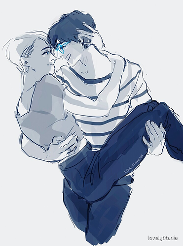
3-4 minutes of searching, and I've got 2 really good photos for reference on hand placement and how the legs of the one being carried bend, and a really nice sketch for style and expression/body language.
So let's see if we can take what we see in these photos and use it to help us position the characters a little better, really sell the reader on this moment, ne?
Put it all together and clean it up a little, aaaand
Could definitely still use a little cleaning, but the pose feels a lot more naturalistic now.
The more you do this, the better you'll get at it, but in general, don't assume you know how to draw anything, even if you think you already do. You don't just want to 'not be afraid' of using reference, you should be EAGER to look up and understand how people do things in real life. It's not about finding an exact pose from the exact right angle and copying it either, it's about how weight shifts, which muscles are used for which actions, what overlaps what and where, all stuff you can learn just by looking at someone performing the action from nearly any angle. Keep referencing for everything, and you'll build up an internal library of sorts, of understanding how people move in order to do certain things. You've got a pretty decent foundation here, so once you get the subtler nuances of character acting down, I have no doubt you'll be able to go far with this.
Hahaha, thank you very much! I was honestly expecting something much harsher, I guess that's me being critical of my own work. I know some panels have issues and wonkiness, particularly in the first parts of issue 1 when I was still getting my feet under me making comics. The dialogue in issue 1 feels a little hammy at times too, a little forced. There's some drift in my lettering style in the first half of that book too--hahaha I could probably pick that first book apart all day, but I was still figuring stuff out, so I guess I can give it a pass.
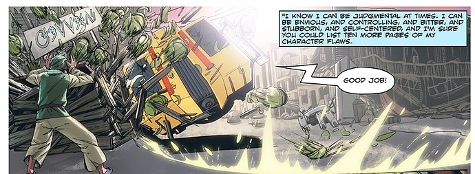
You're the first person to recognize the cabbage man in that panel! Hahaha, Avatar was one of the inspirations for Heaven Hunters, so I felt it was only right I pay homage!
For the shading style, there hasn't been all that much thought behind it. Most of the style changes in episodes 6 and 7 were me kinda experimenting. I guess the softer shading is supposed to be for more light-hearted scenes, but that's not an all-the-time thing. Like in that scene with the thick line shading that isn't meant to indicate intense movement, the reason I used it there is that I thought doing it with thick lines would be faster than thin lines. And it could've worked if I spaced out my lines more and didn't make it look so harsh. The only time it works in this episode is when Rin makes an angry face and it's supposed to be an intense expression.
I felt like the difference between the shot of Rin running and the panel with Poppu stopping suddenly was the level of detail put into it. Like Poppu is shaded with a harder and simpler cell shading, while Rin is shaded with a softer and more rendered kind of shading. Maybe I should've used hatching on Rin for a more consistent tone, but I feel like the softer shading matches with her mood a little more.
Sometimes tho, I decide how I shade based on how much effort I wanna put into a panel, and it's just... lazy. And it's really obvious where I'm being lazy too because I put so much effort into most of my art.
I do probably spend way too much time on shading and not enough on making sure my anatomy is accurate. A lot of my art includes very detailed faces (not always well-drawn, just detailed) and then the rest of the body is just like "yeah, that's kinda what a body looks like"
I'm obviously still trying to figure it out, it's the first time I've tried making a comic like this. Some of these problems have kinda been fixed in the episodes I'm currently working on. Nevertheless, I'm still really proud of my small victories in all my drawings regardless of how bad I end up thinking they look. I'm always trying something different, and it really helps to have someone else put it into words so I can look out for it more. Thank you for your criticism
I always jump to the most recent pages to make sure I'm critiquing current work, so I didn't even really look at the beginning stuff. I'm also almost exclusively looking at art stuff here; there's way too many of these for me to read through the narrative of each one and get enough to sink my teeth into for a story critique. Same reason I'm not doing novels, so un-hamming your dialogue isn't something I'm gonna be able to help you with on a quick visual criticism like this.
Thanks for offering your time for this. I've been lurking and I've wanted to get to posting my first (actual) comic here so feel free to get to this whenever you have the time. This is mainly a series I'm doing just to "find my footing" if that makes sense?
Also the third chapter might be posted by the time you get to it since I'm currently working on it. Just letting you know.
hiii if this is still open I'd love to get some critique. This is my first official webcomic so idk what I'm doing honesty. https://tapas.io/series/Road-trip-BL3
Hello ! I've been reading some of your critiques and I must say you're doing a damn well job at it and I kinda wish to know your opinion on mine, because I lack good and/or severe constructive criticism.
You can see the evolution or my style through the pages (125 episodes) !
It's mystery/investigation-themed but presented like a slice of life comic, with subtle philosophical meaning about being human and open-minded. It tackles bullying, and depression, and it is also LGBT oriented. It takes place in 2007/2008, somewhere in West Virginia.
Although book 1 is done, Im already working on book 2 atm.
@faisalhussein394 Hey mate, happy to see you in here ! I wanna hear the critics on your work too !
The Divine, Page 23:
The Divine, Page 34:
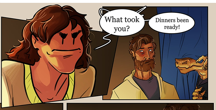
It was 11 pages between seeing dragon boy going through that cloth tapestry and seeing any indication of the space these characters are in beyond a single plate and the barest edge of a table.
As far as I know, these characters were sitting in a floating brown-orange void this whole time.
Draw more environments.
Your drawing is solid across the board, character acting is great, coloring is nice and lavish while meshing well with your inks. You've got a ton of great stuff going on here, but I can't for the life of me tell where it's going on.
The lack of environments is bad enough on its own, but you also have some pretty heavy talking-heads sequences; it's nothing but busts/waist-up shots from mostly eye-level camera angles. Give me some wide shots, give me some top-down views. You're treating the camera as though it's another human sitting in the room with your characters, which works really well for some scenes, but it fails to utilize the full potential of viewing angle in the medium of comics. Your camera should be wherever it needs to be to communicate the most interesting parts of your story at all times.
Other than that, not much I can say: The art is aesthetically gorgeous, you just need to focus on framing that art in an equally aesthetic way.
Texture, my boy. Texture.
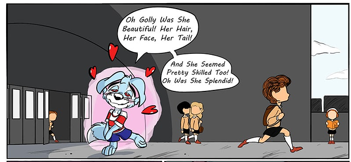
Generally, yes, you need more texture on objects and items to inform the reader about the kind of material things are made of, but also texture within the environments themselves: you've drawn a middle school here:
But what KIND of middle school is it? What you've drawn looks like heavy concrete and dull grey, no greenery, with a drab color palette. It gives the vague impression that this school is supposed to feel like a prison, but... well, that's the issue; that impression is vague. If you want it to be a metaphorical 'this school FEELS like a prison' thing, then push it farther, make it abstract and extreme (especially since it would contrast with Scamp's bright colors and glowing pink aura even better).
If that impression isn't intentional, then you need to think of what sort of environment you want this to be like. Is it a prim and proper private school? Then give it some nice redstone bricks and neatly kept bushes/trees out front. Is it a run-down and bland public school? Put a big ugly dumpster hiding behind the corner and some half-dead grass growing patchily next to the sidewalks.
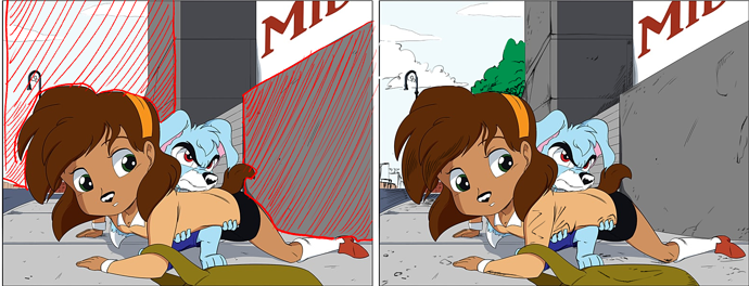
now here, I've outlined 2 issues I saw on this panel:
On the left, those areas I've marked in red are just a whole bunch of nothing. We should be able to see the street and the school, yes, but there's just these big swathes of negative space that aren't really serving any purpose. Ideally, you'd crop the camera in a little closer here, but you can also help the composition feel less dead and flat by adding more textural details as I've done on the right.
You've got a little bit of it here, but you can push it farther; the closer those stone walls are to the viewer, the more and more granular detail we should be able to make out in the exact shapes of cracks and pebbles and pock marks.
Once it gets farther away, those texture details can become less detailed, but they get denser and push the value down, making the environment a little darker and therefore farther away.
I also added the top of a tree, made the clouds bigger, and added some larger buildings to just kinda take up some of that space and make it feel less empty.
There's a ton of panels you have like this; large swathes of empty space that you've filled with either nothing or a simple flat color/gradient. It makes your otherwise decently-solid character art feel really sparse and flat and lacking in energy. Pull your camera in closer, make better use of overlapping and perspective, and pay attention to what the negative space is doing to your compositions.
Speaking of your character art, like I said, it's mostly solid. Your character acting on the other hand...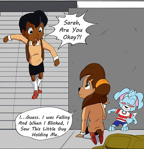
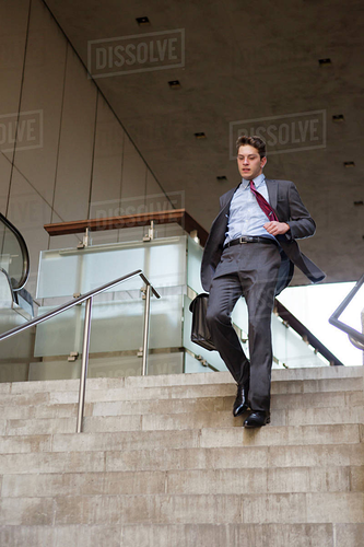
Let's just go to google and look up 'running down stairs', shall we?
it's not the exact same angle, but you can clearly see that this guy has his weight back and his arms tucked in so he doesn't throw himself off balance. The girl in your panel looks like she's running full tilt forward, which makes her almost as likely to pitch over and fall on her face as the girl Scamp caught.
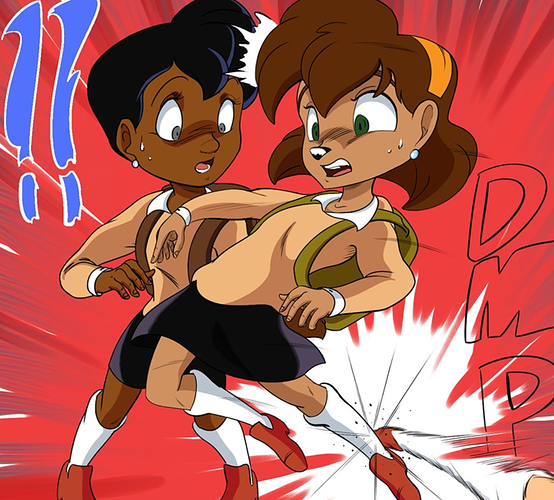
in general, intense action poses seem to be your weakest point. If this girl is getting kicked in the ankle hard enough to throw her off-balance, shouldn't the ankle getting kicked be getting pushed in the direction of the kick? why is the point where her balance is broken the ONLY part of her that's still touching the ground?
I like the overall character design sensibilities. Feels a little old-school don-bluth-y, which you don't see too often anymore. And you've got enough of a foundation that I can discuss composition with you, as opposed to technical basics. You could definitely still do with a little anatomy and construction drawing work, but I can see you've got enough of a foundation there that you should have a solid trajectory with it.
Real unique style, feels kinda like if Panty and Stocking was a 90s newspaper strip or something.
Careful with overusing those halftone effects, though: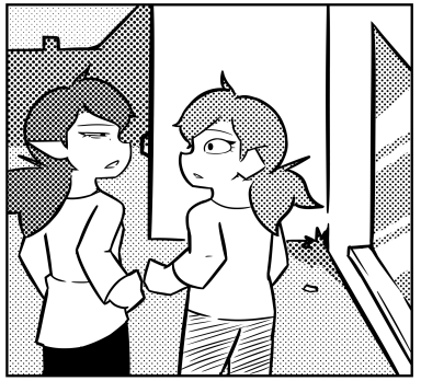
The girl on the left's hair almost completely flattens out into the background because they're both using such a dark value. With an LPI this low, you are going to run a serious risk of flattening out your drawings, so use the halftones more sparingly so they don't just eat everything else.
Especially when I go back just one episode and I see really great use of spotted blacks and hatching to give some visual variety.
Use these effects more. They look good, and you're pretty good with them.
However...
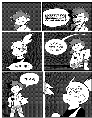
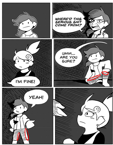
Be careful of this. Using your hatch marks to taper out and leave white space is great, but when it's not due to lighting, but instead in an attempt to avoid other lineart, it looks very obvious and feels unfinished. These lines are indicating value (how dark something is), but you're letting them be affected by the lines that are being used to indicate form (what shape something is), causing the illusion of that value to fall apart.
first off, this is just the plot to Donut County, isn't it?
Anyways, I'm not here to judge story,
The simplicity of your style makes it hard to do much in the way of critique; not a whole lot to do with an art style as cute and minimalist as this.
Your biggest focus is going to be readability; you've got incredibly simple characters and environments. That's not a dig by any means (fuck, Order of the Stick is an incredible webcomic and has even simpler art than this most of the time), but if you're going to have characters with singular black lines for their limbs, then maybe a 90% grey does not the best backdrop make.
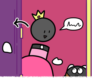
Additionally, this bothers the hell out of me normally, but it goes double for you. If you need to label your art (again, especially an art style as simplistic and straightforward as this) with something like an arrow, then you have failed. If you can't tell me the direction the door is moving without writing it out in a literal directional symbol, then you need to draw it better.
Art like this is amazing for extremely clear, straightforward, and easy-to-understand action. Take advantage of that and use the very simple visual language to communicate with me through the art itself, not through symbology and diagrams.
Thank you! All I've gotten for my series is "wow this super cute" and that's it! I needed to hear this, and I will be taking what you said into consideration! Also yes, this scene is taking place in a middle school. There was an establishing shot of it the previous part. Don't know if you read that part but it's whatever :).
it's not about whether or not I read the part that establishes it's a middle school; I can tell that from the uniforms and general shape of the building, but you should be showing what kind of middle school it is through the visual language you're using to draw it. Even if you established it before, keeping those details consistent and refreshed in the viewer's mind (not 'that it is a middle school', necessarily, but all the other details about the atmosphere and mood) is paramount to keeping that immersion.
Like I said, if it's supposed to feel like a prison, then make it an abstract mash-up of a prison and a school like we're inside the character's head and are seeing visually they way that they perceive it. If it's not, then make it look more like a regular school (again, just google everything. ALWAYS use reference), and think about the specific unique details. This isn't just some school wherever, this is a specific school that specific characters go to.
I remember my high school had an entire basement level with several classrooms, so dotting around the edge of the school were these almost well-like structures with grates over them to let natural light down into said classrooms. Super weird and unique architecture detail that makes that environment tangible and real-feeling. Some schools have covered walkways, some have open courtyards, some have big windows, some have small, etc. etc. Which details about this school make it THIS school, and what does that do to help set your story's tone? Can you tell your readers that this school is meant to feel dangerous just by looking at it? Friendly? Nostalgic? Cold?
The more you can use the art to communicate with your reader, the better. it means there's more information to take in, more immersion in your world, more attachment to your characters. Never let an environment or background just be there 'because it has to be'. Make it mean something, use the space effectively.
Okay, for the most part you're solid on basic drawing skills. I can see some shortcuts you're using that are maybe a bit too much,
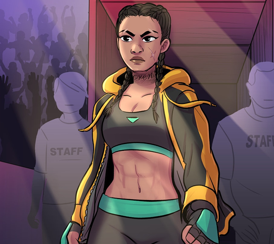
Like, yeah, those staff members are meant to be set dressing and not at all focused on, but they're only barely farther away than Sousa, and yet they have been completely dropped back to a single color with no shading and no faces. They actually stand out MORE than if they were fully-drawn and detailed characters who were just in heavy shadow. Simplifying them to this degree makes them distracting from your focal point, which is the last thing you want when you're doing a big shiny character introduction moneyshot.
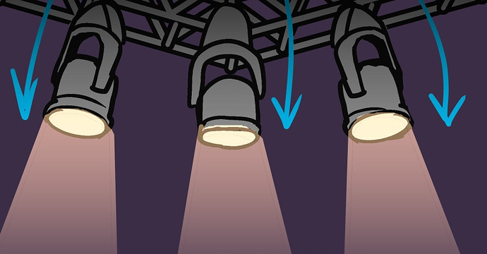
Other little things, like the hairline border left because you used a paintbucket with too low of a color tolerance to fill in these spotlights. It may not seem like much, but it's just enough to break immersion and make me realize what tools you were using to create certain effects, and little things like that are going to add up and take me out of your story.
I absolutely can't say too much, as I've had a lot of... little lazy oversights in my own comic in an attempt to produce it quickly, but in general, the more things like this you can get rid of the better.
That shot reminds me, though...
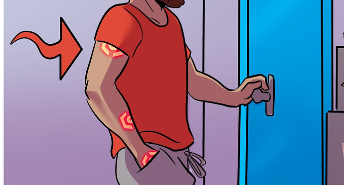
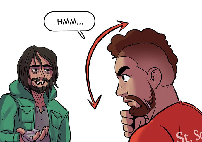
I hate this. Don't do this.
If you need to draw me an arrow diagram in order for me to understand how your characters are moving, you have failed as a comic artist
In both of these cases, I don't think you needed to draw the arrows. I can see what the characters are doing clearly enough that the arrows are simply redundant, but if you use them at all, they can easily become a crutch and you might end up inadvertently drawing lazy character acting and depending on the arrows to tell the reader what's happening.
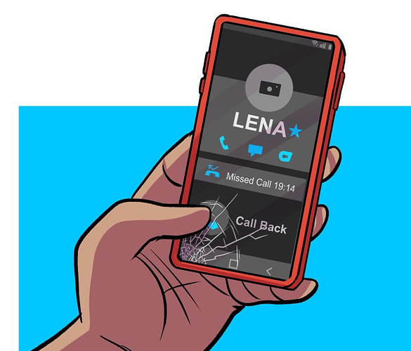
this is an amazing detail. I adore this. Not just that his phone screen is cracked, but I can clearly see HOW it got cracked and that it's just left there is an incredible little unique personality detail delivered in a very subtle way. More shit like this.
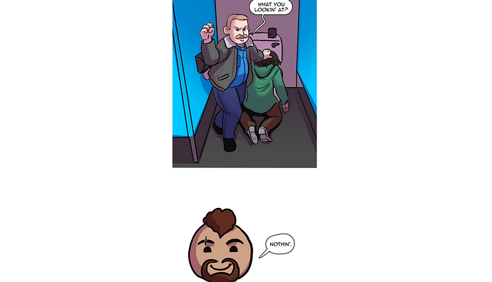
this moment bugs me a little from a storytelling perspective.
This dude just walked in on a mafia collection call in the middle of a public restroom. He's nonchalant about it and doesn't care, that's great (good character moment), but the situation is dead serious even if he isn't taking it seriously. Using the little chibi head like this makes it feel like I'M supposed to be as amused by it as he is.
Immediately after, he thinks to himself that crime is getting out of hand, so it's clear he's putting on at least some degree of an act in order to avoid trouble, so that makes me feel like the chibi head is even more out of place. I feel like this is a place where a fully-detailed shot of Mr. Eyedrops with a cold, flat expression would work a lot better; the little cutesy bobblehead is a jarring disruption of tone here.
I'm not gonna go through every single panel in your fight scene, but your sense of gesture is really stifled. This is an MMA fight; these people are going to be throwing their weight into their actions HARD, but you've got a lot of moments where someone is throwing a punch or a kick from a standstill, with their body totally upright. They should be, as the phrase goes, 'putting their back into it'.
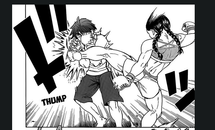
I highly recommend looking at Manga for this; they tend to be much, MUCH better about the granular details of a fight than american comics. In particular, Teppuu is an incredible series specifically about women's MMA fighting.
Just look at how the weight of the body is shifted in this panel to show the weight and movement in that kick, the arms are thrown out to the sides as counterbalances while the entire torso leans off to the right. This is the kind of stuff that's missing in your comic. The drawing is solid, but it feels more like action figures being posed than people in the middle of motion, and that all comes down to Gesture.
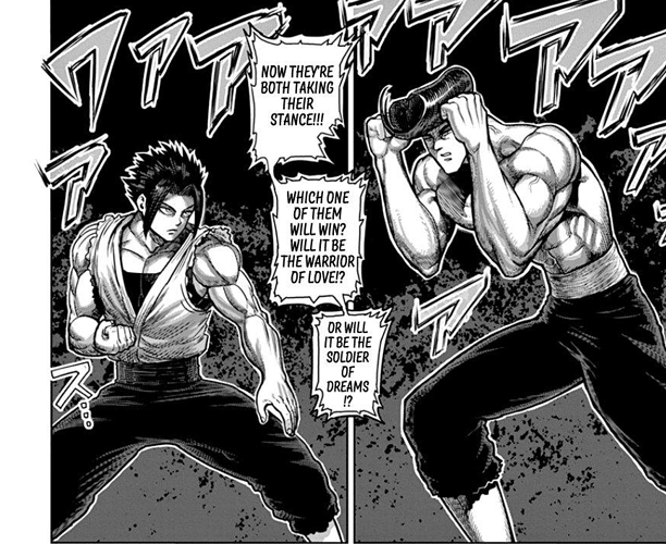
Another great manga to study for this that I recommend is Kengan Asura. It's... way less grounded and realistic than Teppuu, but it is an AMAZING example of getting weight and movement into close-combat martial arts battles.
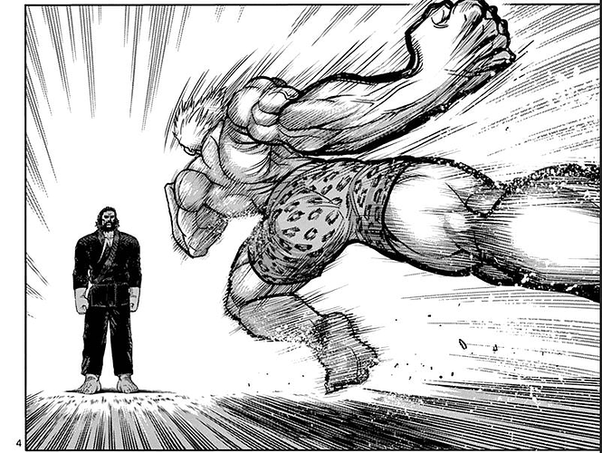
Even when these characters are just stancing up, there's attention paid to where they're placing their weight and keeping the gesture fluid. And when those characters go into motion...
god DAMN.
Like I said, Kengan Asura is way less grounded and realistic than your story, but it has some incredible examples of exaggeration and intensity in fights.

