not gonna tear it apart quite as hard as you think. Your improvement from the early pages to the recent ones tells me you're putting a lot of effort into this.
The easiest thing I think you can do is ease up on the textures.
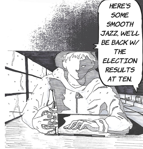
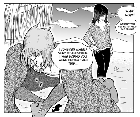
look at how much space is being taken up by those really dense textures you put on the cloak and shirt. And in addition to that, the one on the cloak especially is obscuring a ton of your actual linework. It's a massive strain on the eyes to look at, and could easily be replaced with a solid grey and serve the same purpose. I would recommend you ditch about 90% of the texture effects you've included, and save them for when they're REALLY necessary, otherwise the comic's going to be hard to look at for more than a couple minutes.
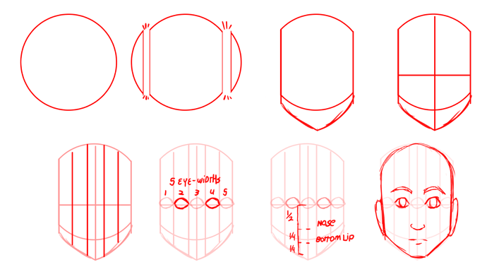
So one of the biggest things I'm seeing is just a general lack of proportions. Your character's faces are tiny on their heads, and generally don't fit super well in the places they're generally supposed to go. here's a bunch of the rules I've learned for how to place things accurately on the face. Most of what isn't detailed here is up for grabs; the jaw can be straighter or rounder, the nose can stick out more or less, eyebrows can be higher, lower, shaped oddly, hairline can move up or down, and ears can be bigger or smaller.
Keeping the roughly equal spacing of the eyes, placing them in the center of the skull, then using that to determine how far down to place the nose and mouth aren't up for debate in about 99% of people, though.
Obviously art style and tone can affect this a lot; bigger eyes are really common in animation and comics because the eyes are so expressive and making them bigger makes it easier to communicate emotions. Noses can be ultra realistic with individual shapes for the nostril flares and a full-on structure to the bridge, or they can be tiny little triangles. Mouths can take up the entire bottom half of the face if a character is meant to be screaming ultra loud, or they can be tiny little pinpricks if a character is supposed to be biting their tongue.
All of this is, ultimately, up to interpretation, but knowing what you're starting from is really important so that you can distort or exaggerate things in the right way.
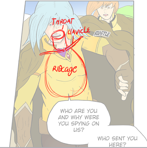
You've got a lot of other anatomy flubs going on. I'm actually getting a good sense of 3-d form underlying all of this, but your inaccurate musculature is hurting that a lot. Focus on what's underneath, as opposed to what we can see on the surface. You need to know where the character's bones are in order to place the muscles accurately, and the muscles need to be placed accurately to place the skin, which is needed for the clothes.
If those bones are off, it will make every step afterwards look wrong and you may not ever know why.
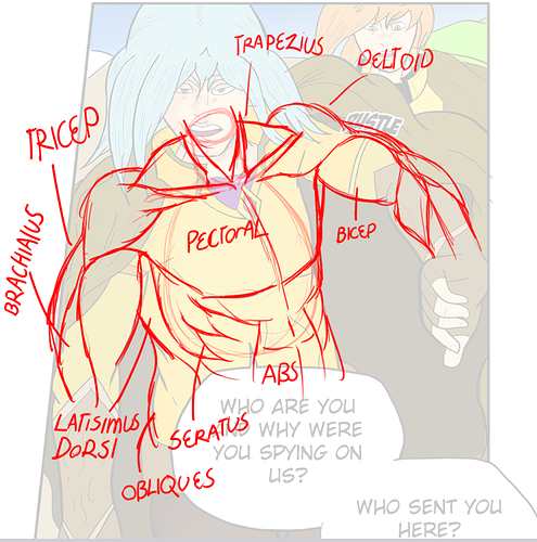
Now that we have the basic bones in place, the muscles, which are way more complicated but also more fun, can be placed where they need to go. You seem to know generally what a muscular person looks like, but you may not have a super clear understanding of which muscles precisely go where.
That's perfectly understandable, mind you, it's a LOT of information to know, but the better you can get at it, the better your characters will look.
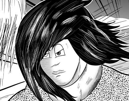
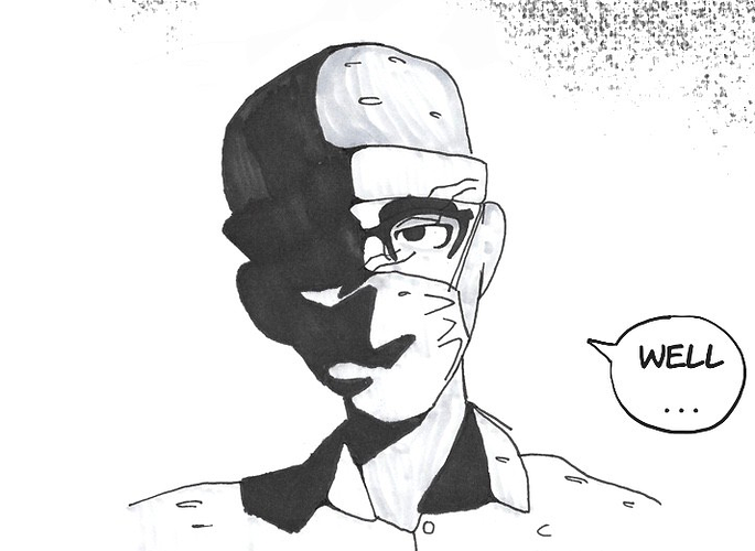
this character's face bugs me in a way that's hard to describe.
I get that you're doing this intentionally; the big cartoony eyes and lack of nose are supposed to make him look 'weird', but with the stuff I mentioned about facial construction earlier, it just doesn't quite mesh.
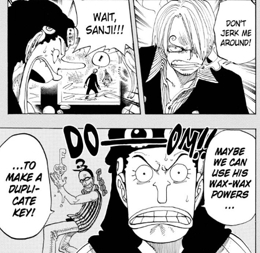
I recommend checking out One Piece for a great example of weird/unusual faces that mesh well with the characters who have them. Oda does an phenomenal job of making a lot of super bizarre or unusual facial features that still feel like they belong on the physical form of the character with them.
Additionally, as far as your inking is concerned, you've got a really solid basis in terms of line weight. You're regularly using thicker lines to define shapes, then thinner ones to add shadow and texture, and that's great, that's exactly what you should be doing.
At the moment, though, your use of hatching and texture marks feels very unrefined and haphazard. Like the lines are just being thrown in wherever they land as opposed to being used with intent to define the form more effectively.
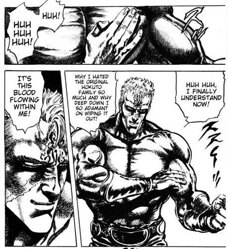
In general, I feel like you're kinda-sorta going for something kind of like Fist of the North Star in overall tone (buff manly dudes duking it out in empty wastelands tends to give me that impression), so go take a look at how Tetsuo Hara uses those densely layered internal marks to build up super solid, heavy-feeling forms.
Like I said, tons of improvement from the beginning to the latest pages, I can tell you're working hard. Go read more of the classics and pay attention to how the artists are using their lines and their shapes to construct their characters so that you can start doing the same.