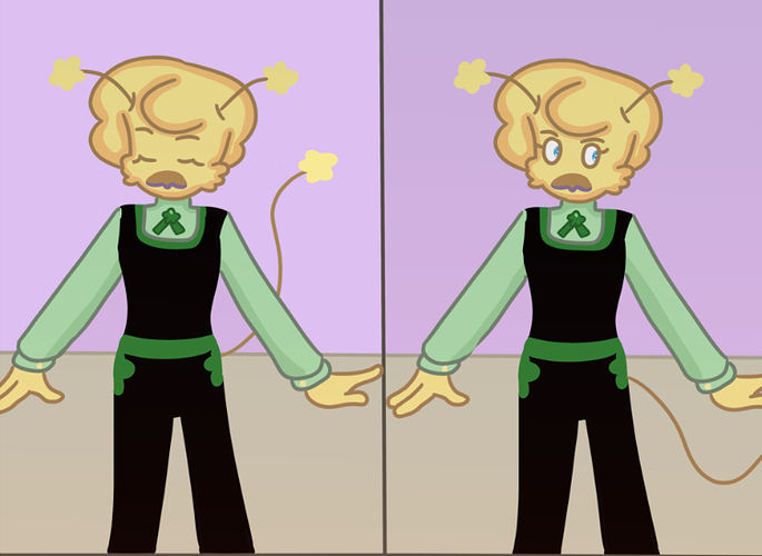
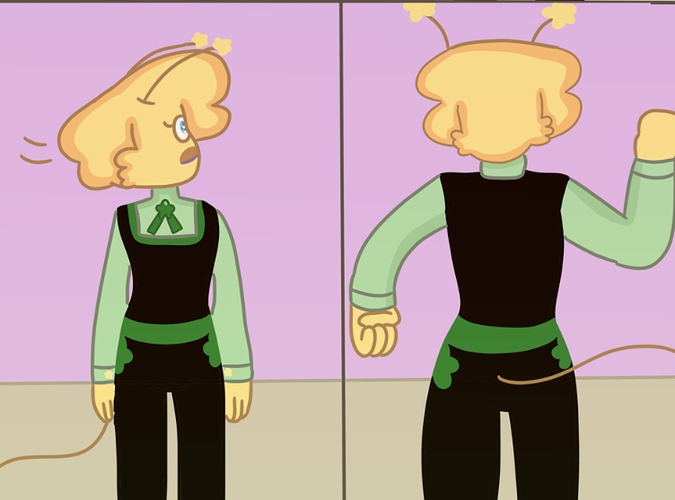
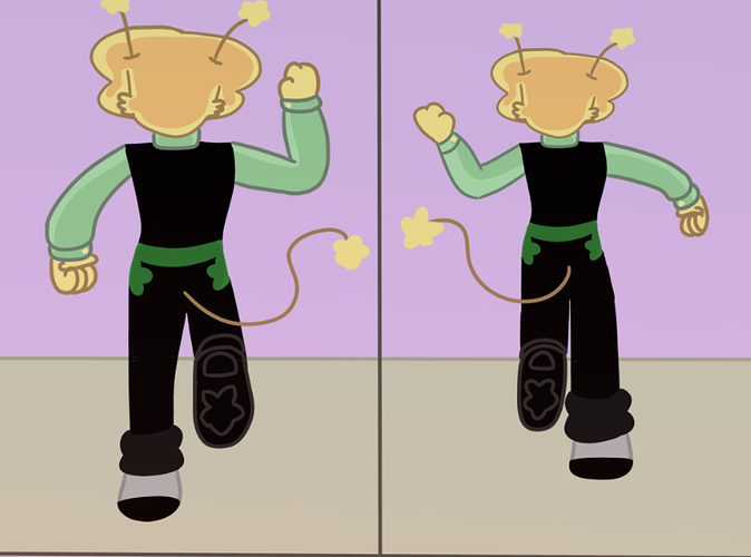
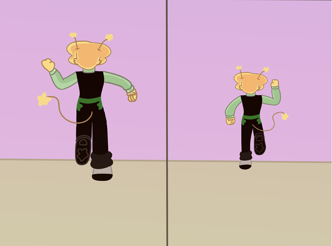
Okay, for you, I'm not gonna touch the art at all. It's not amazing, but it's very solid and you clearly know what you're doing when it comes to inking.
What you need to work on is pacing and lettering. These two things go hand in hand here:
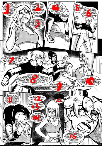
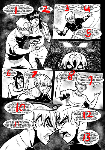
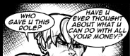
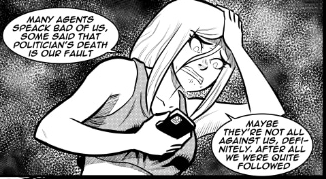
16 bubbles for a single page of 7 panels.
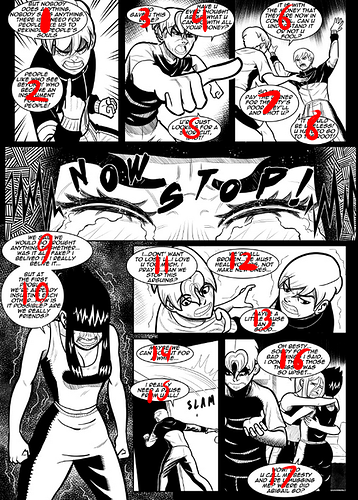
13 for 6 panels
17 for 8 panels.
That's 3 comic pages, a total of 21 images, and 46 text bubbles.
That is WAY TOO MUCH INFORMATION.
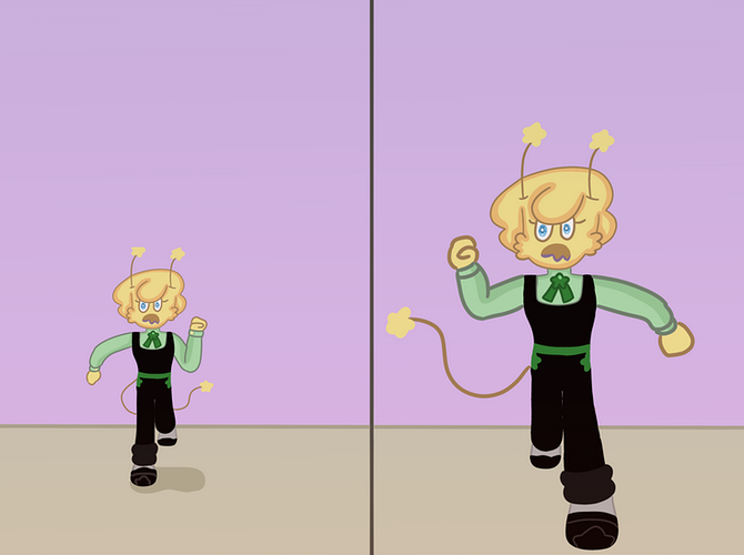
It's fine to have pages like this: Sometimes the story calls for it, but reading through your most recent updates, this is very consistent. Nearly every page has this level of density to it, and it makes the story REALLY hard to read.
Additionally...
Do not use internet shorthand. Spell out the word 'You' whenever you use it.
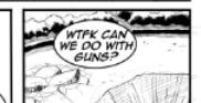
Have the text bubble actually say 'what the fuck', not an abbreviation.
and most of all, spell check yourself. Speak does not have a C in it.
I don't know if English isn't your first language or if you're just not particularly experienced in writing like this, but either way, it's an area to work on. I'm not going to disparage you, English is a really inconsistent and overly complicated language, especially if it's not your first (Again, I don't know if that's the case or not, just trying to take a more universal perspective), but the better you can get at this, the smarter your comic will look, and the more interested your readers will be.
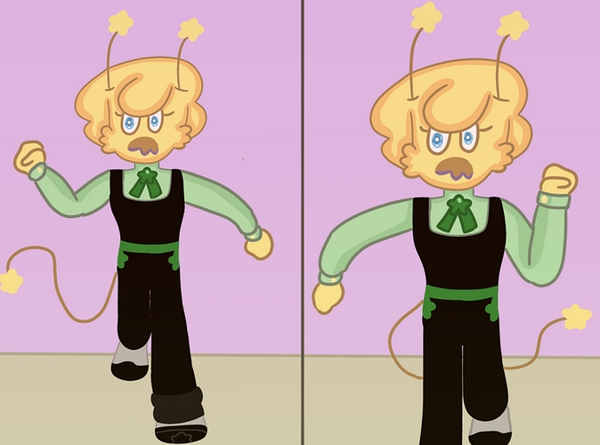
Now, this many text bubbles, along with shorthand within those text bubbles, is bad enough, but you are also making them EXTREMELY cramped.
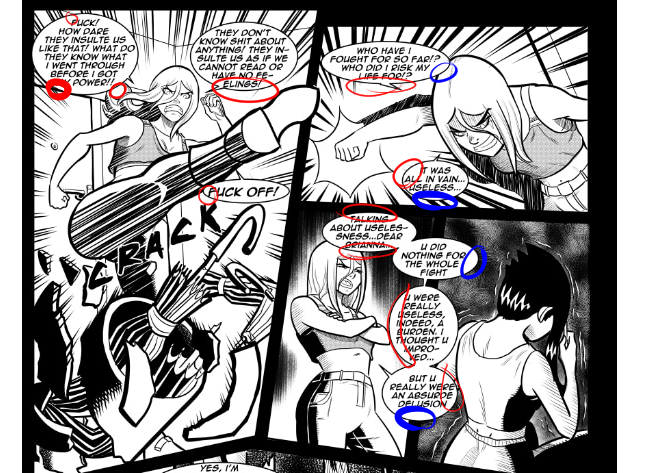
All the places I've circled in red are places where your text is too close to the borders of your bubble. All the blue spots are places where you have too much space.
Using perfect circles or ovals to letter your comic inevitably leads to this issue: what you want is the shape I usually refer to as a 'squircle', that is an oval, but flattened out just a little on the top, bottom, and sides. It allows for much more natural space around the outer edges of your text so you don't get big dead zones of white and also don't run into those corners being too cramped.
You want a decent amount of empty white space around your text, but not too much; the objective here is for the reader to not even notice that they're reading a text bubble, but instead intuitively go through it and then back to the art seamlessly. Even a tiny fraction of a second having to figure out what a word is or noticing that one letter is touching the edge of the text bubble or seeing those big white spots can be enough to really take a reader out. It breaks the illusion and makes them notice the shape of the bubbles and the fact that you've got letters and text and etc., and suddenly they're not actually experiencing the story, they're paying attention to the artifice of it, and that's the last thing you want.
All of this compounds together: You have a lot of panels per page, and a lot of dialogue per panel, this leads you to using shorthand to make the text take up less space, and then your bubbles are SUPER tight around the text, making it harder to read.
All of those things together make the pages EXTREMELY cramped and exhausting to read.
You're not giving your story any time to breathe here: make some panels larger so you have more empty space to put those bubbles in, Spread the bubbles out more between panels so you don't have 4 people talking at once or a single person giving an entire monologue in one singular panel, and make the bubbles bigger and more adequately shaped to fit the blocks of text. This is a digital comic, even if you plan on printing it someday, so there's no hard constraints on how much information needs to be contained in any given section of your story. You can make the panels bigger, fewer panels per page, give yourself enough room to work with.
Honestly, your art is solid and dynamic, you've got a pretty great sense of character acting, and you know how to use speed/motion lines to convey a sense of movement. Good stuff as far as the drawing is concerned, but you really need to be paying more attention to laying out your pages as COMIC PAGES, not individual illustrations. Pay attention to your flow and pacing, and for the love of god put a little more care into your lettering.