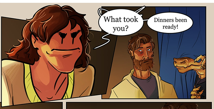
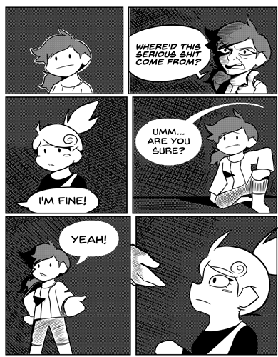
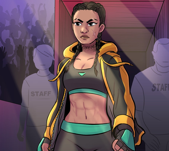
Okay, for the most part you're solid on basic drawing skills. I can see some shortcuts you're using that are maybe a bit too much,
Like, yeah, those staff members are meant to be set dressing and not at all focused on, but they're only
barely farther away than Sousa, and yet they have been completely dropped back to a single color with no shading and no faces. They actually stand out MORE than if they were fully-drawn and detailed characters who were just in heavy shadow. Simplifying them to this degree makes them distracting from your focal point, which is the last thing you want when you're doing a big shiny character introduction moneyshot.
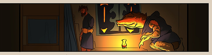
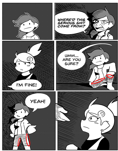
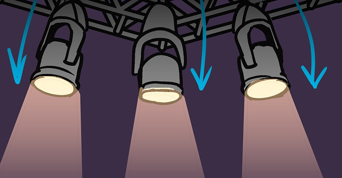
Other little things, like the hairline border left because you used a paintbucket with too low of a color tolerance to fill in these spotlights. It may not seem like much, but it's just enough to break immersion and make me realize what tools you were using to create certain effects, and little things like that are going to add up and take me out of your story.
I absolutely can't say too much, as I've had a lot of... little lazy oversights in my own comic in an attempt to produce it quickly, but in general, the more things like this you can get rid of the better.
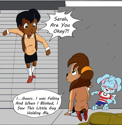
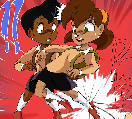
That shot reminds me, though...
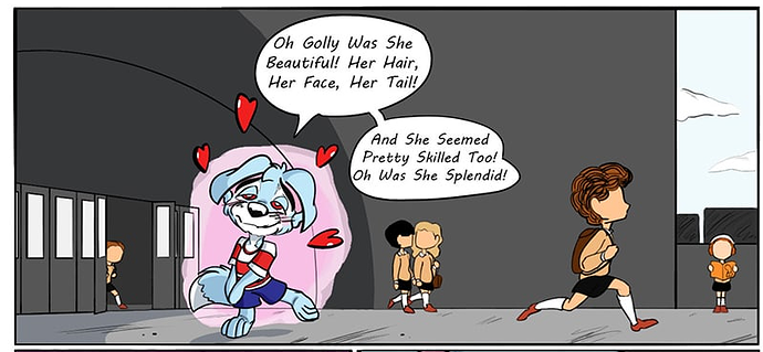
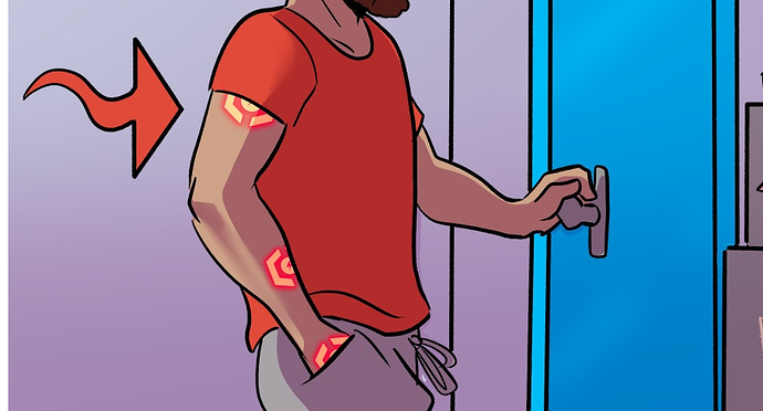
I hate this. Don't do this.
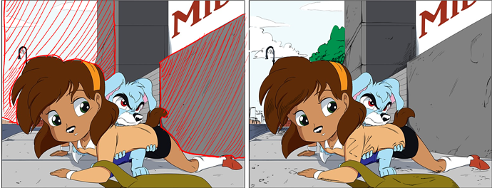
If you need to draw me an arrow diagram in order for me to understand how your characters are moving, you have
failed as a comic artistIn both of these cases, I don't think you needed to draw the arrows. I can see what the characters are doing clearly enough that the arrows are simply redundant, but if you use them at all, they can easily become a crutch and you might end up inadvertently drawing lazy character acting and depending on the arrows to tell the reader what's happening.
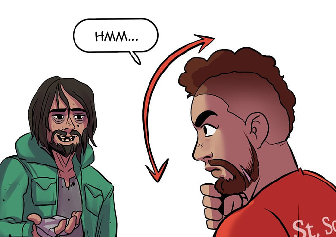
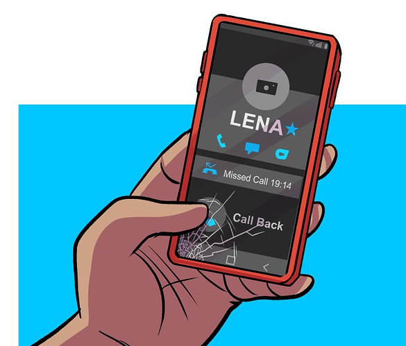
this is an amazing detail. I adore this. Not just that his phone screen is cracked, but I can clearly see HOW it got cracked and that it's just left there is an incredible little unique personality detail delivered in a very subtle way. More shit like this.
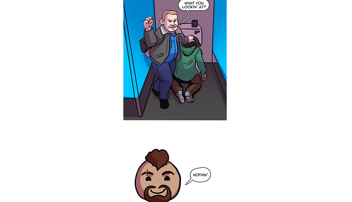
this moment bugs me a little from a storytelling perspective.
This dude just walked in on a mafia collection call in the middle of a public restroom. He's nonchalant about it and doesn't care, that's great (good character moment), but the situation is dead serious even if he isn't taking it seriously. Using the little chibi head like this makes it feel like
I'M supposed to be as amused by it as he is.
Immediately after, he thinks to himself that crime is getting out of hand, so it's clear he's putting on at least
some degree of an act in order to avoid trouble, so that makes me feel like the chibi head is even more out of place. I feel like this is a place where a fully-detailed shot of Mr. Eyedrops with a cold, flat expression would work a lot better; the little cutesy bobblehead is a jarring disruption of tone here.
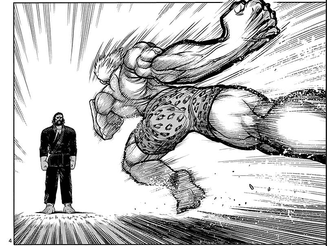
I'm not gonna go through every single panel in your fight scene, but your sense of gesture is really stifled. This is an MMA fight; these people are going to be throwing their weight into their actions HARD, but you've got a lot of moments where someone is throwing a punch or a kick from a standstill, with their body totally upright. They should be, as the phrase goes, 'putting their back into it'.
I highly recommend looking at Manga for this; they tend to be much, MUCH better about the granular details of a fight than american comics. In particular, Teppuu is an incredible series specifically about women's MMA fighting.
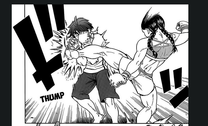
Just look at how the weight of the body is shifted in this panel to show the weight and movement in that kick, the arms are
thrown out to the sides as counterbalances while the entire torso leans off to the right. This is the kind of stuff that's missing in your comic. The drawing is solid, but it feels more like action figures being posed than people in the middle of motion, and that all comes down to Gesture.
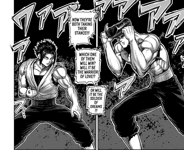
Another great manga to study for this that I recommend is Kengan Asura. It's... way less grounded and realistic than Teppuu, but it is an AMAZING example of getting weight and movement into close-combat martial arts battles.
Even when these characters are just stancing up, there's attention paid to where they're placing their weight and keeping the gesture fluid. And when those characters go into motion...
god DAMN.
Like I said, Kengan Asura is way less grounded and realistic than your story, but it has some incredible examples of exaggeration and intensity in fights.