No.
no, no, no, no, no no no.
no.
And, furthermore, no.
Manga is literally just the Japanese word for comics. In Japan, Superman is a manga. Calvin and Hobbes is a manga. Every single comic book is a manga. Manga just means comics in Japanese.
The only thing we in the west are using the title 'manga' for is to denote the comic's place of origin, meaning that you can not, I repeat can not make a manga if you are not based in Japan.
There is nothing wrong with this, I want to make that abundantly clear. The idea that manga are superior to comics from anywhere else is patently absurd, and there is no need for it to be a competition. Comics are comics, and they are good if they are good, period. Who gives a shit where they come from.
Your work can be inspired by manga, you can have a manga-like style, you can study manga and try to create like mangaka do. All of these things are valid, and also apply to me, so clearly I don't think there's anything wrong with them.
However, this does not mean that I make manga.
The reason manga read right-to-left is because they are written in Japanese, which reads right to left. Flipping the pages over to read left-to-right makes things look awkward, it makes left-handed characters right-handed instead, etc. etc. You don't fuck with the artist's original vision, so we just leave them in their original format and re-do the letters in order in our language and accept that you have to read right-to-left even though our language goes the opposite way.
You, on the other hand, are writing a comic in english, and you're advertising and discussing it on an english-speaking board. Therefore, the absolute bare minimum you should be doing is making a comic that works with, rather than directly against, the language you're using.
Now the reason I'm harping so hard on this is because as soon as I saw that, I stopped giving two shits about your art. Yes, your art is bad, your proportions are all over the place, your characters look like paper dolls, your environments are lazy, and there's really nothing grabbing me and drawing me in, but you can go read through the rest of this thread to get any advice I would give you on that front.
See, for you, the fact that you're producing a comic in the english language but having it read right-to-left 'because that's how manga does it' tells me that you aren't actually paying attention to what you're doing.
I guarantee you that you aren't actually as inspired by manga as you think you are.
All you have done here is lift manga's basic surface-level aesthetic. You're taking it and wholesale slapping it on your comic without actually understanding what it is that makes it work. You have no understanding beyond the most basic superficial idea that it looks cool.
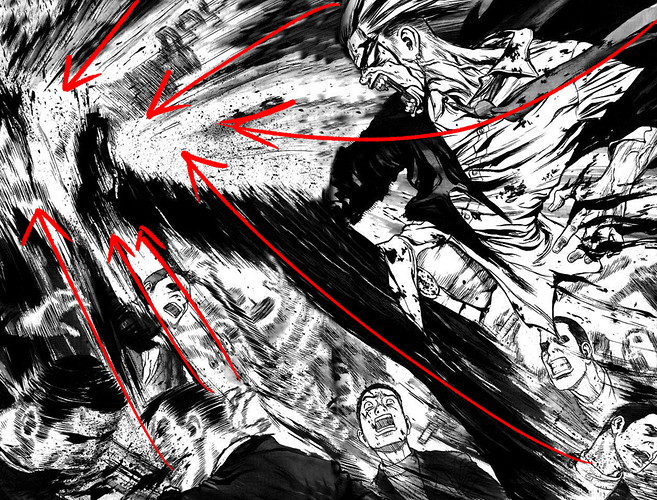
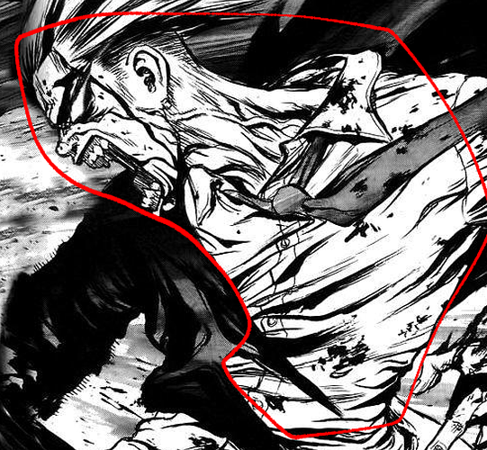
So, let's take a page from one of my favorite comics, Sun Ken Rock, and see what I mean, shall we?
Most people will look at this and think 'damn he kicked them in the face, that looks cool.'
That's fine, that's how readers are supposed to react; they are just along for the ride.
You, on the other hand, are not a reader. You're a comic artist, which means you need to understand how that ride was constructed and all the parts that went into it.
So when
I look at this double-page spread, I'm not
just thinking 'oh damn that looks cool', I'm taking in WHY and HOW it looks cool.
The most basic thing here, and an incredibly great tool for making your pages look good, is composition. Look at how practically every element of the page is leading in towards that point of impact. The streaky hatch marks on his legs, the angle of his tie, the motion lines of the dude getting kicked, the angle the character is facing, EVERYTHING on this page is working in conjuction to create a flow from the outermost edges in, across the figures and the action, to the point of impact.
If I zoom in close, look at how rough and streaky these marks are. They look like a jumbled mess when up super close, but...
the cleaner elements of the page are so well-defined that I can make out not only the individual wrinkles on his shirt, but the shape and form of each and every one, along with the buttons and seams, the veins on his neck, and the knot of his tie.
so when you take both of those elements together, it makes that leg look like it's moving super fast, it's got this frenetic, violent energy to it. The leg can be a streaky jumbled mess that doesn't actually look much like a leg because context from the rest of the image fills in that information. This makes the streaky hatch marks actually work BETTER, because they don't have to worry about defining his leg accurately, and ALL effort can be focused on the energy of that impact.
These fellows down in the corner are done with dense hatch-marks that work similarly to the leg in order to show motion, but it's less extreme than the leg because they don't have the benefit of context; you still need to be able to tell these are human heads, so the action lines are as intense as they can be without obscuring the form they're trying to define.
On top of all of that, there's detailed construction drawing, an intimate understanding of form and texture. The figures are solid and detailed and feel real. They move with so much impact because they have real weight. That in and of itself can take an entire college semester's worth of lecturing, so I won't go into the details here, but ALL of these aspects are working in conjunction with one another. You can't just lift what you see and expect it to work the same way, because the stuff you can see directly is so strongly affected by what you as the reader aren't able to see.
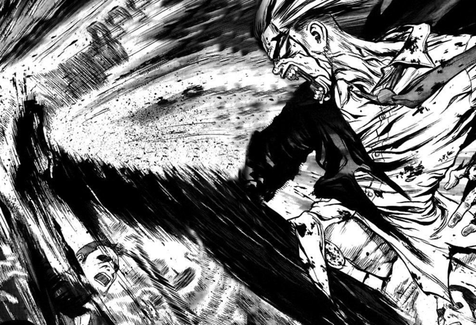
There is SO MUCH going on in this page that is more than 'thing looks cool', and from reading your comic I can tell you haven't been picking this kind of stuff up. You've only been looking at the surface and not digging deeper into the mechanics of WHY it looks so good. What makes art look good is an understanding of the world around you, and a unique way of expressing that understanding (often referred to as a 'style')
Manga is characterized by certain aspects of style (though honestly even that is up for debate. Look at Monkey D. Luffy next to Jotaro Kujo and tell me those two comics are even remotely the same art style), but those stylistic aspects are built on the same understanding of the world that we're all working to develop.
If you're only lifting the style, and not the understanding what they are based on, then you're just spinning your wheels. I honestly can't critique your comic much at all because there's so little actual artistry going on. It's just you mimicking what you've seen on the most superficial of levels without learning the fundamental elements of what makes art good in the first place.
I want you to drop this 'I'm making a manga' bullshit and go study art. Not a certain kind of art, not a style, not a medium, art. In general.
Go to a park and sketch the things you see, buy some traditional books (Andrew Loomis is a great go-to suggestion for figure study.) If you can manage it, go find a local community center and sign up for art classes there. Start paying attention to what it is you pay attention to, focus on portraying the world around you in all of its lush, intricate detail, and only then will stylistic influences like this work for you.