6 / 11
Feb 2021

I’ve never drawn a real background before usually it’s just a really simple kind of blurry background for potrait/characters. Now that i try to make comic this is like an exercise and brainstorming. Let me what you think and maybe point me in the right direction? Thanks in advance.
Btw sorry in advance i’ll reply collectively in hours maybe since i’m really sleepy right now. :relaxed:

  • created

    Feb '21
  • last reply

    Feb '21
  • 10

    replies

  • 631

    views

  • 4

    users

  • 31

    likes

  • 1

    link

Looks pretty good. The colours are definitely the highlight here, especially the sea, which really evokes that feeling of being at the beach.
for things to look out for, the perspective is a little confusing on that rocky outcrop and the horison line. Also that cloud that's below the horison, overlapping the water would need to be extremely low. Maybe look up some reference pics for getting an eye for this kind of thing. "Perspective! For Comic Artists" by David Chelsea is a good book on the subject.

Overall ,this is a good start with a strong atmosphere and personal style though, keep at it!

It’s definitely confusing just as you said lmao i was just kinda guesstimating where everything should be and need to learn more about perspective. I’m glad that it conveys the beach atmosphere fine enough. When you said strong style i was kind of dumbfounded that i have a....style? I’ve never realized on my own. :joy:
Thank you for the great insights and pointers!! :smile:

I think it looks pretty good, just needs a little adjustment in my opinion.

  • I would straighten out the horizon line and maybe follow the perspective a little tighter with the waves.
  • For the waves, I would stay away from brown and use those lovely colors you already had in there. I looked up some reference for how waves crash on a beach to get a feel for the shapes of the waves. You could also add some nice foam washing up on the beach.
  • I also moved the island in the back up a little bit and straightened out that perspective line. I made the water in the distance quite a bit darker, and got rid of a lot of the water detail, because at that distance you're not going to be able to see much as far as individual waves.

Hope there's something here you find useful! :grinning:

Edit: I just saw that @artamazon posted and mine is a bit similar, but still...

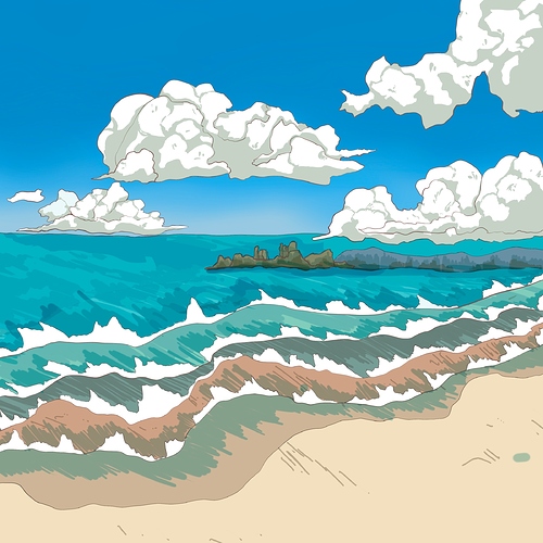
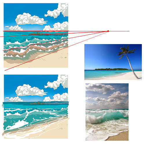
I like the colours and how you did the waves! One quick tip is to make the horizon line completely straight. Right now it’s a bit wavy, but in reality the horizon line is so far away that it will look completely flat, even if the water has waves (hope you get what I mean).

For the clouds I think it helps if you make them follow the perspective of the sky, so for example the clouds that are closer to the horizon line will be smaller, and clouds “higher up” in your pix will be larger. Like this photo:

4

Do you teach? Cause that’s an amazing feedback that it almost single handedly answers my struggle with everything—-i don’t even know how to properly explain it. Your guide is so clear and i really like the way you adjusted everything—-it just makes sense so much. Thank you sooo much for the time and effort in drawing + explaining everything so detailed to me i’ve kinda teared up a little bit. Thank you soooo much. :sweat_smile:

That is very useful tip you got me there!! I think i got what you mean with the horizon and thanks for providing me with an example of cloud perspective, it is very useful! :grin:

lol thanks but no, I just work in an environment where artists have to give clear feedback to each other haha :smile: Glad I could help!

That’s a very positive environment then :smile_01: