9 / 13
Feb 2020

Hi, I just finished the first chapter of my first comic and I would like some feedback of it, since this is the first time I do something like this I know there is a lot of stuff I can do better, I can think of some already but I also would like to hear the opinion of the more experieced people.

  • created

    Feb '20
  • last reply

    Feb '20
  • 12

    replies

  • 1.3k

    views

  • 5

    users

  • 6

    likes

  • 2

    links

Error 404. We couldn't find the page you're looking for.
The link you followed may be broken, or the page may have been removed.
Go back to the previous page, return to the homepage, or get help.

Either a Glitch or you're 'Blocking' by specific person or region.

Weird, the link works just fine, here, just copy the link on your browser "https://tapas.io/series/Mas-Blanco-que-Negro-Pokemon-BW2-nuzlocke"

Lol, I had you blocked, why would I do that? You´re unblocked now sorry for the troubles

You should check if anyone else (possible hacker) is logging into your account.

Just changed the password, thanks for the advice

@asaku - I just finished reading your first chapter and I think you've got a really great base. Honestly, I love your drawing style. I think the character designs are cool, I really like the monotone color (all pink - mostly), and I think it's great that you're breaking away from traditional comic tropes and trying something new. Having all the art on the left and the dialogue on the right is something original that, at least, I haven't seen before and I think it makes your comic look very clean and inviting.

My critiques come from that non traditional layout though. When there are multiple characters talking in a single panel it gets confusing as to who is actually talking. If you'd be willing to add additional colors to your panels, I think this could be solved by assigning each character their own color, that way the readers would know who's talking based on the color of the text. I would also suggest adding a little extra space between the pieces of dialogue spoken by other people. Right now the only thing the let the reader know that someone new has started talking in the same panel is the dash you include, but sometimes that can be over looked, and if you just have a larger amount of space in addition to the dash that would help readability a ton.

I think just making those few changes could really escalate your comic to the next level and with the easier readability attract new readers. Good luck and keep up the great work!

Off to a solid start, congrats on completing the first chapter! I think the main thing that stands out to me as something that could improve it quite a bit is just that it's rather light on pictures/panels. Like each episode has 6 panels/pictures, but then often times on the side the text will go through what I would typically be expect to be like... many more panels worth of dialogue and content. It's almost like a picture book where key moments are being pulled out to illustrate rather than illustrating everything like you would usually see in a comic. That's not necessarily a bad approach though!

I have 2 possible approaches that might improve it:

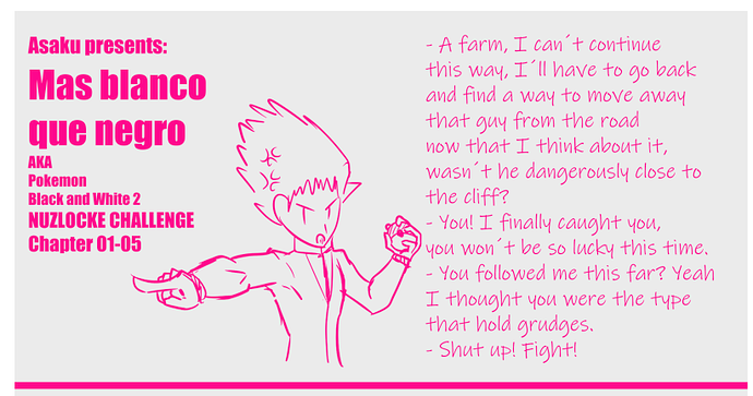
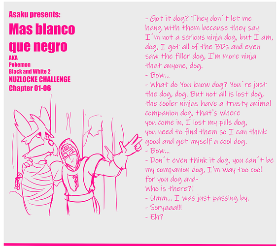
1.) Lean more into it being a comic and add more panels~ In animation, there are things called "Key Frames" and "Inbetween Frames". Key Frames are all of the most important moments that make up the story, while the Inbetween ones are what make the animation as a whole flow smoothly as they transition from key frame to key frame. What seems to be happening with your comic is that it only shows the key frames in pictures and doesn't have any inbetween frames, which makes the images jarring and inconsistent compared to the words on the side. For example, this panel:

Evidently what you wanted to emphasize here was the rival showing up and challenging the player to a fight. That was the key moment that you identified and chose to draw. But really, this panel contains like... 3-4 panels worth of content in the dialogue. The first bullet point of dialogue could be either 1 or 2 panels- at the minimum 1 showing the farm in question, but perhaps a second of the player thinking back to the guy from the road". Next would be a panel showing the rival behind the player yelling at him from afar. This is kind of what i interpret what's actually drawn to represent. Lastly there would be a panel where the player turns around to face the rival and they exchange the last two bits of dialogue. This would allow us to read the story at a more event pace to what's actually happening. As is a lot of stuff actually happens in this panel, but all we get to see is an angry guy pointing off into the distance with no sense of context or who all is even involved or talking.

2.) The other option is to lean more into the picture book feeling where you still only illustrate the key images for each scene, but then I would advise you to be a little more careful and selective with what 1 picture helps represent the panel the best. An example that I thought of comes from a video game I've played recently, Atelier Ayesha, where for several of the character events/endings, they use a single illustration while they run lots of dialogue over the top of it. Here's an example:

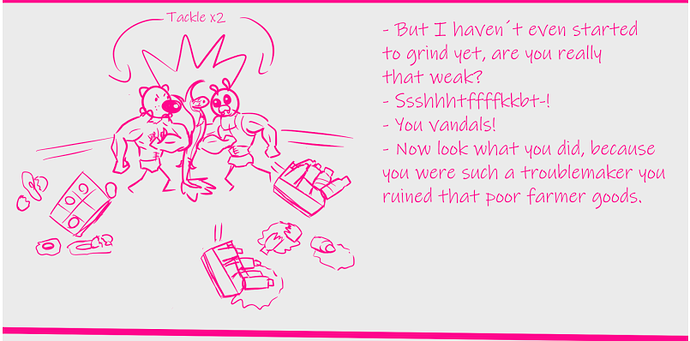
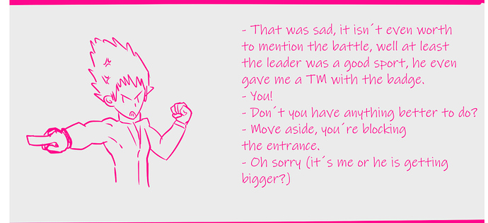
The main takeaways are: each character involved in the scene can be seen, the dialogue pop ups indicate which character is talking, the poses and expressions selected are a good summary of how each character feels throughout the scene, and some hints of background are shown to contextualize where the characters are, both in general as well as in relation to one another. You actually are already doing this pretty well in some panels:

(just as a few examples, these aren't the only ones)

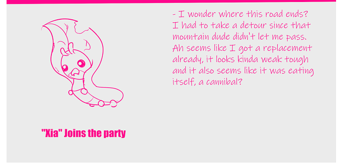
But others like these are a little dull or feel incomplete, and probably aren't the best key frames to tell the story with. Adding some background elements and the player character where he's speaking could go a ways towards improving them:

I hope this review was helpful, best of luck moving forward :smiley:

Yes I also noticed that it was hard to read in the more text heavy panels, I thought I could fix that with a more readable font but your idea of adding extra spaces is actually better, i'll certainly will try it on future chapters, thank you for taking the time read my comic and reviewing it.

Yes like you said there are many panels that feel empty or unfinished, the reason is that they are incomplete, I had the self imposed rule of doing one chapter per day meaining that I played the game, scripted the chapter, tought of a few jokes and drew it all on the same day forcing me to priorize on wich panels should I focus while at the same time I neglected others; I did this as an experimet so I could learn to manage my time more efficiently on future chapters. As for the lack of pannels its true that I omitted a lot of them but it was because they would have been mostly contain bust shots of the characters with a back and forth dialogue or simple sceneries with the character standing somewhere that being said I was actually aiming for second option you metioned but in the end the idea wasnt quite compatible with my rushing and all. I will be using the idea of adding a background tough also I think I will add a small box to indicate the location on each scenery change I really think it will help to make the scene on each pannel a lot more readable. Thank you for taking the time read my comic and reviewing it. :slight_smile:

So I'm always down for a Pokemon fancomic, kudos to you for keeping the tradition alive /thumbs up (especially after SmackJeeves went downhill, it was literally the home for Pokemon fancomics lol)

That being said, this really isn't a comic right now? The "dialogue" layouts look like what a script laid out in Notepad would look like, before it's actually been transcribed to comic form. Considering your "panel" layout, if you want to go for the Korean webtoon type vibe (basically just horizontal panels stacked vertically) I'd suggest checking out some of those comics and seeing how they don't let the limitations of single horizontal panels stop them from conveying dialogue scenes, mood, perspective, etc. Like the way you have your "dialogue" laid out makes it hard to even know who's talking to who, or what feelings they're actually feeling while talking because we don't see their faces or stances, etc. we're just seeing lines of script. So I think you need to re-evaluate how you actually want your comic to look before going forward because right now it looks more like the thumbnail sketches someone would lay out before actually drawing it to completion.

And if you do want to stick with the format you've got going on rn, I agree with the above post - start using other colors to make it less confusing. I'm all for alternative panel layouts and styles, but it should be for the purpose of creating a new experience, not confusing the people you're actually trying to share your work with :stuck_out_tongue:

Its not really a comic "comic", I just called it like that because I tought it was fitting but I wanted to do something new and took an experimetal aproach with the layout mixing the writting style you would find on a novel with some images, it also seems like people are having troubles to distinguish who is talking on each panel I tried to keep the dialogues neater by having only two speakers, max, on each one but it wasnt enough. I also considered the korean style but I actually hate it, I find it really uncorfontable to follow, most likely because Im more used to the classic manga reading ( left to right). It seems like my main problem will be to find a way to make the dialogue more readeable. Thank you for taking the time read my "comic" and reviewing it.